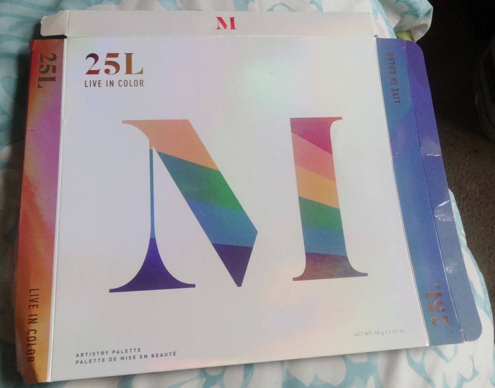
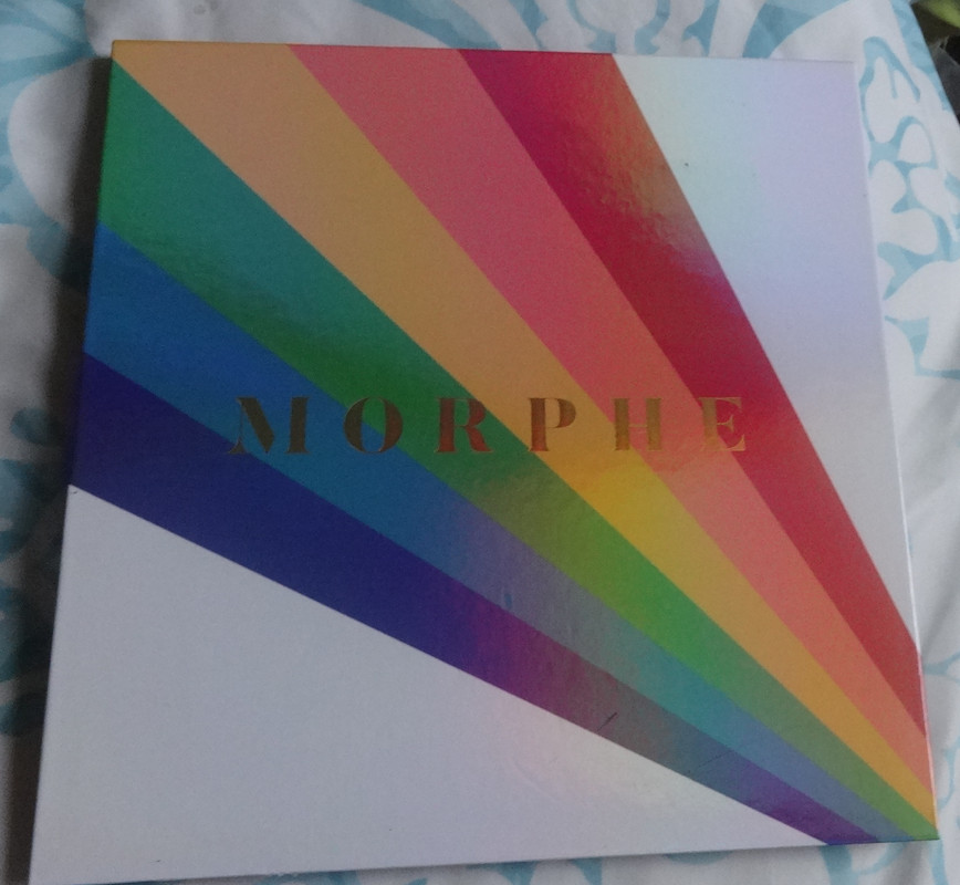
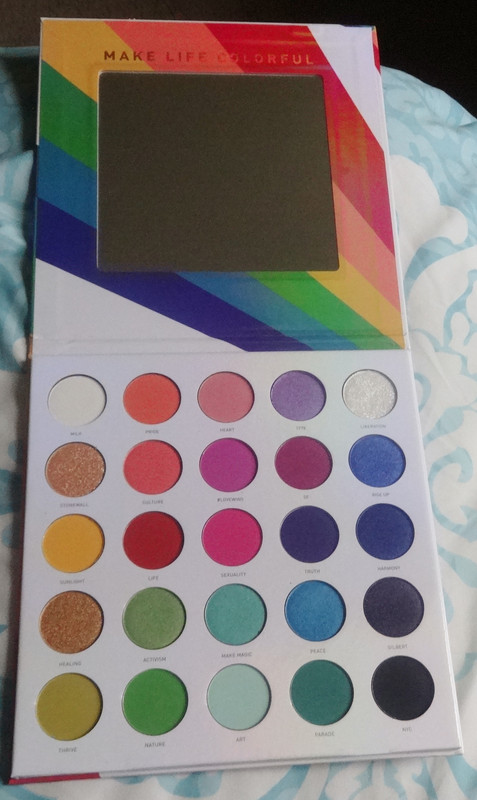
Today I bring to you the Morphe 25L Live in Color Palette
Availability: This palette appears to be discontinued.
Would I buy this again? No.
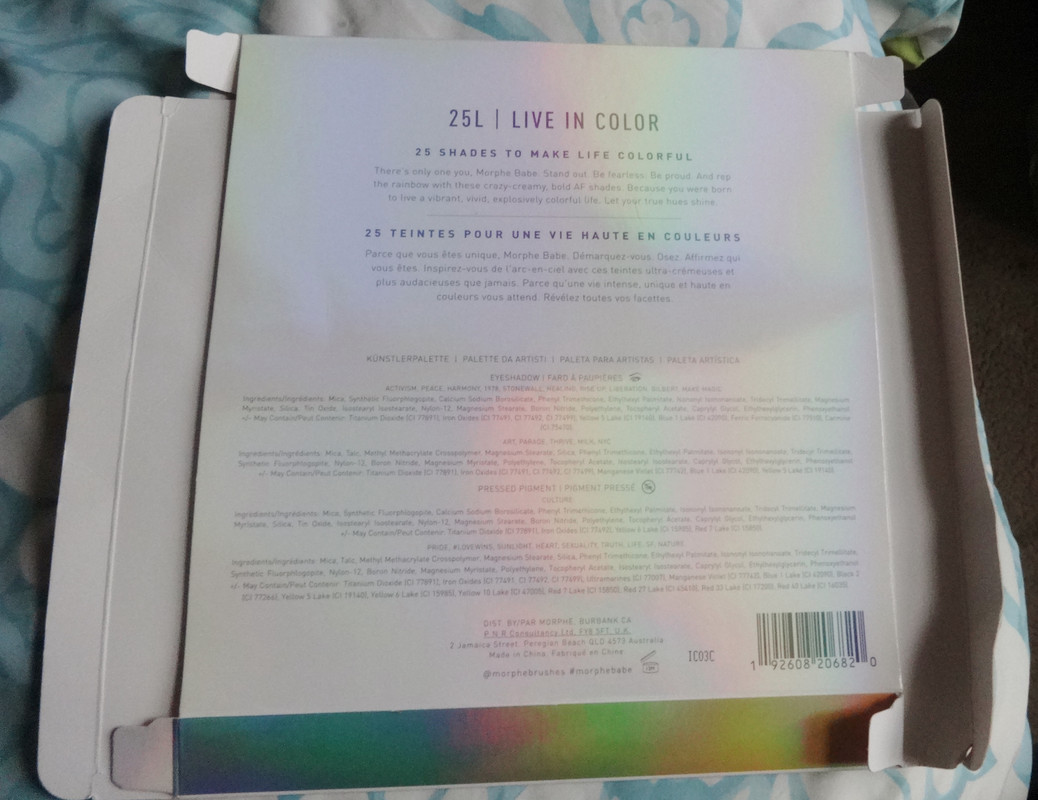
Notes: This palette wasn't on my radar at all until my friend Kevvie posted about wanting it so of course I had to get it for her, for me, for another friend but alas, I haven't had a chance to play with it until now. Frankly at first glance I was so excited because, this might come as a surprise to many of you, I love color and rainbows and pride and the LGBTQ community. This was all a wonderful tie-in and the reason I ended up purchasing several palettes is because the profits from this (I don't remember if all or a portion) went to the Trevor Project. That said, and you'll see this from the swatches, is that the pigmentation and quality of the palette isn't... how do I put this nicely? It's not up to my standards. It's definitely workable but I know it's not a palette I will reach for because it's so meh. Without further ado, the swatches:


Notes: This palette wasn't on my radar at all until my friend Kevvie posted about wanting it so of course I had to get it for her, for me, for another friend but alas, I haven't had a chance to play with it until now. Frankly at first glance I was so excited because, this might come as a surprise to many of you, I love color and rainbows and pride and the LGBTQ community. This was all a wonderful tie-in and the reason I ended up purchasing several palettes is because the profits from this (I don't remember if all or a portion) went to the Trevor Project. That said, and you'll see this from the swatches, is that the pigmentation and quality of the palette isn't... how do I put this nicely? It's not up to my standards. It's definitely workable but I know it's not a palette I will reach for because it's so meh. Without further ado, the swatches:
Milk is a matte white.
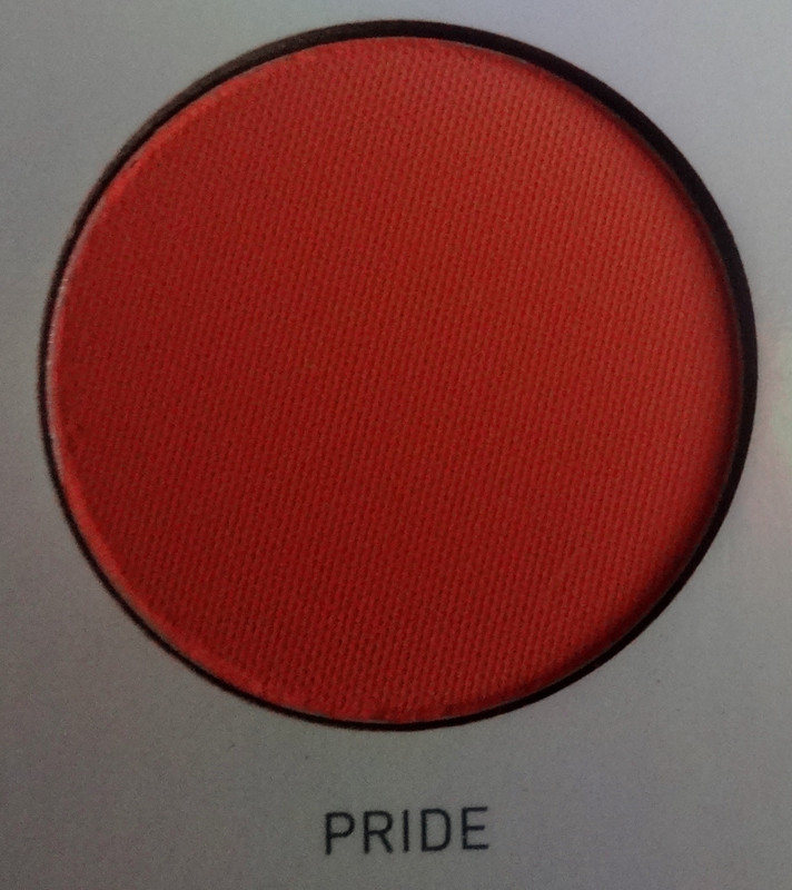
Pride is a matte coral orange
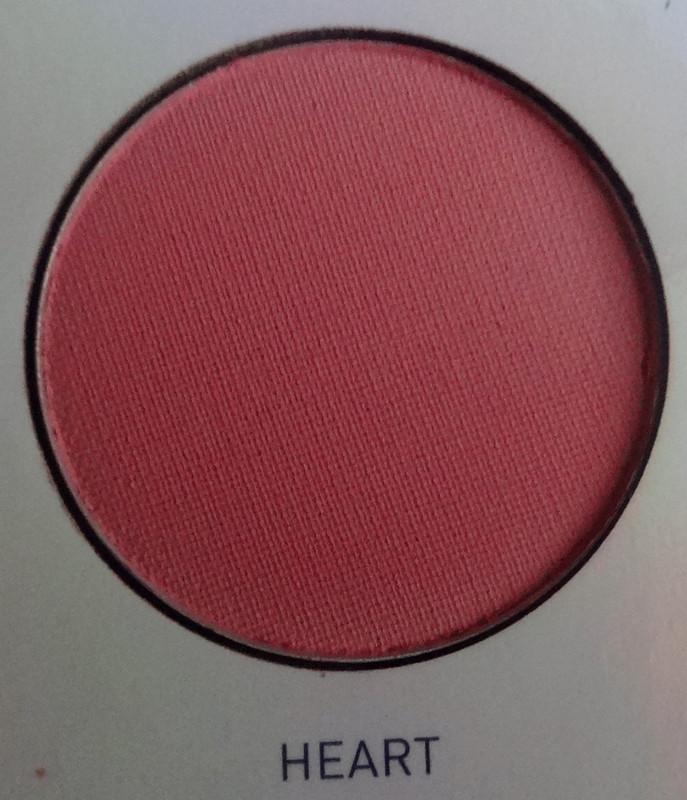
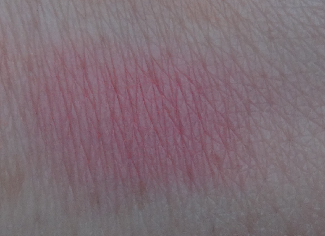
Heart is a matte peachy coral.
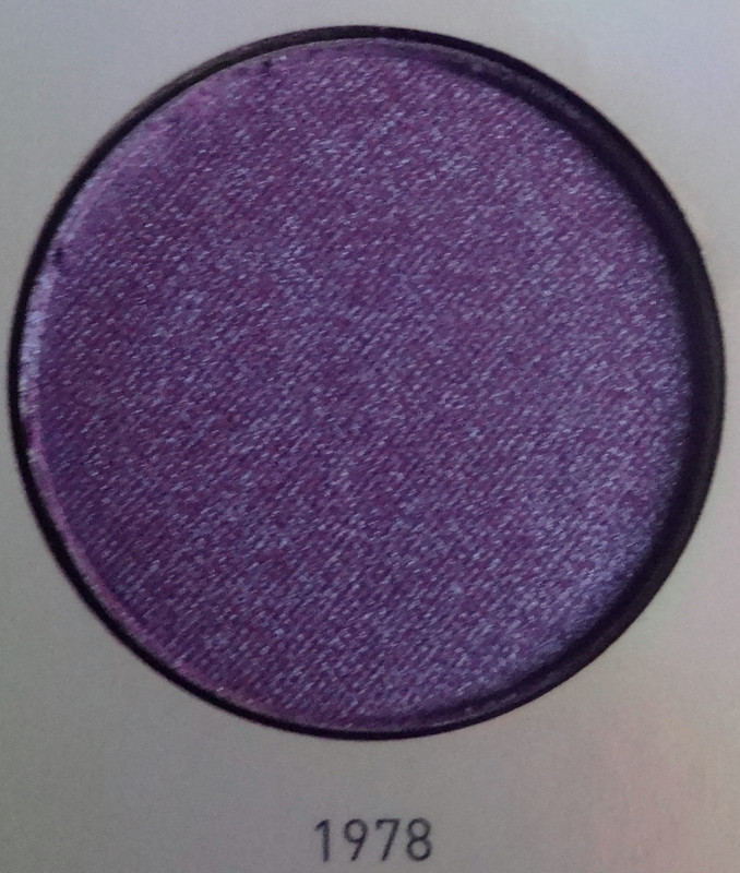
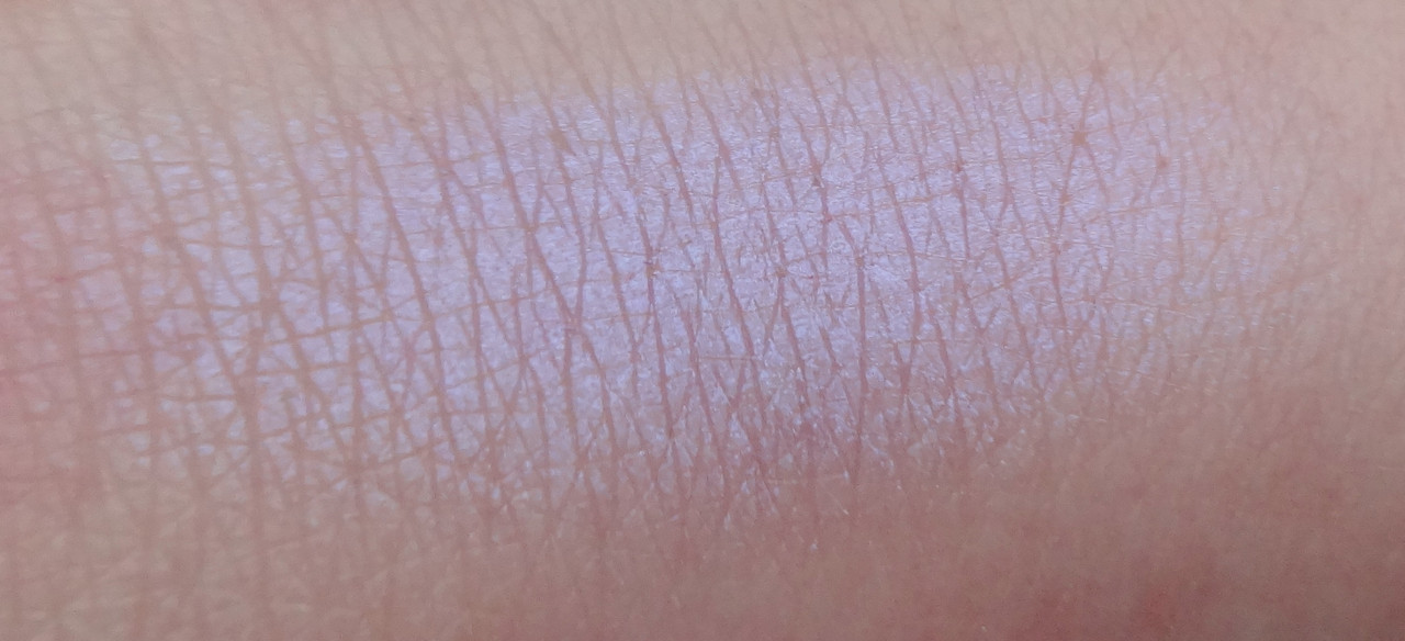
1978 is a satiny purple with a violet pearl.
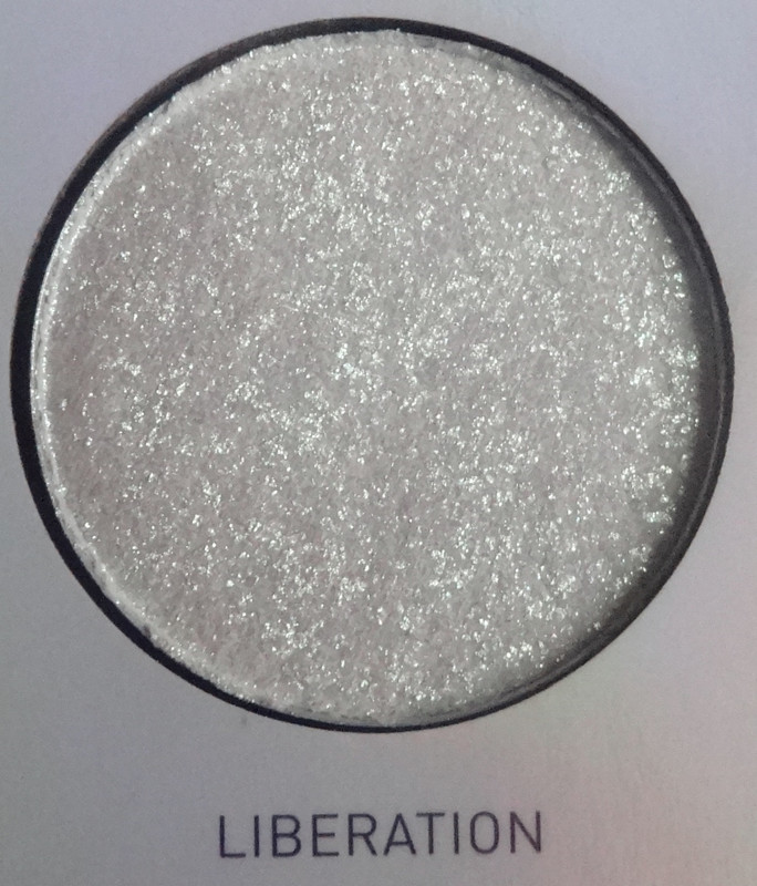
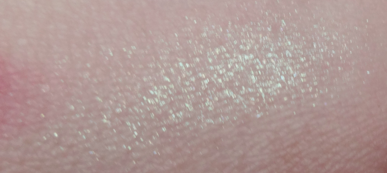
Liberation is an off-white satin base with chunks of mostly teal and some rose-gold micro-glitter.
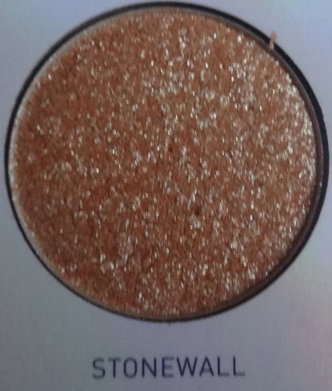
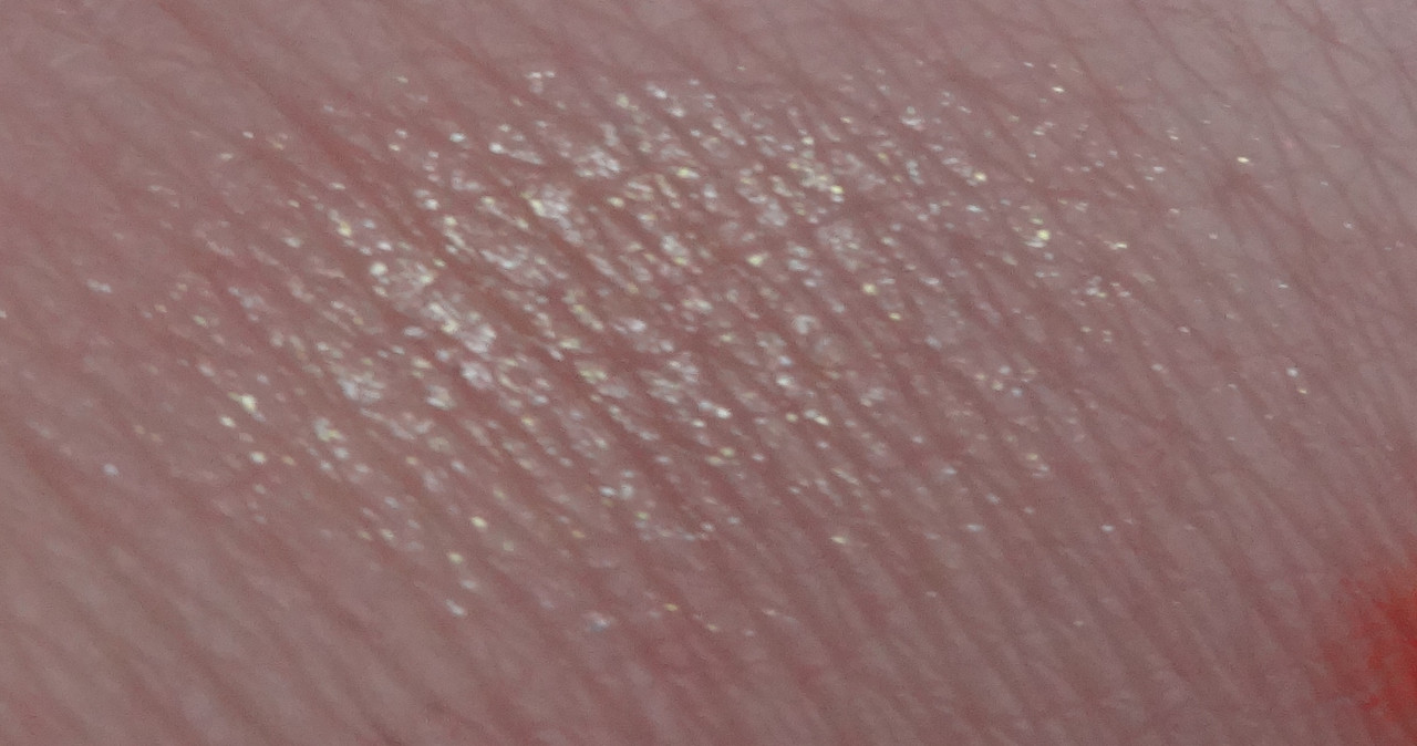
Stonewall is a satiny off-white base with chunks of gold and white-gold micro-glitter.
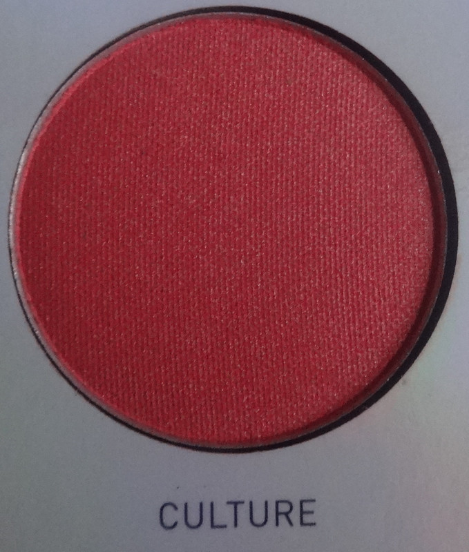
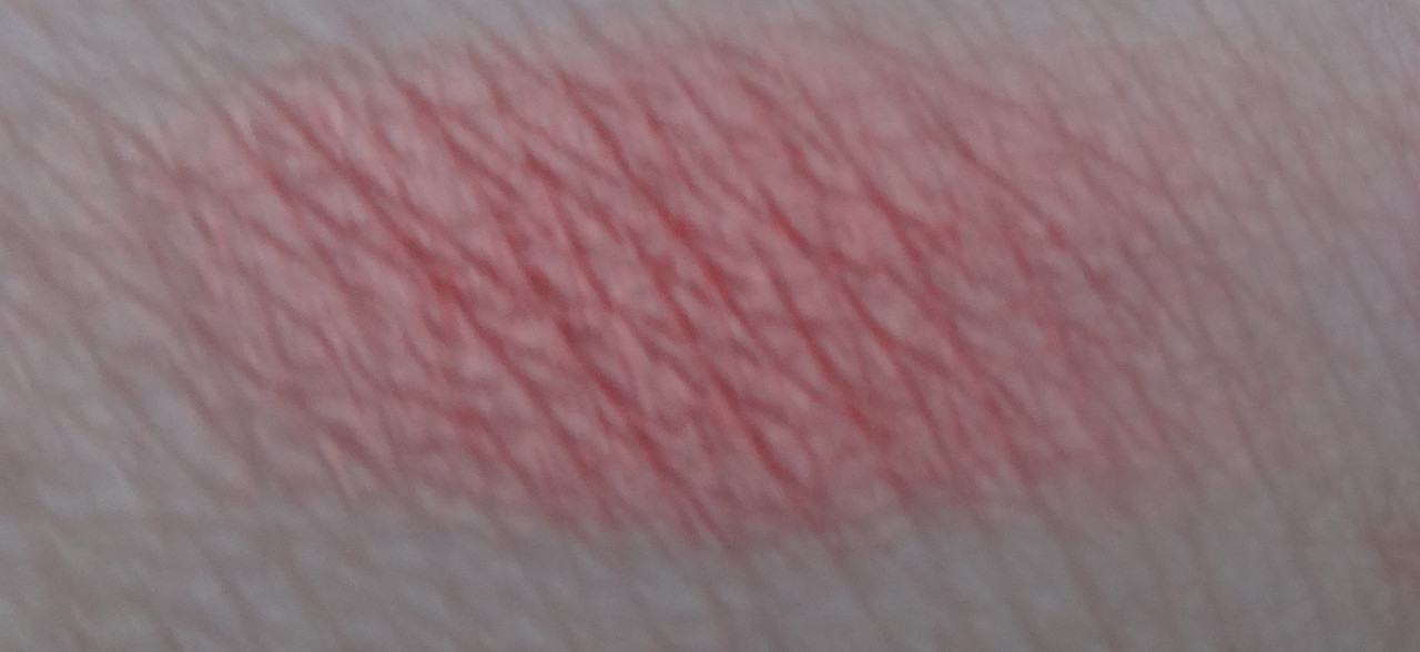
Culture is a satiny peachy coral with a golden pearl.
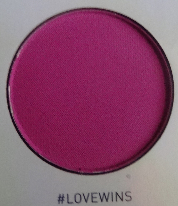
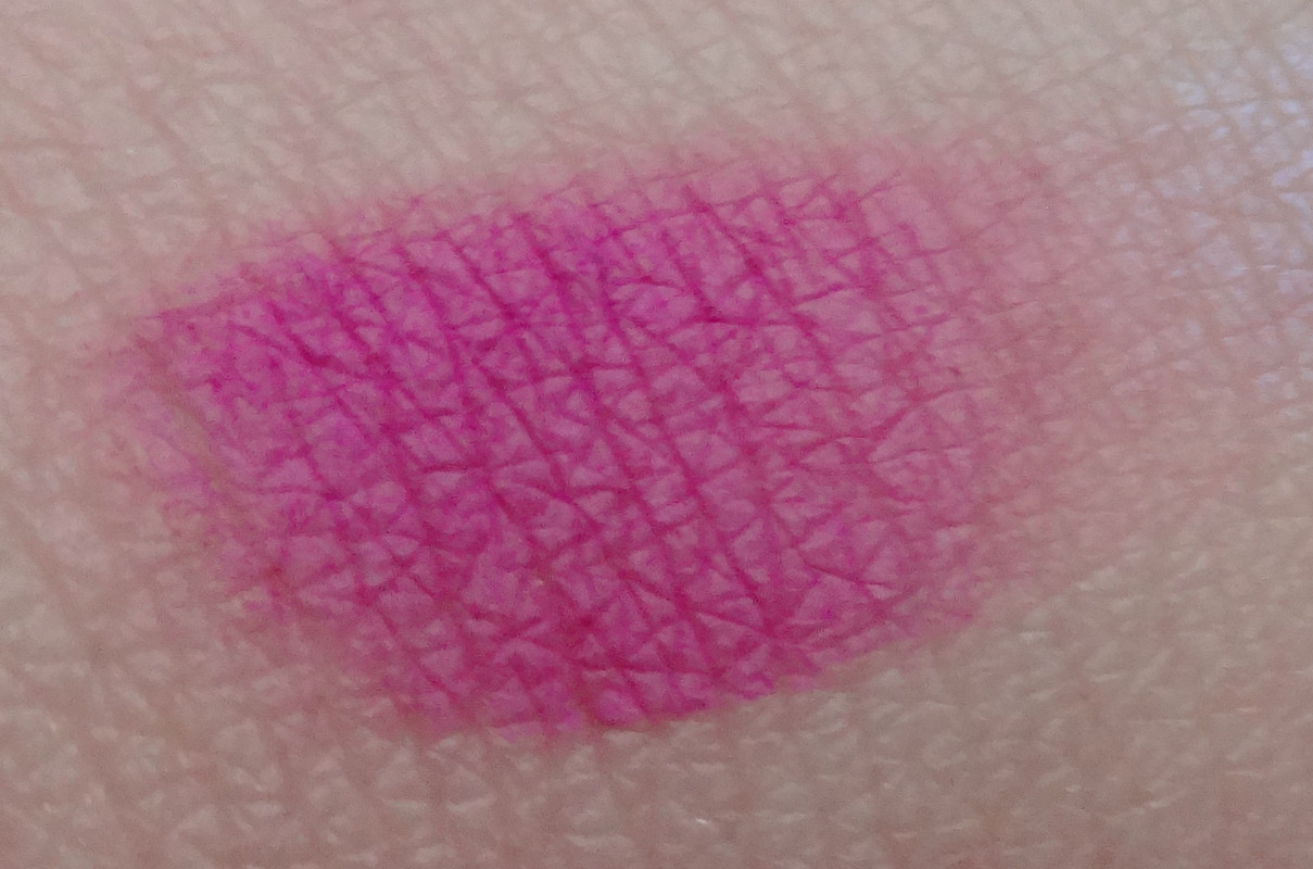
#lovewins is a matte magenta pink.
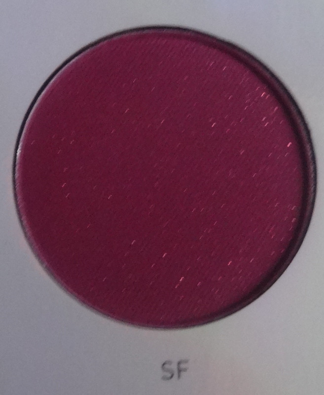
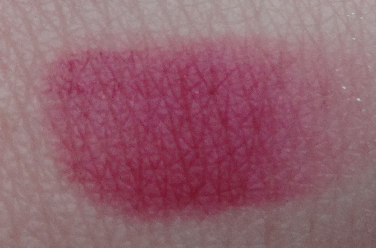


SF is a matte magenta red with pink micro-glitter bits. I really like this color and feel like the glitter adds visual interest, unfortunately it won't really show up in a look unless you use some sort of sticky base.
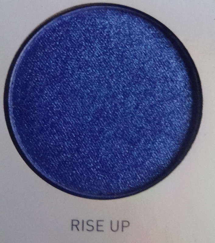
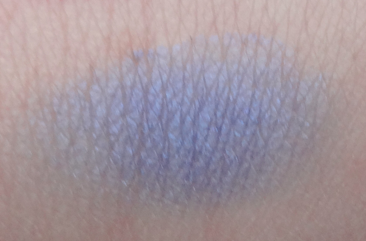
Rise Up is a satiny blue.
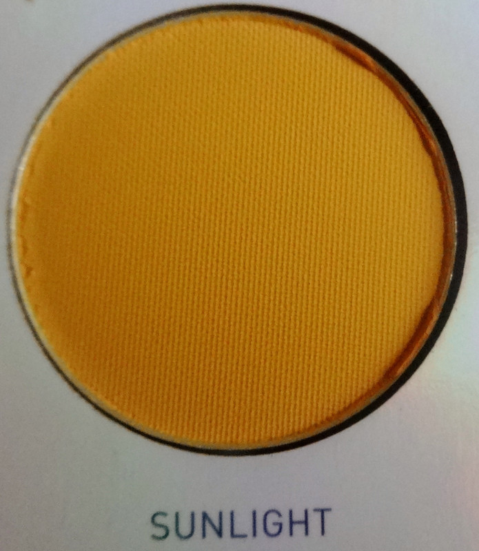
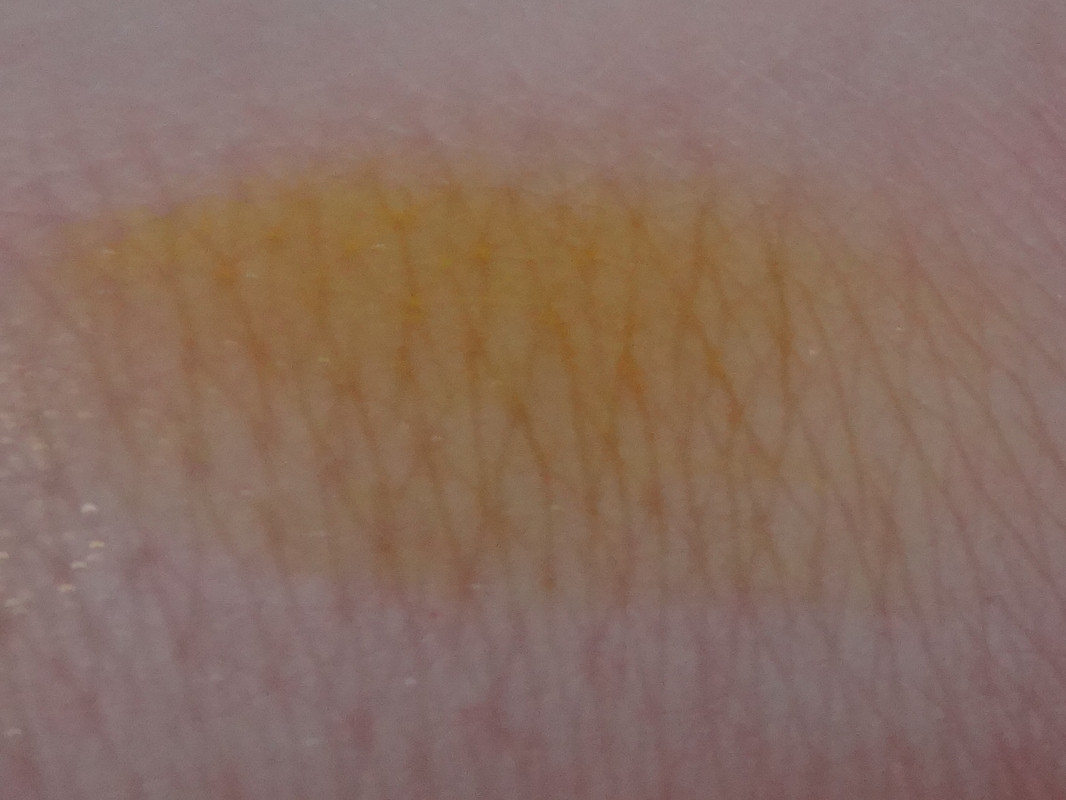 Sunlight is a matte yellow.
Life is a very smooth matte red.
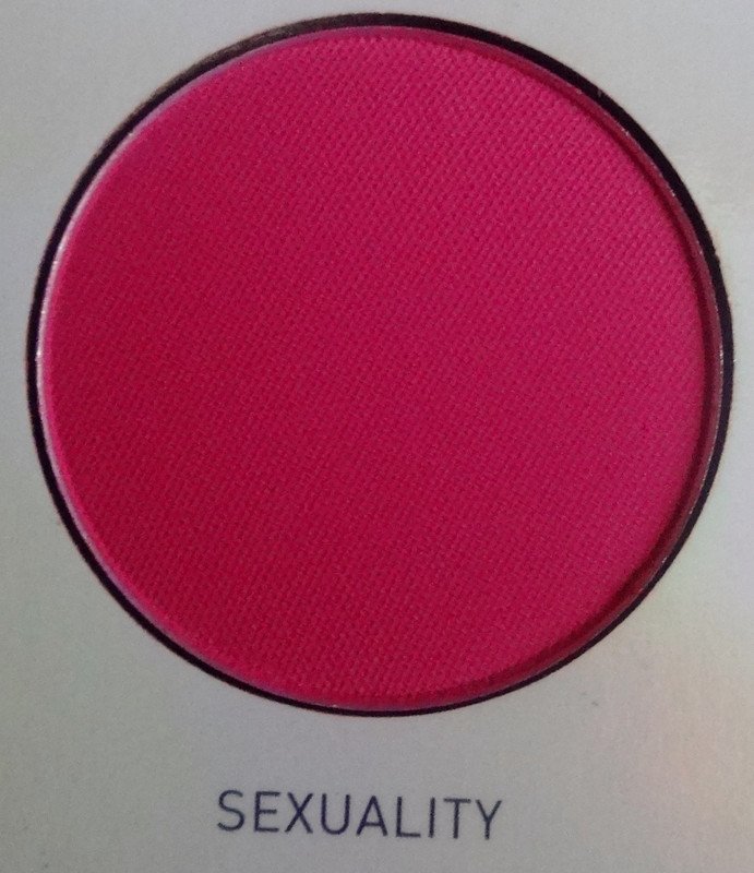
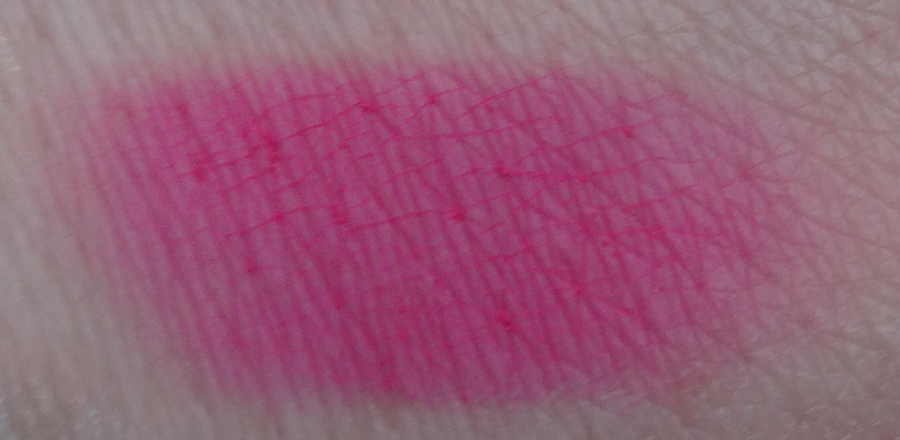
Sexuality is a matte fuchsia.
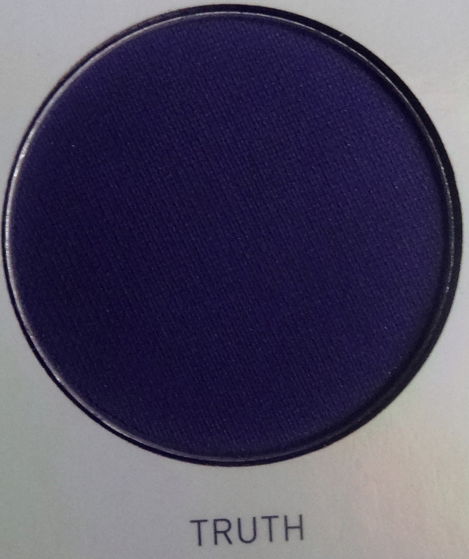

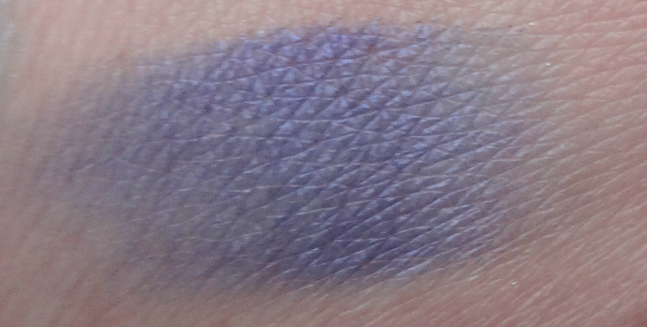
Truth is a matte, dark bluish purple
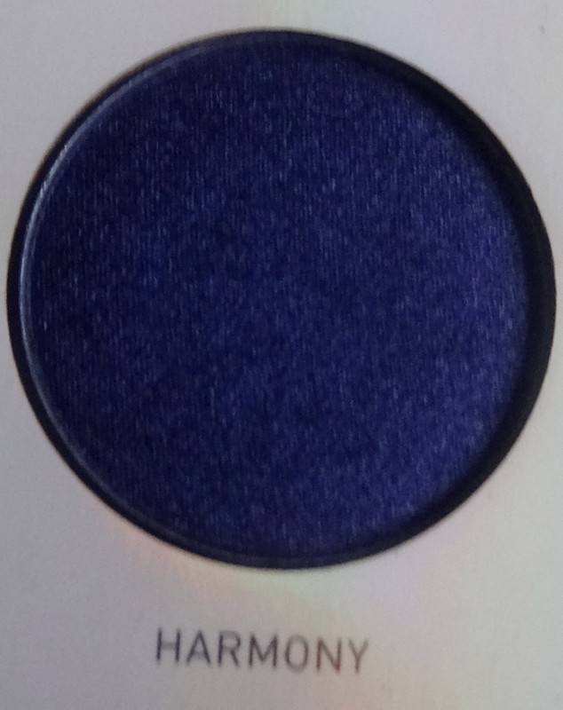
 Harmony is a satiny navy blue.
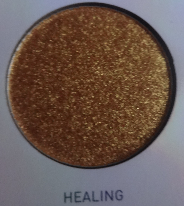
Healing is a satiny gold base with a white-gold pearl and golden micro-glitter.
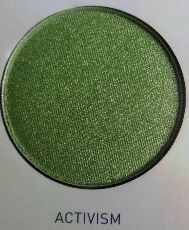
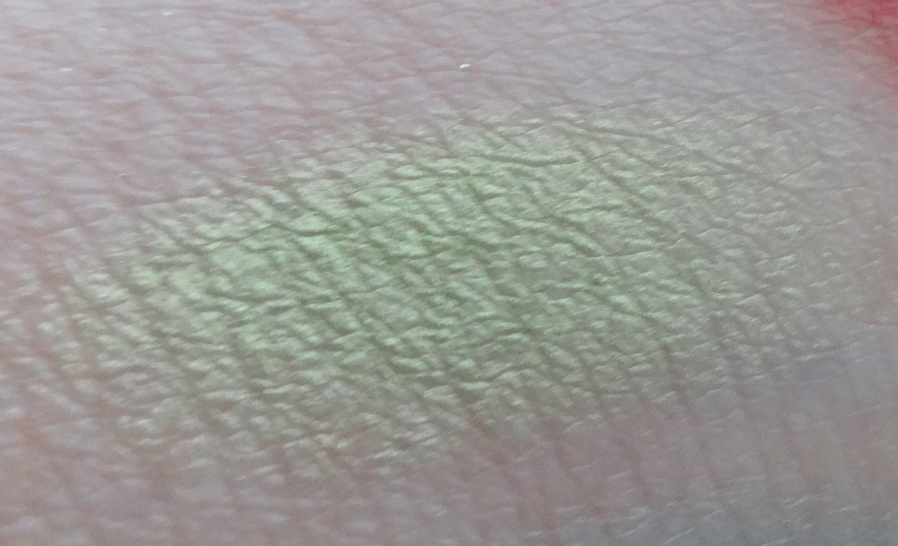
Activism is a shimmery chartreuse with a golden pearl.
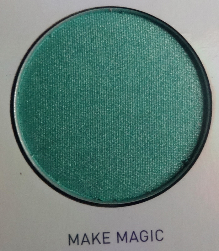
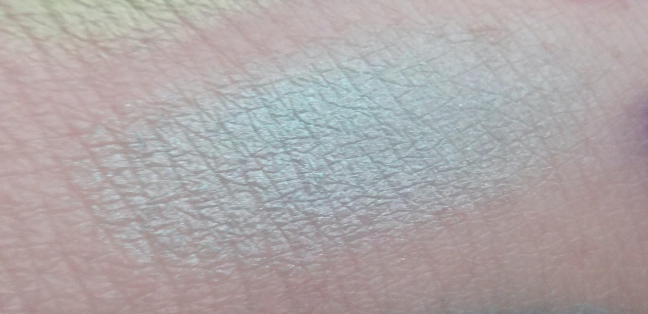

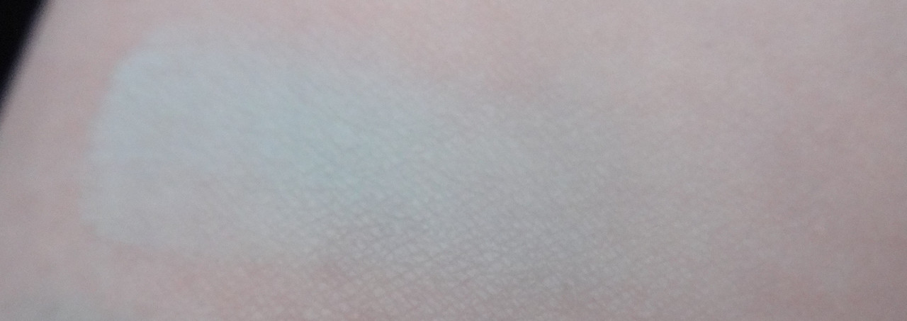
Make Magic is a shimmery minty blue. I love the color of this but I wish it was richer in texture and had better color payoff. It works fairly decent wet (you'll see that in the look I did) but alas.
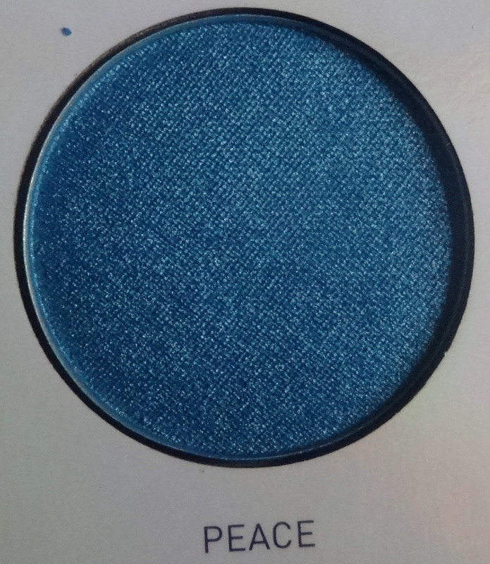
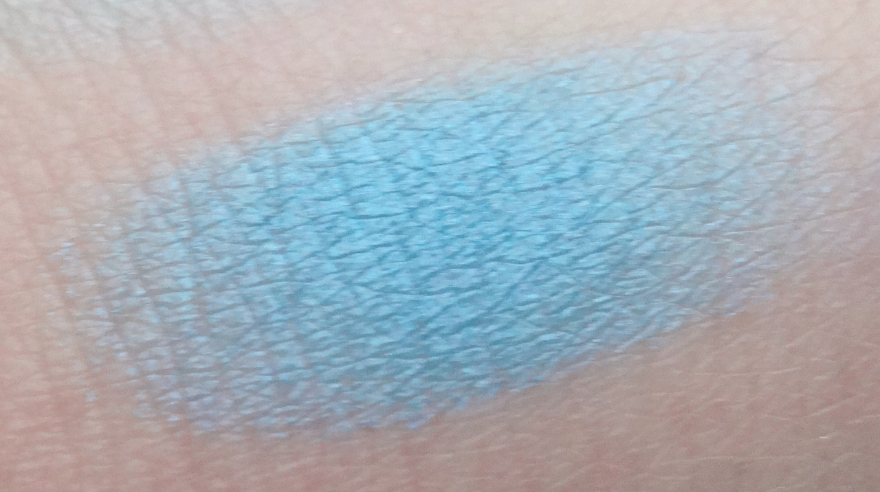 Peace is a shimmery Caribbean blue.
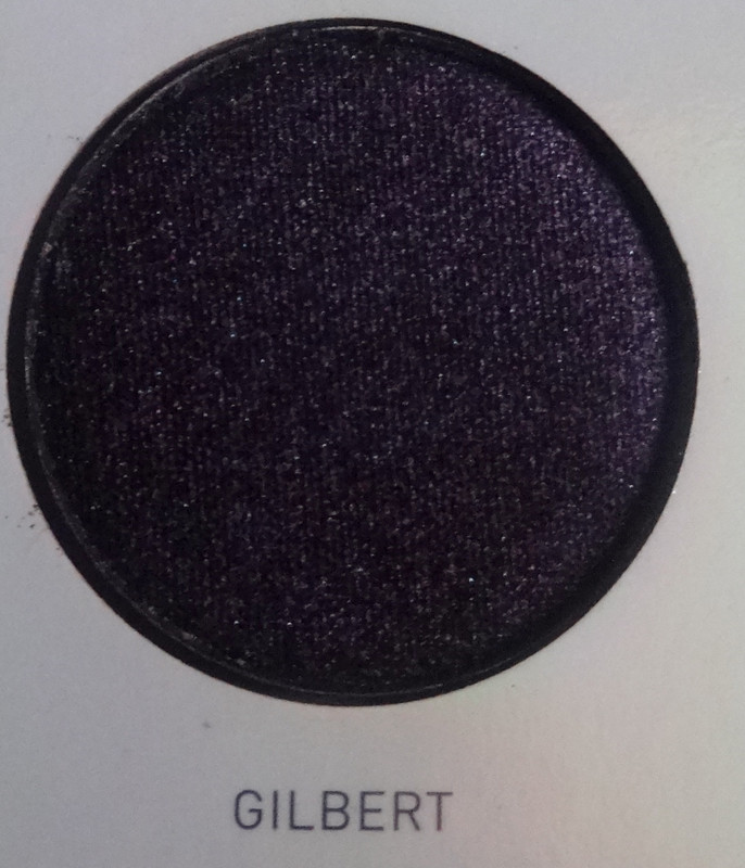
Gilbert is a satiny blackened purple with blue and pink micro-glitter bits; again, the micro-glitter makes this shade so pretty but it won't show up without a tacky base.
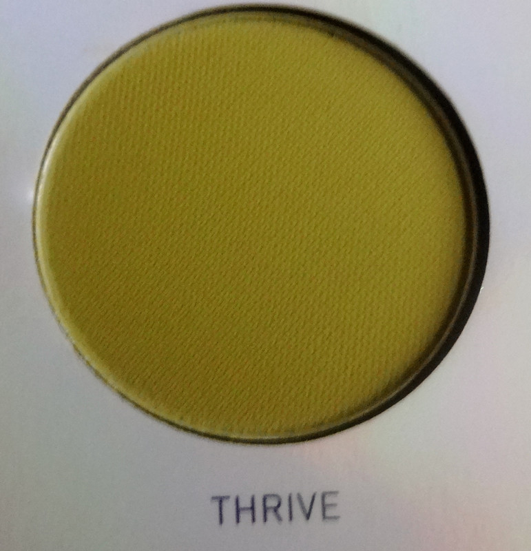
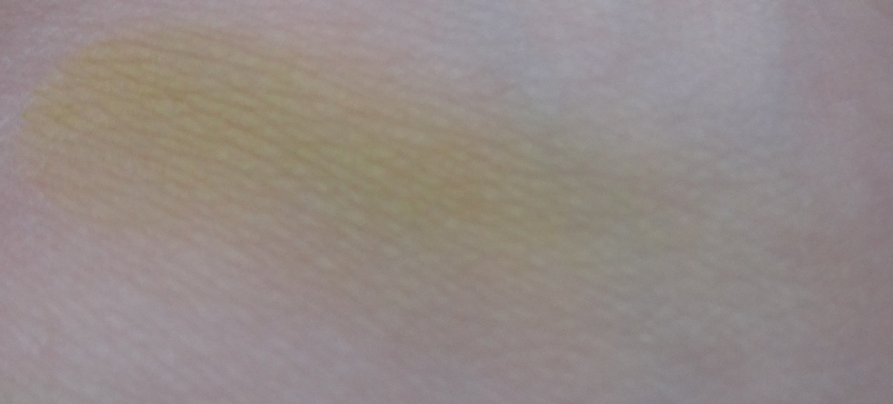
Thrive is a matte mustard green.
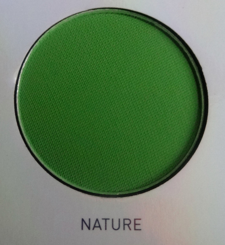
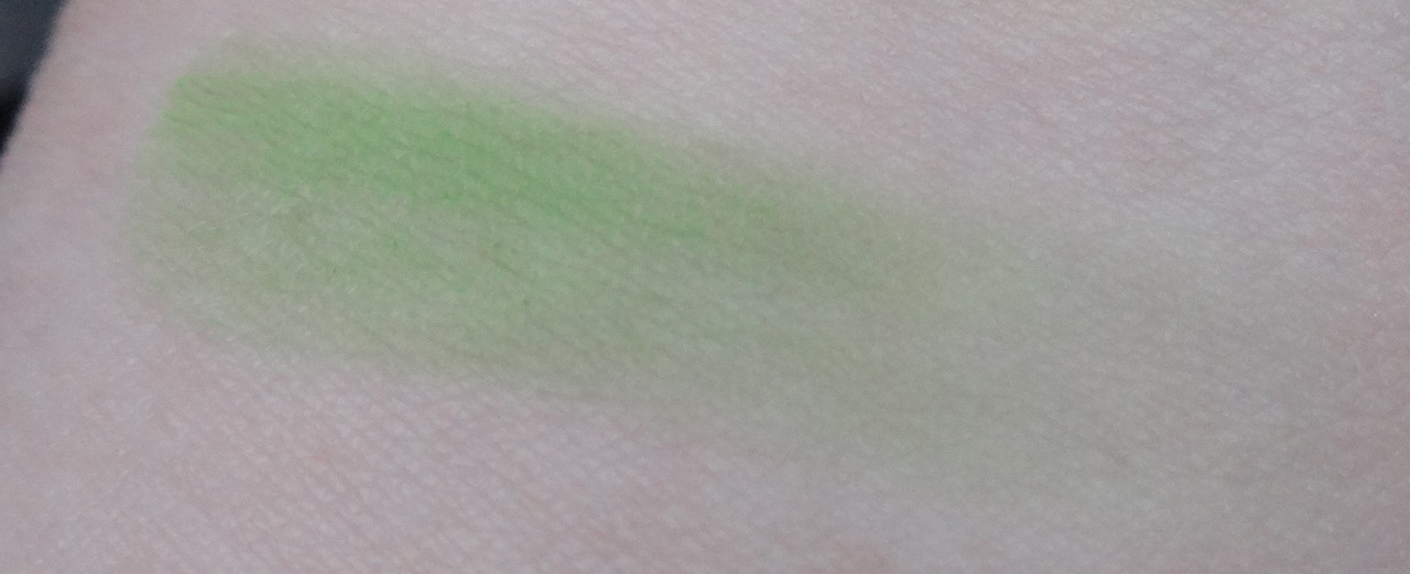

Nature is a matte grass green.

 Art is a matte minty blue. I so wish that this swatched the way it looks in the pan :'(!
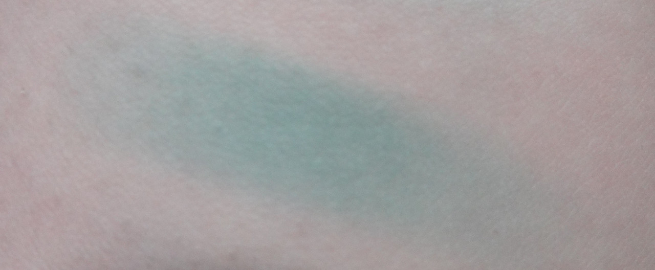
Parade is a matte turquoise gray.

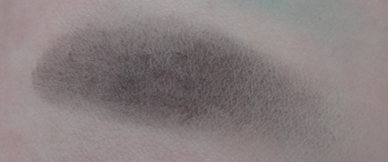
NYC is a matte black. This shade swatches just absolutely pitifully.
Please let me know if you have any questions or comments.
Disclaimer: I purchased this palette myself.
No comments:
Post a Comment