The big moment we've all been waiting for - I managed to get my greedy sea-hands on this box of gorgeousness. We are about to embark on a journey featuring review and swatches galore. Strap yourselves in folksickles.
![](https://i.postimg.cc/dJt73v29/DSC05118.jpg)
![](https://i.postimg.cc/G2Jc2H3Y/DSC05116.jpg)
![](https://i.postimg.cc/9VdzBz1p/DSC05117.jpg)
![](https://i.postimg.cc/8Cd8dx8g/DSC05119.jpg)
![](https://i.postimg.cc/dJt73v29/DSC05118.jpg)
![](https://i.postimg.cc/G2Jc2H3Y/DSC05116.jpg)
![](https://i.postimg.cc/9VdzBz1p/DSC05117.jpg)
Availability: This palette is available at lorac.com and kohls.com - it retails at $59.
Would I buy this again? Yes.
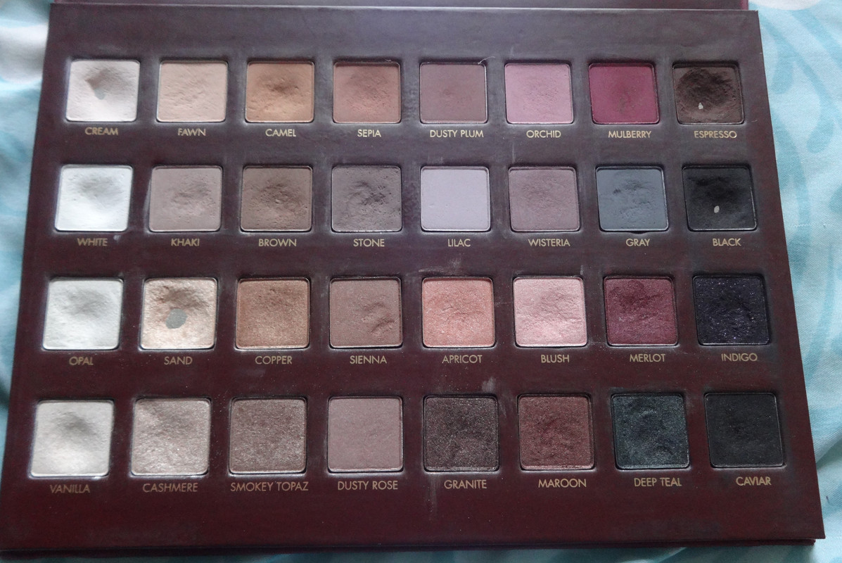
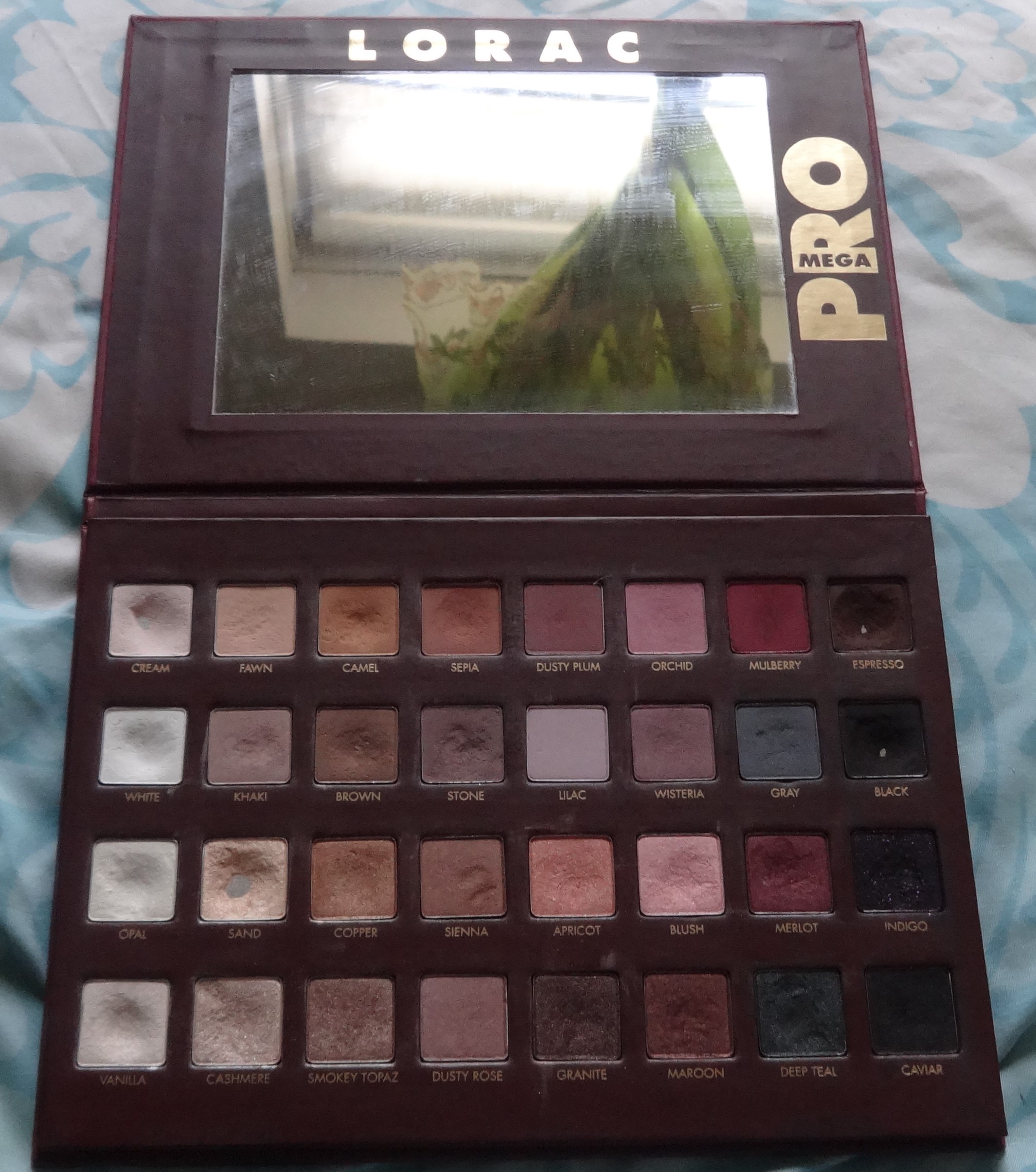
Notes: The palette contains 32 shadows, 16 of which are matte/satin and 16 which are pearly/frosty. They are absolutely beautiful in their textures and work well with one another. I haven't had an issue with pigmentation or anything of that kind. This is my very first Lorac palette and I'm very happy with it. I might pick up the Pro Palette 2. :P This palette is very heavy on warm-tones and rosy colors.
![](https://i.postimg.cc/xTjdXyzd/DSC05120.jpg)
![](https://i.postimg.cc/tgNfnPPX/DSC05152.jpg)
![](https://i.postimg.cc/xTjdXyzd/DSC05120.jpg)
![](https://i.postimg.cc/tgNfnPPX/DSC05152.jpg)
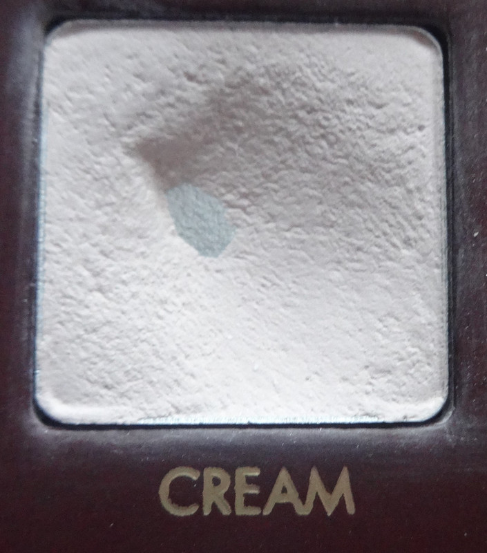
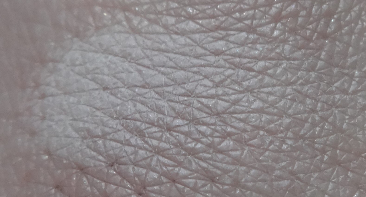
Cream - a soft off-white.
![](https://i.postimg.cc/P5Pr4XKs/DSC05121.jpg)
![](https://i.postimg.cc/k4jpfmfz/DSC05153.jpg)
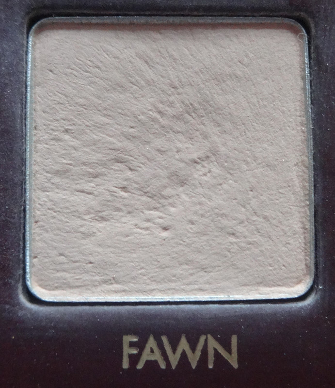
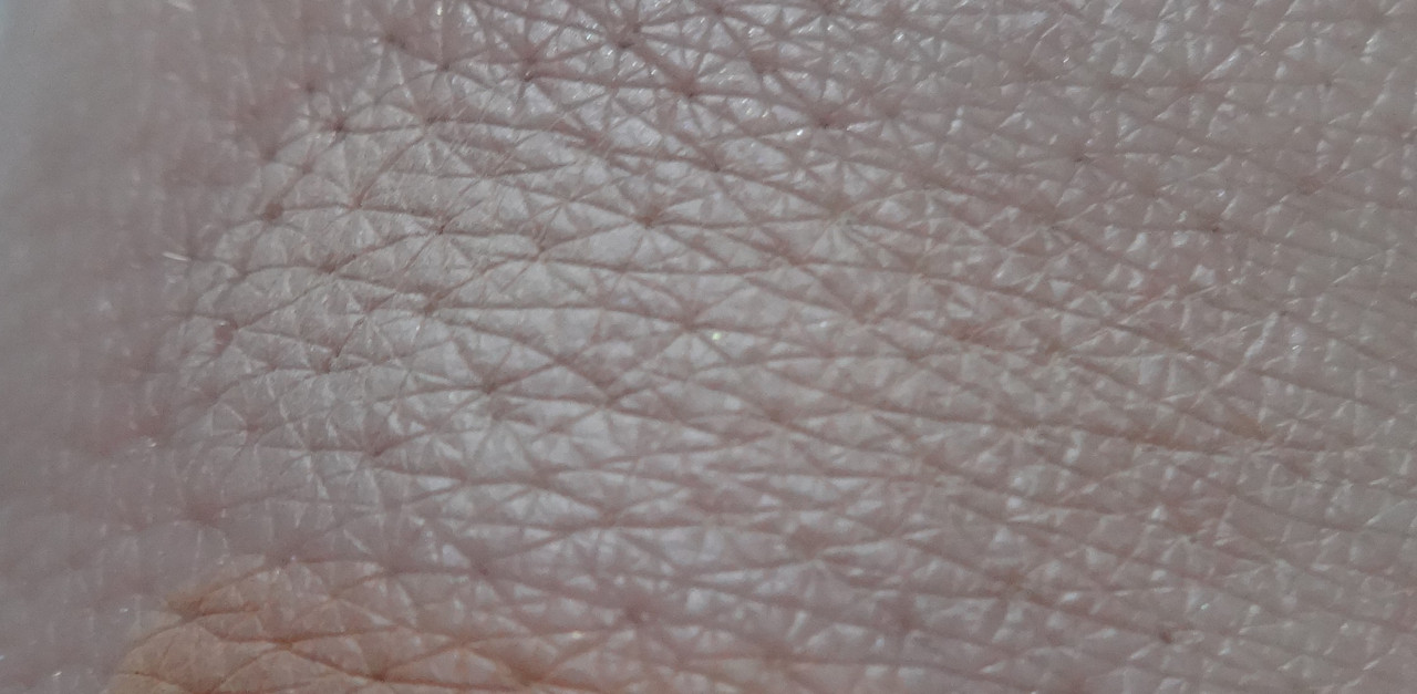
Fawn - a soft, warm flesh-tone.
![](https://i.postimg.cc/C0WfN30F/DSC05122.jpg)
![](https://i.postimg.cc/WzhfyHy3/DSC05154.jpg)
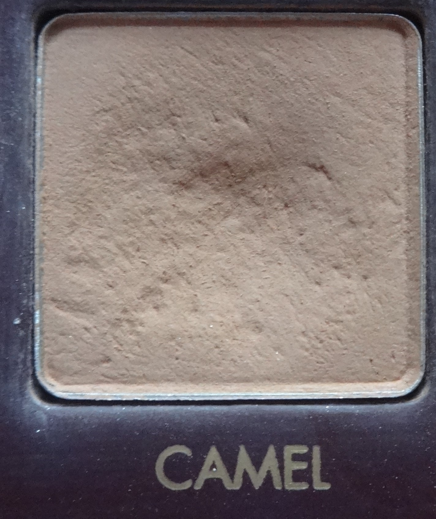
Camel - a light warm tan flesh-tone.
![](https://i.postimg.cc/ZKf5pB8x/DSC05123.jpg)
![](https://i.postimg.cc/nh8wdTGF/DSC05155.jpg)
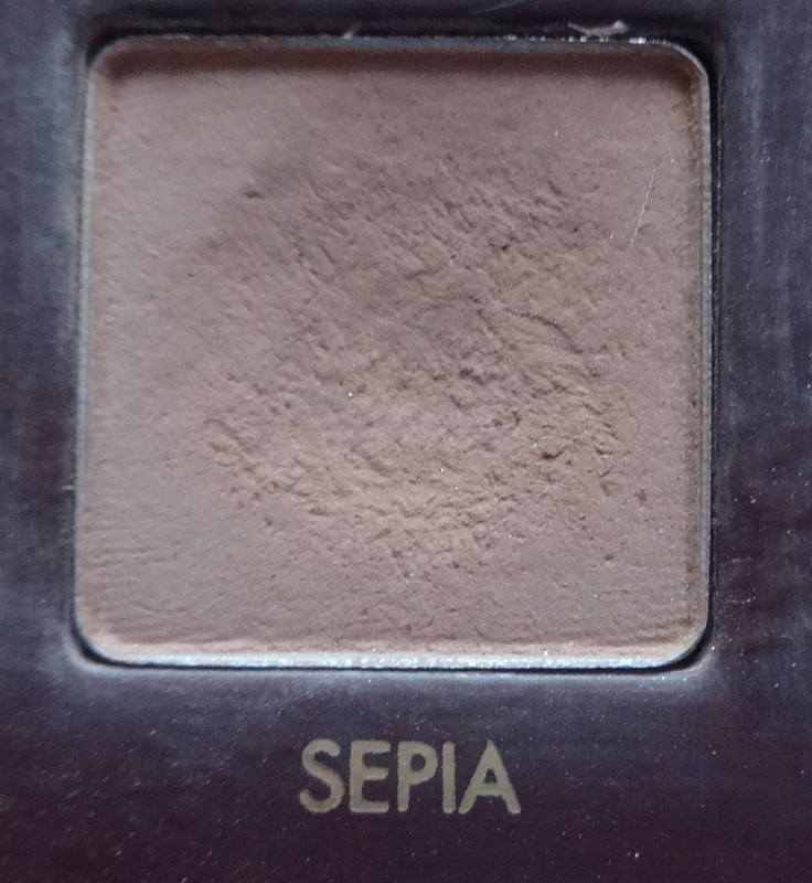
Sepia - a mid-tone warm tan.
![](https://i.postimg.cc/s2WjkTtT/DSC05124.jpg)
![](https://i.postimg.cc/7PWRzqCT/DSC05156.jpg)
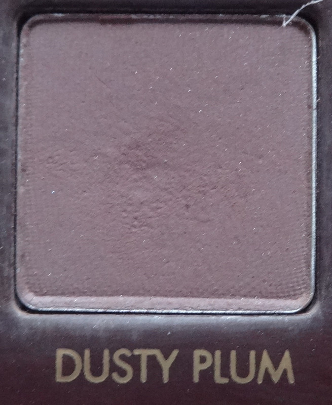
Dusty Plum - a plummy rosy brown.
![](https://i.postimg.cc/cCxd806z/DSC05125.jpg)
![](https://i.postimg.cc/kXRpFL8Y/DSC05157.jpg)
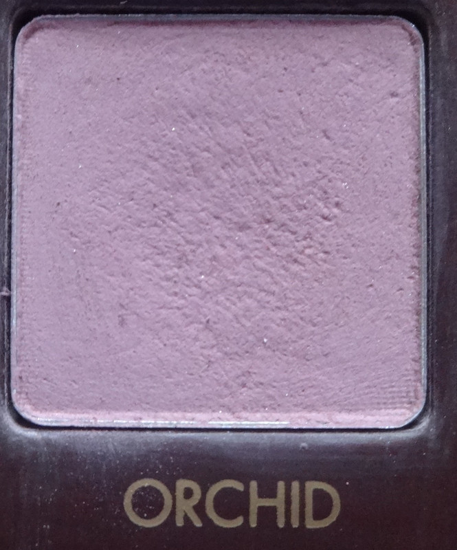
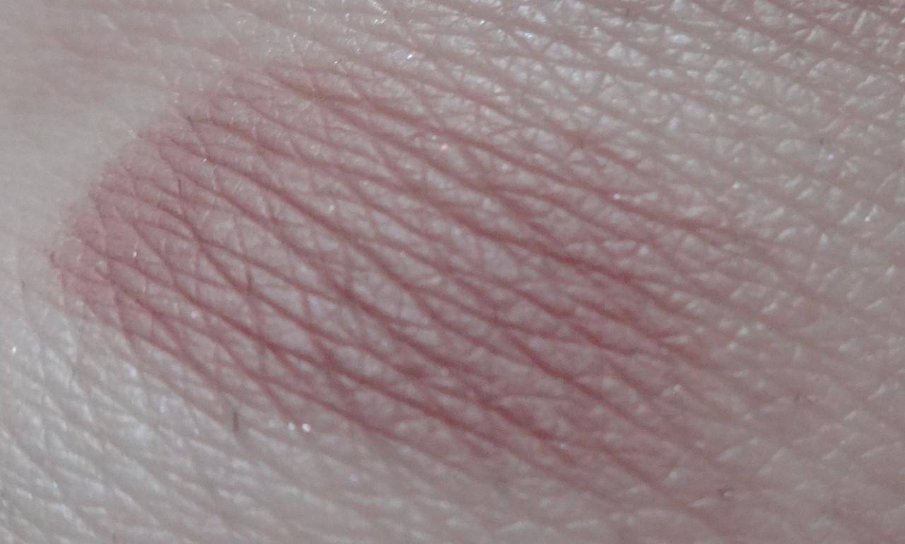
Orchid - a soft cool-toned pink.
![](https://i.postimg.cc/cZyrYf7C/DSC05126.jpg)
![](https://i.postimg.cc/jSz3BNMz/DSC05158.jpg)
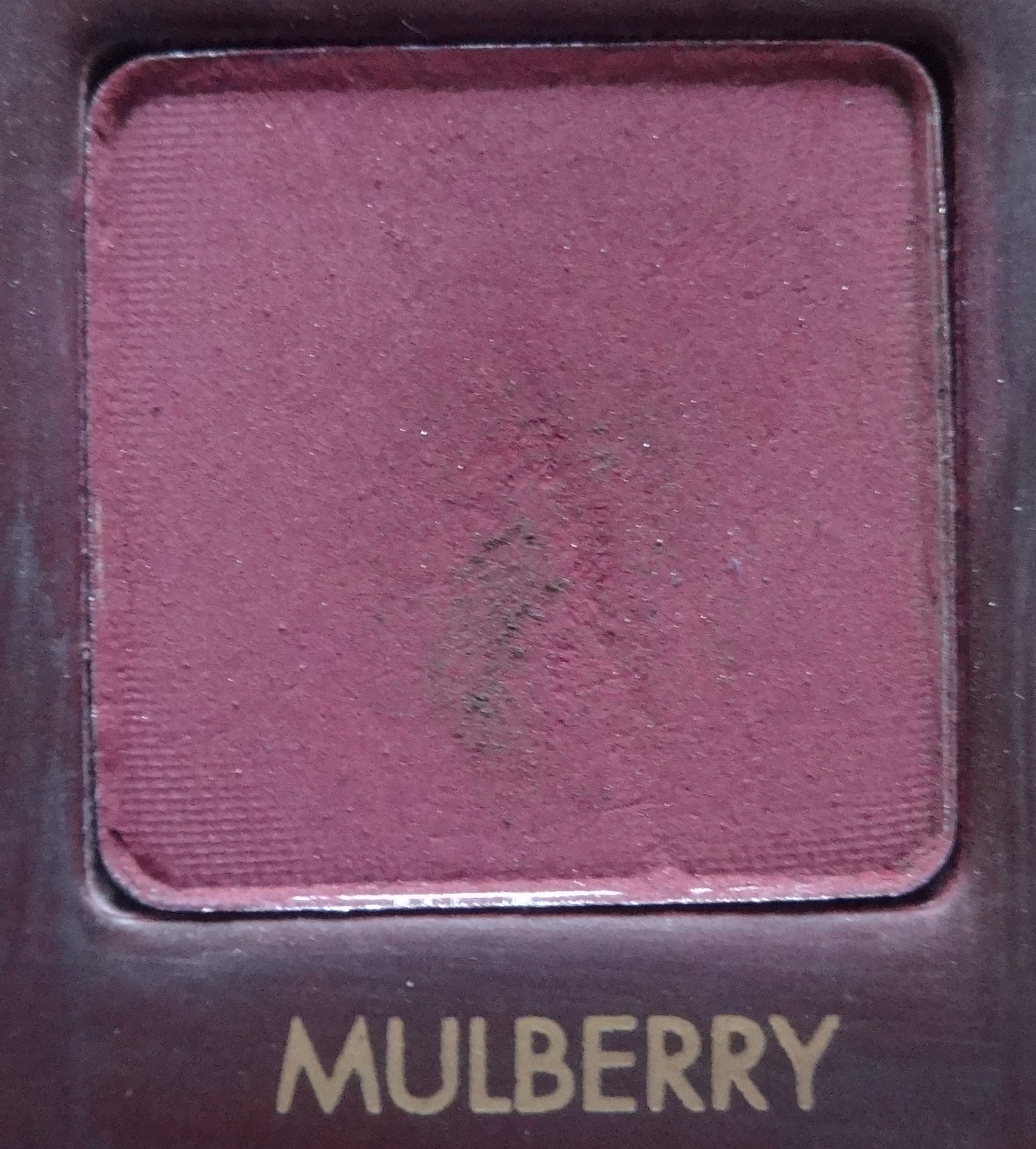
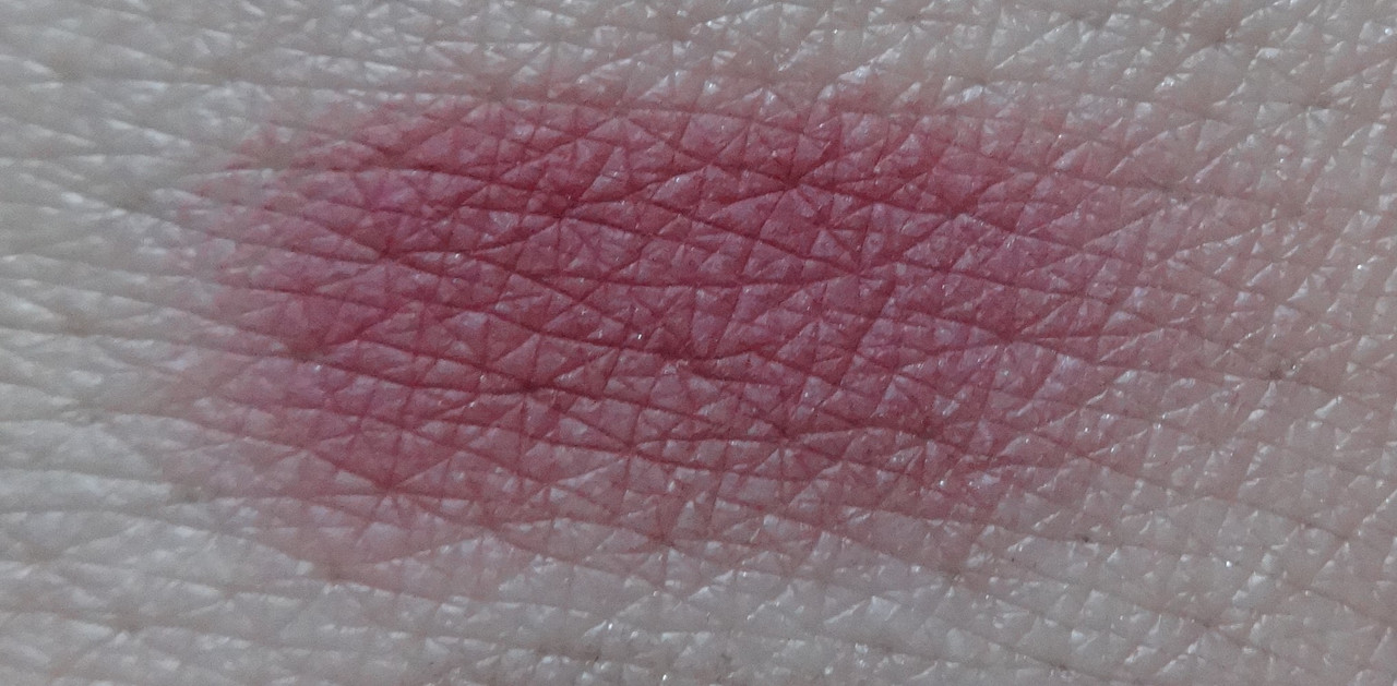
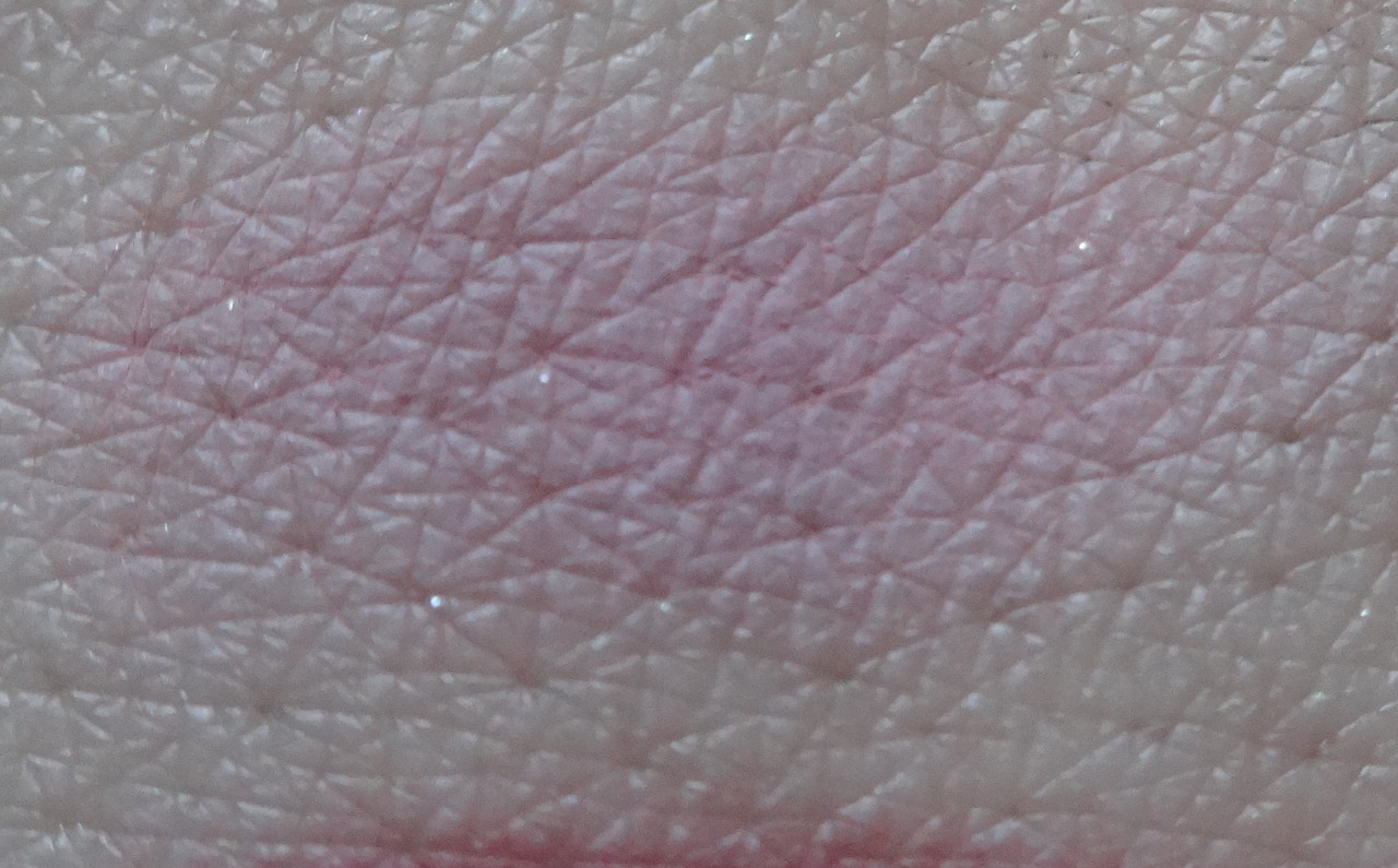
Mulberry - this has a drier texture compared to the rest of the mattes BUT is a beautiful pigmented cranberry red, sort of burgundy. Gorgeous.
![](https://i.postimg.cc/Bbm4TkKn/DSC05127.jpg)
![](https://i.postimg.cc/g0sS2pFj/DSC05159.jpg)
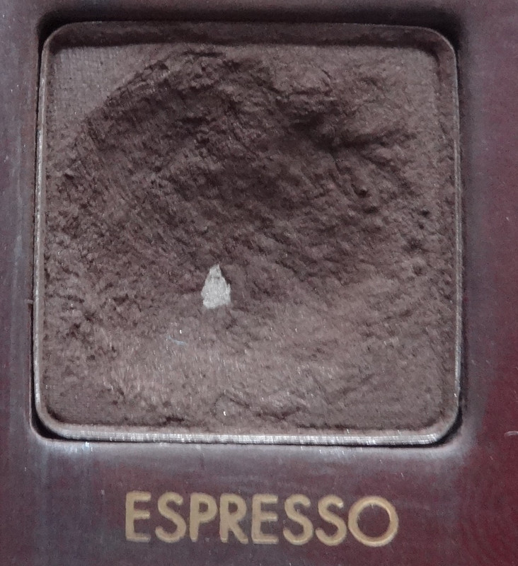
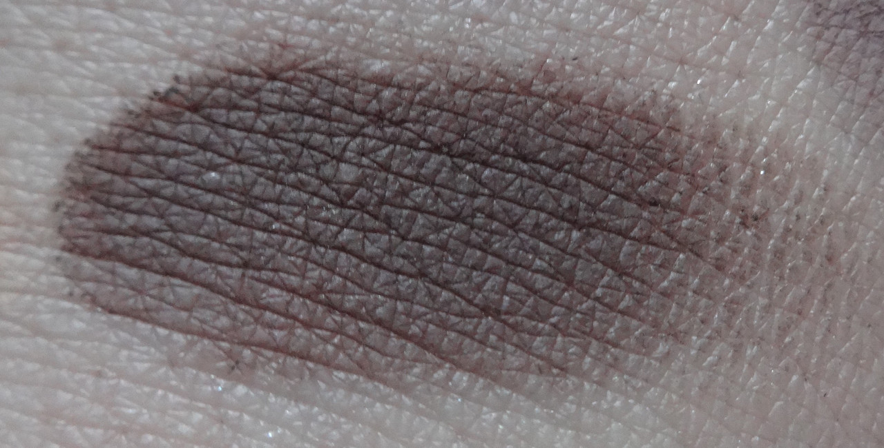
Espresso - a rich blackened brown.
![](https://i.postimg.cc/PtCPb4Fp/DSC05128.jpg)
![](https://i.postimg.cc/SstgcGKp/DSC05160.jpg)
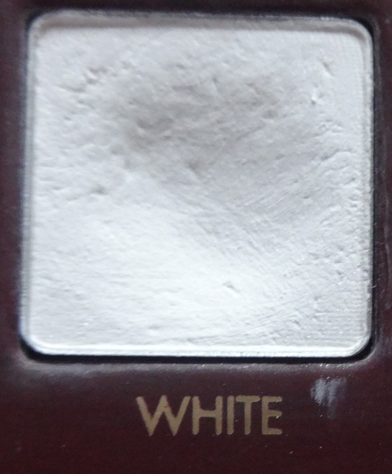
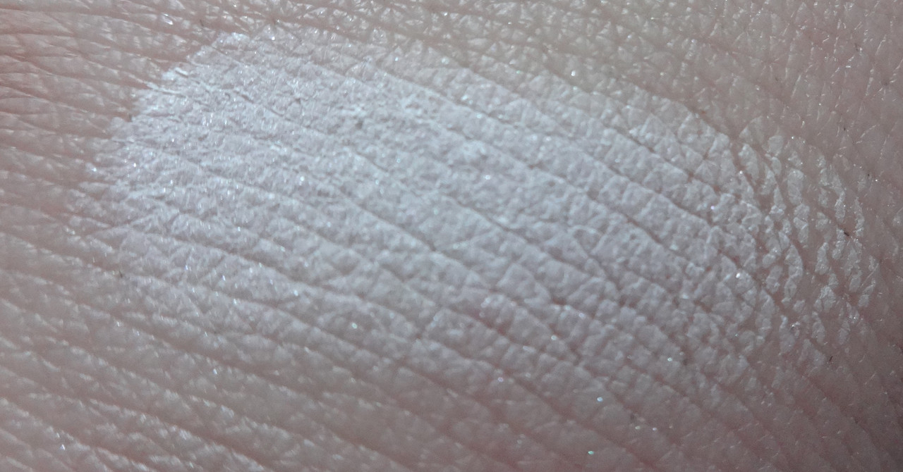
White - a true pure white with a bit of a satin finish, I'm assuming that's to avoid it going chalky on darker skin-tones.
![](https://i.postimg.cc/PTdJVhRk/DSC05129.jpg)
![](https://i.postimg.cc/qqhjwCt6/DSC05161.jpg)
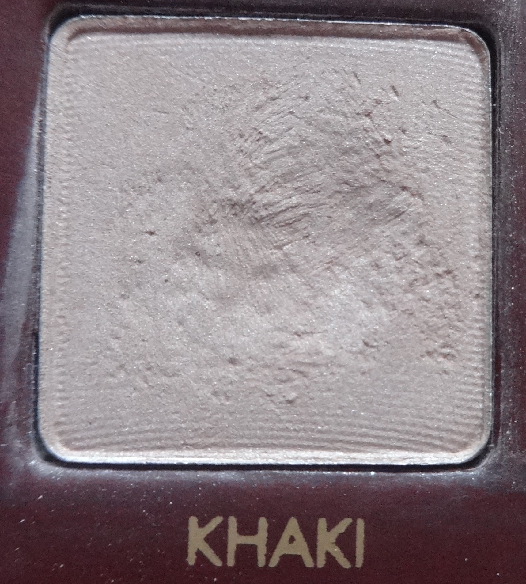
Khaki - cool toned soft taupe.
![](https://i.postimg.cc/7LS4sf2c/DSC05130.jpg)
![](https://i.postimg.cc/rpMZTmH7/DSC05162.jpg)
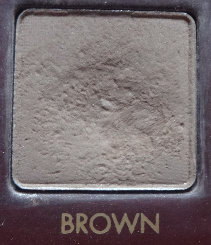
Brown - gorgeous richly pigmented true brown.
![](https://i.postimg.cc/t4KyNhYW/DSC05131.jpg)
![](https://i.postimg.cc/qBWTTsxY/DSC05163.jpg)
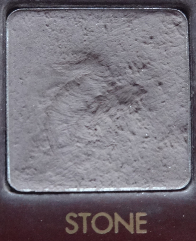
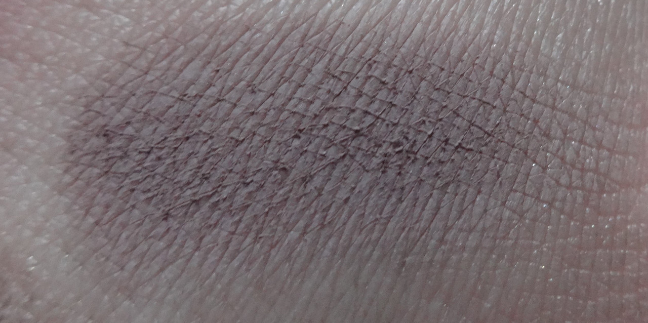
Stone - matte taupe-y gray.
![](https://i.postimg.cc/0yMPSt29/DSC05132.jpg)
![](https://i.postimg.cc/4d38K0s5/DSC05164.jpg)
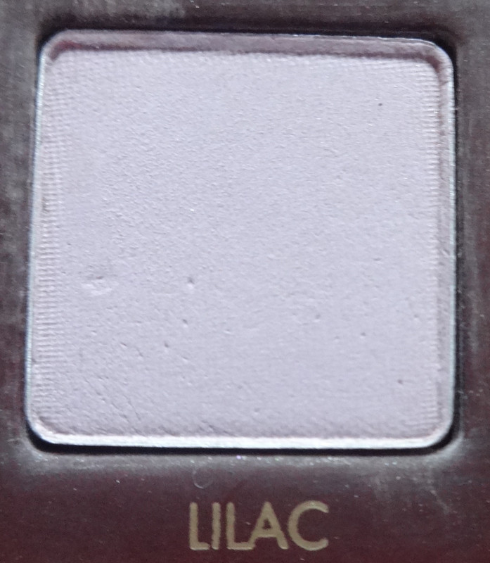
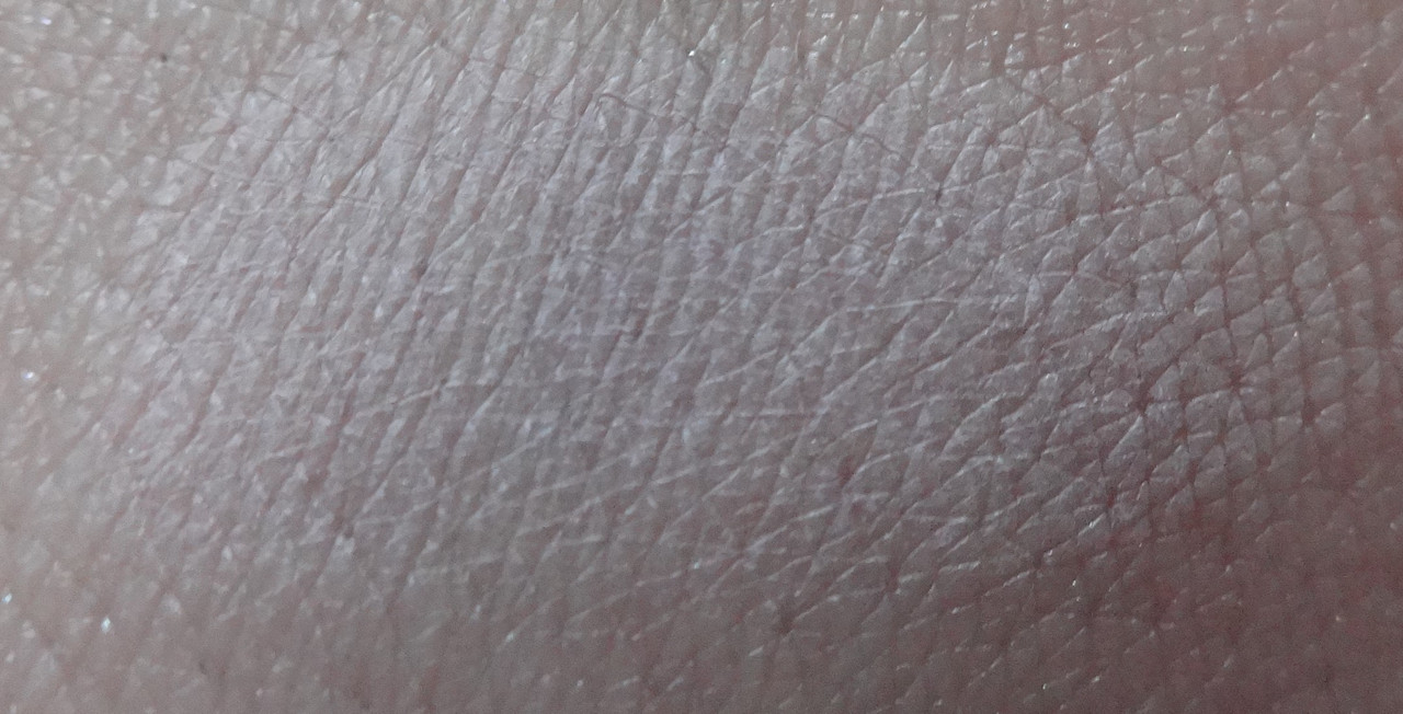
Lilac - soft whitened lilac with a kiss of gray. Others have complained that the pigmentation on this shade is lacking. Um... it's a light color, I don't have an issue with it not showing up (possibly cause I'm white :/) but I'd use it as an all-over lid or highlight type of color.
![](https://i.postimg.cc/0QfsvFZ0/DSC05133.jpg)
![](https://i.postimg.cc/NGKcSJmm/DSC05165.jpg)
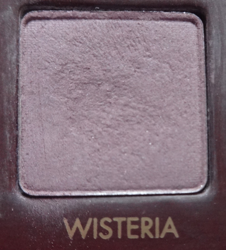
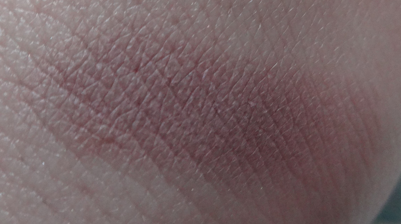
Wisteria - a mauve-y taupe with a kiss of purple.
![](https://i.postimg.cc/rmckvMGp/DSC05134.jpg)
![](https://i.postimg.cc/vTJXNH9q/DSC05166.jpg)
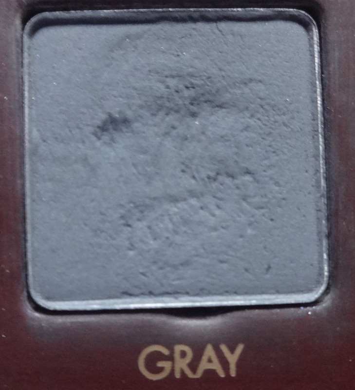
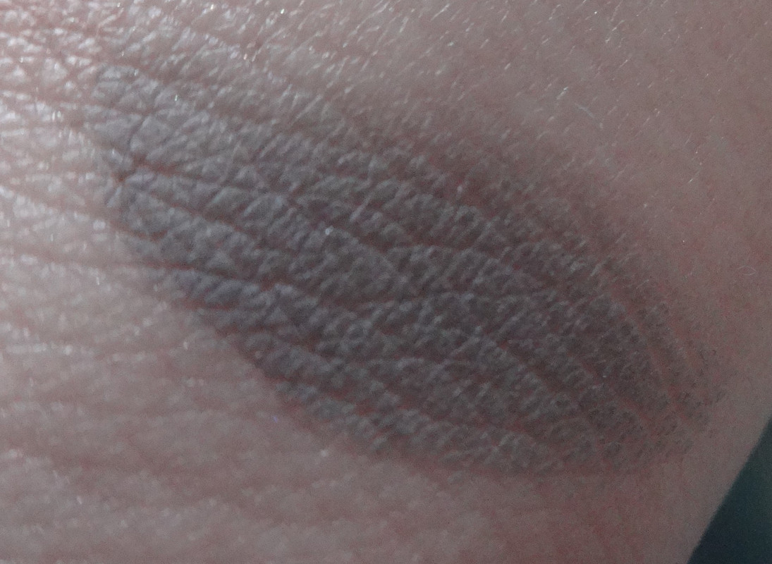
Gray - a rich dark gray.
![](https://i.postimg.cc/yx8z8jb4/DSC05135.jpg)
![](https://i.postimg.cc/J4JW4sTh/DSC05167.jpg)
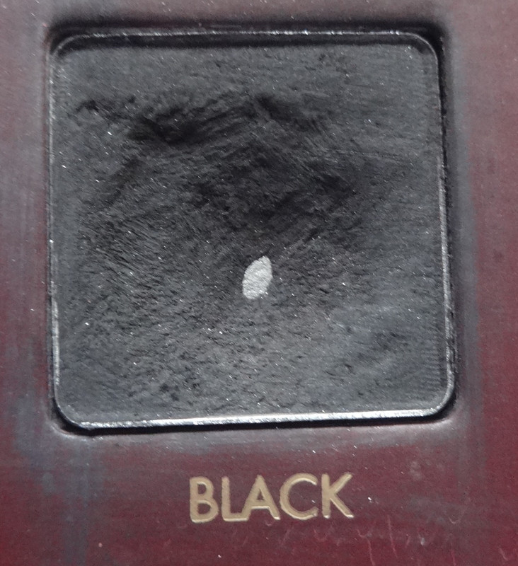
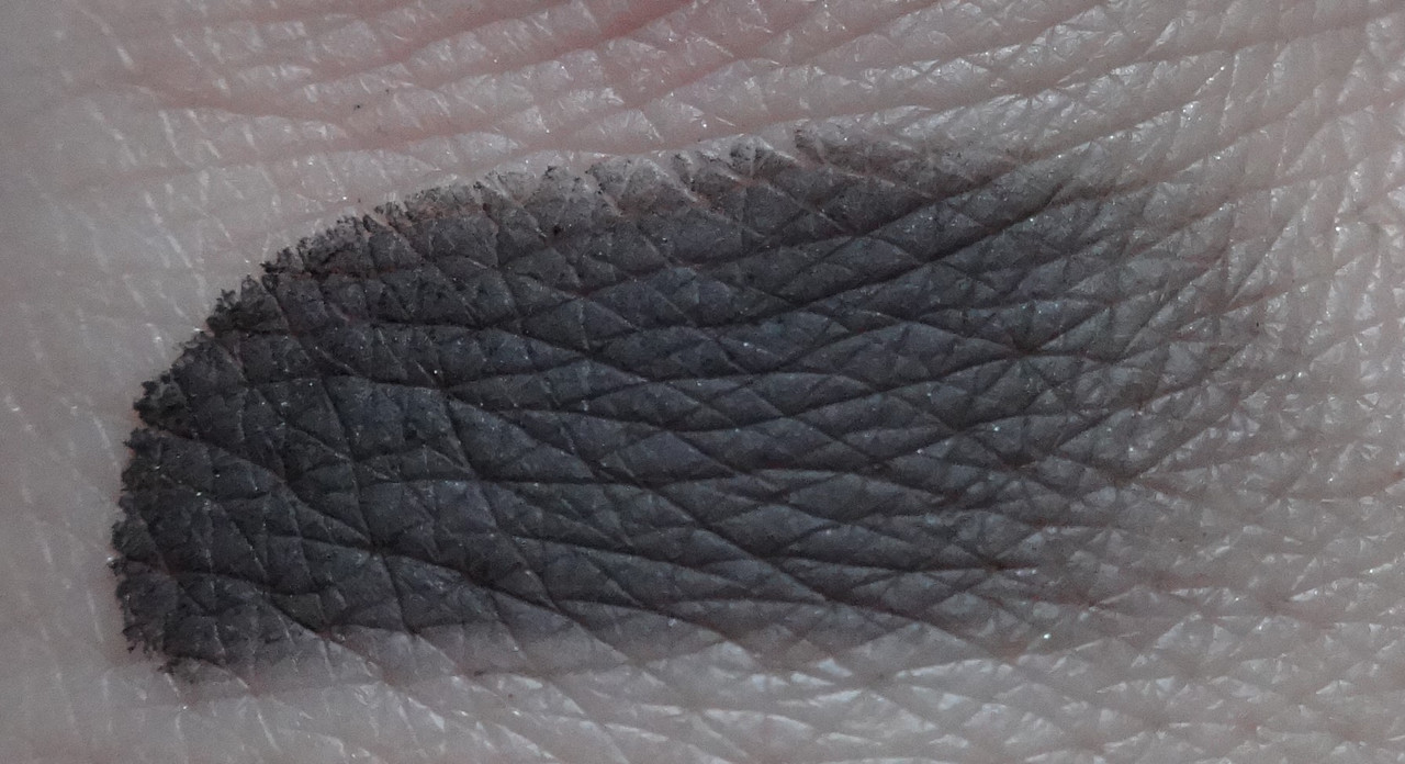
Black - rich matte black, yaaaaas. I love it when matte blacks are rich and buttery like this as so many times a black like this is hard to find.
![](https://i.postimg.cc/wM4YyNCt/DSC05136.jpg)
![](https://i.postimg.cc/vBDJRTgb/DSC05168.jpg)
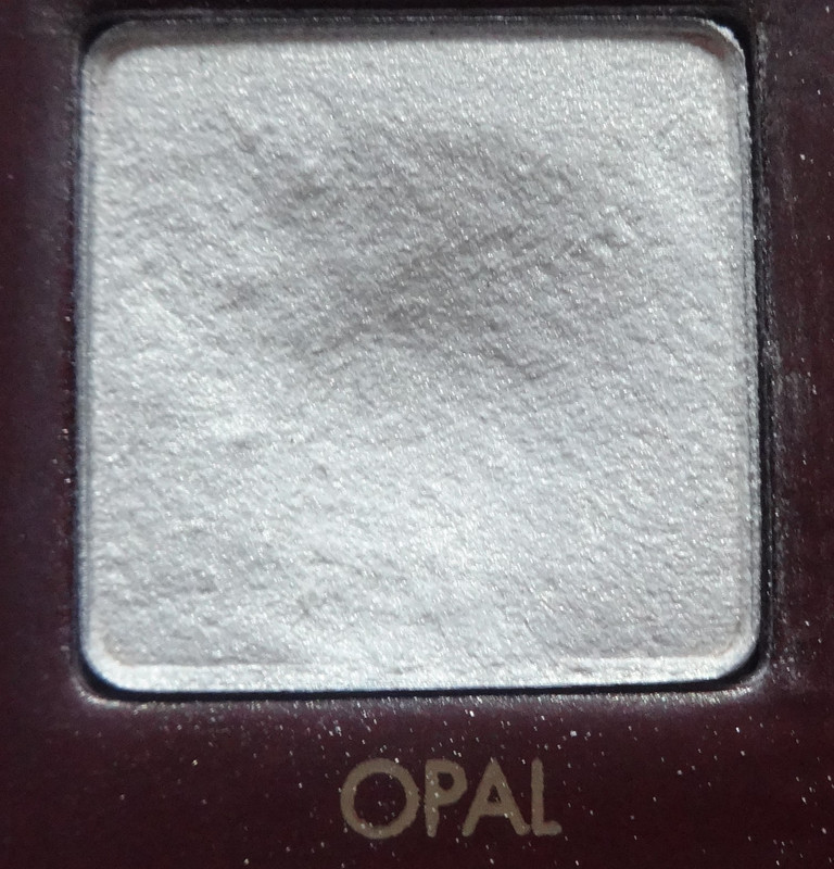
Opal - gorgeous white gold with a hint of pink.
![](https://i.postimg.cc/02rsgtS7/DSC05137.jpg)
![](https://i.postimg.cc/R0CrRXv3/DSC05169.jpg)
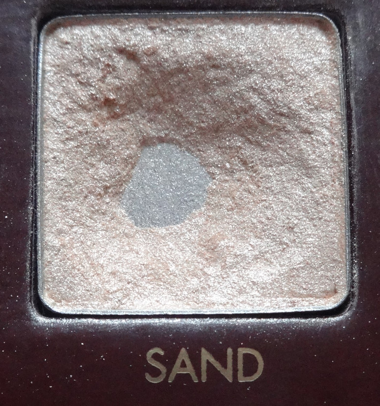
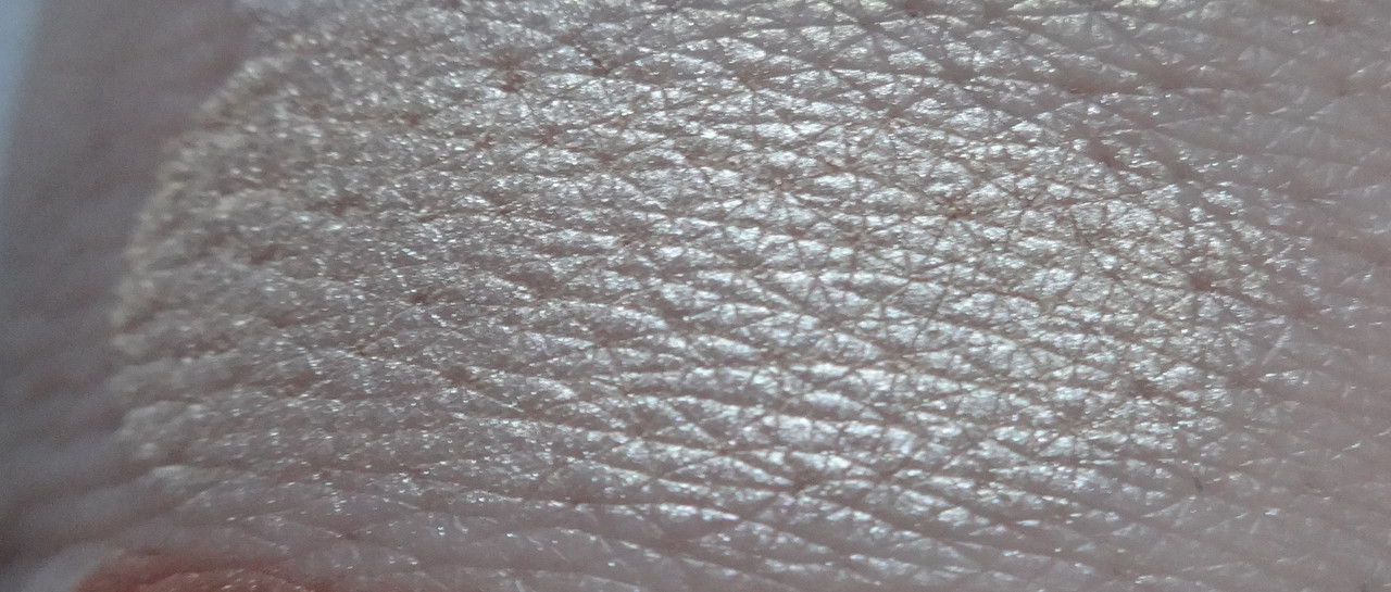
Sand - a pinker version of Opal.
![](https://i.postimg.cc/qMYdp8cS/DSC05138.jpg)
![](https://i.postimg.cc/g2WbwG5H/DSC05170.jpg)
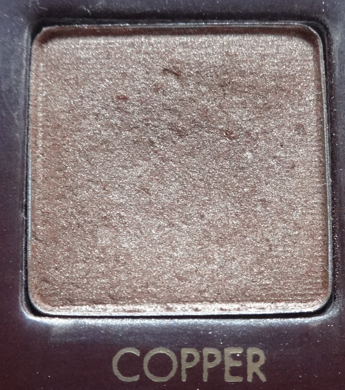
Copper - BEAUTIFUL warm copper. I LOVE colors like this, they just make anyone's eyes pop.
![](https://i.postimg.cc/nZJhMpZQ/DSC05139.jpg)
![](https://i.postimg.cc/q49JVTmR/DSC05171.jpg)
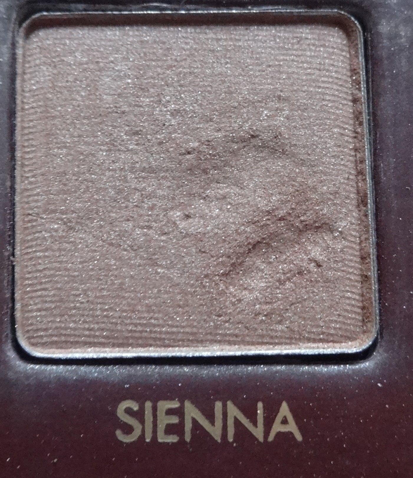
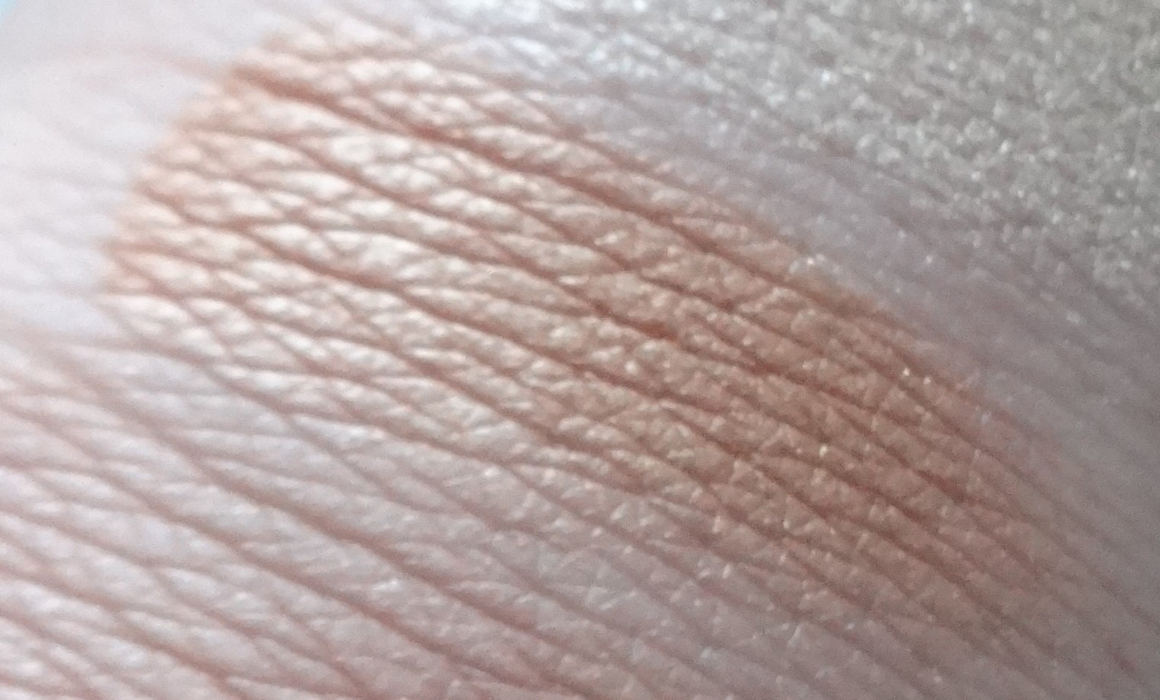
Sienna - a beautiful golden taupe with a kiss of pink.
![](https://i.postimg.cc/htdRvfpj/DSC05140.jpg)
![](https://i.postimg.cc/g0gCB80g/DSC05172.jpg)
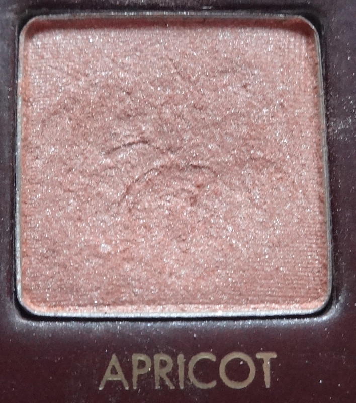
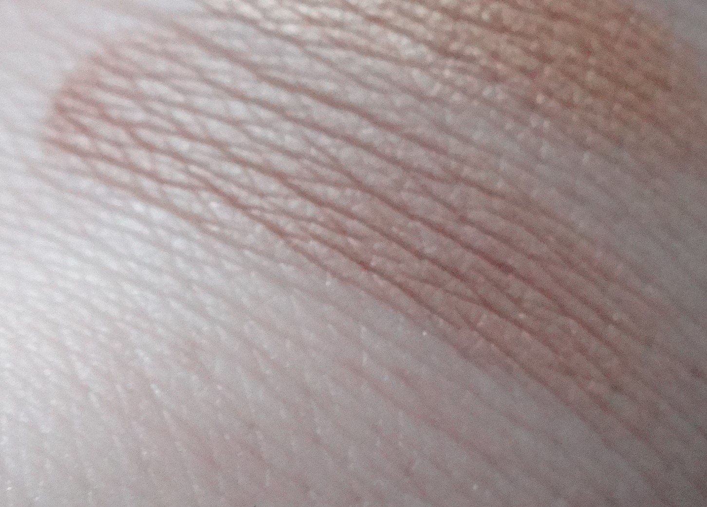
Apricot - a beautiful warm pink with a golden pearl.
![](https://i.postimg.cc/1z1hqsjK/DSC05141.jpg)
![](https://i.postimg.cc/nz56nxB7/DSC05173.jpg)
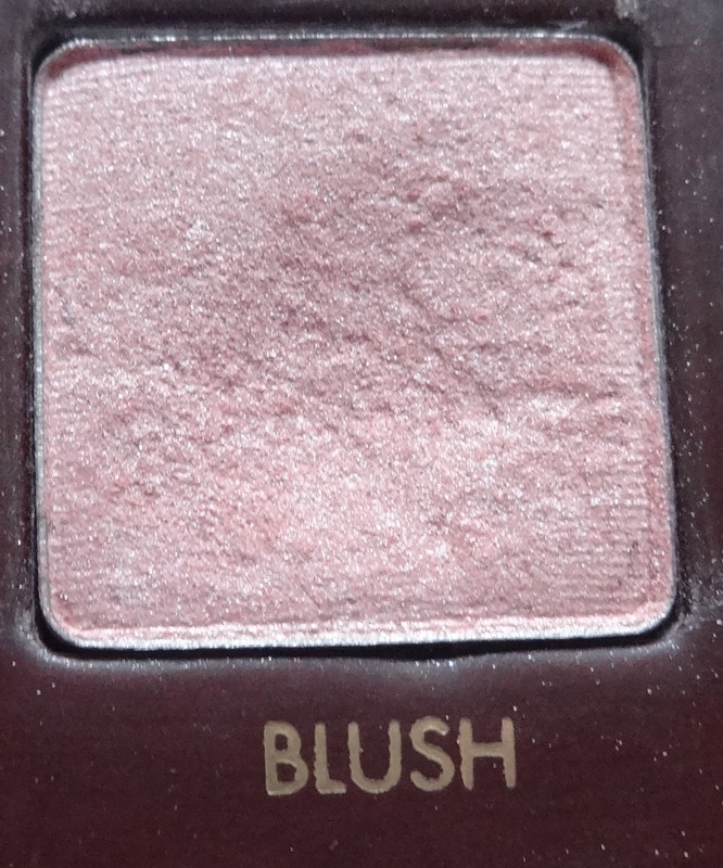
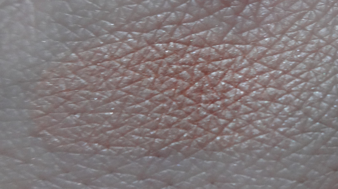
Blush - gorgeous pink with white pearl.
![](https://i.postimg.cc/QtSRw5x6/DSC05142.jpg)
![](https://i.postimg.cc/Y2G5b4Bx/DSC05174.jpg)
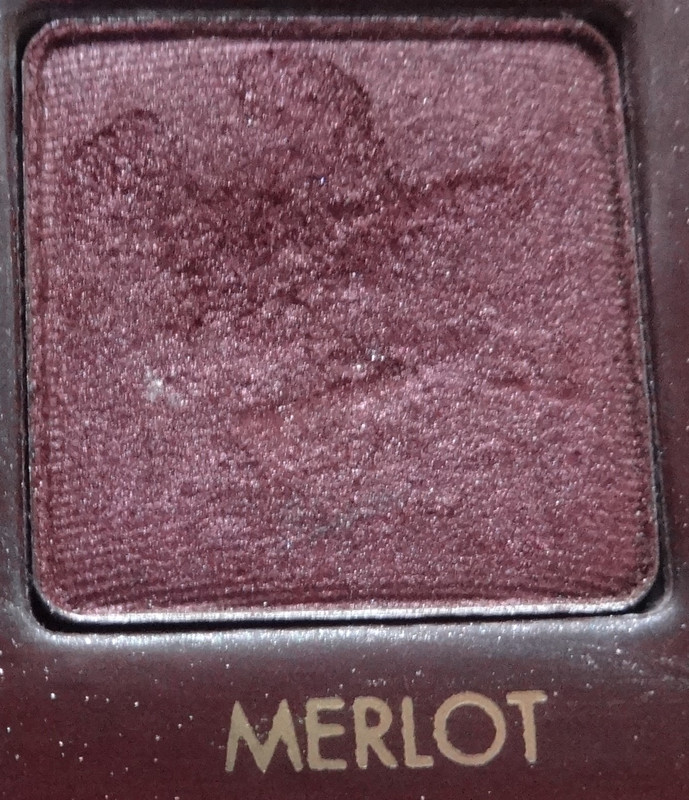
Merlot - the friggin chupacabra. A burgundy that shows up burgundy instead of brown on my skin. LOVE!
![](https://i.postimg.cc/MHThSTnz/DSC05143.jpg)
![](https://i.postimg.cc/vTVCBKtK/DSC05175.jpg)
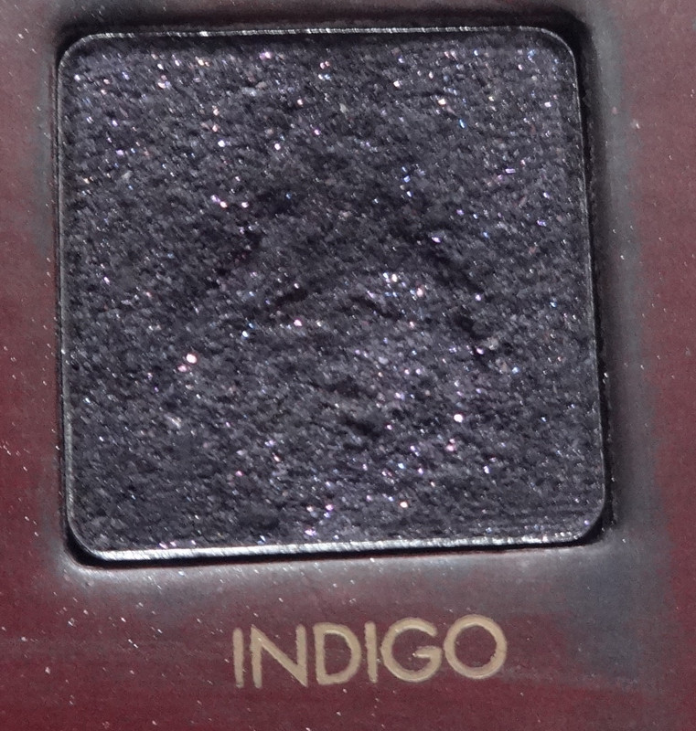
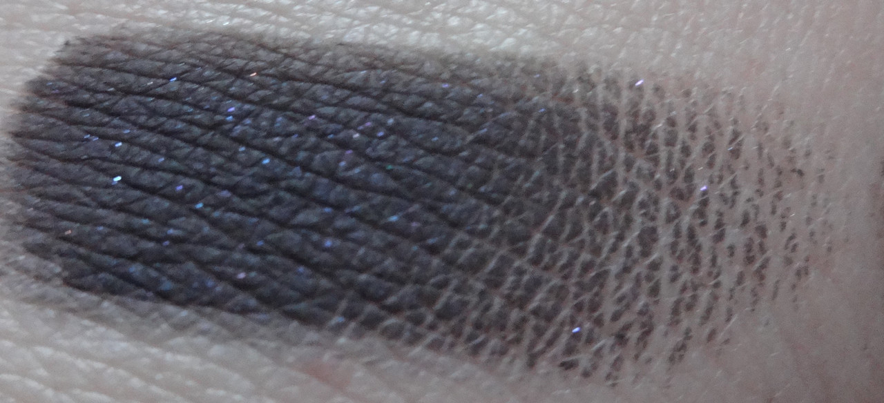
Indigo - what MAC Graphic Garden wanted to be, a rich matte black base with pink, silver, and blue micro-glitter.
![](https://i.postimg.cc/d3xgtYCr/DSC05144.jpg)
![](https://i.postimg.cc/jqpG9ssY/DSC05176.jpg)
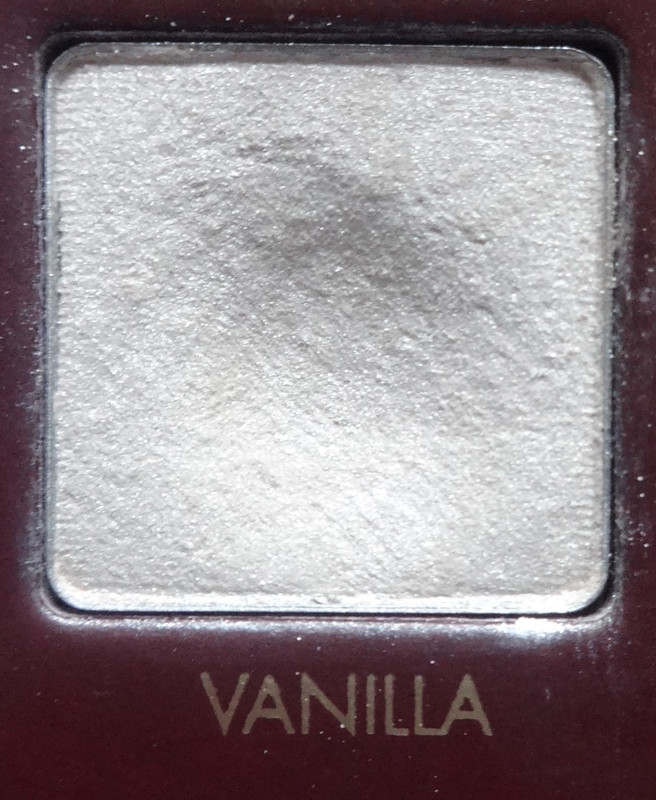
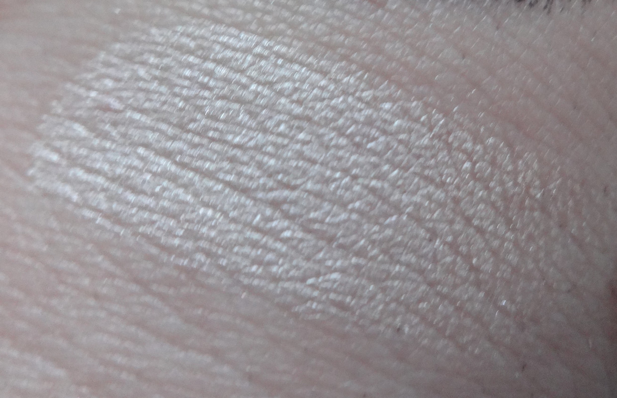
Vanilla - a soft shimmery off-white.
![](https://i.postimg.cc/y6QMTFGx/DSC05145.jpg)
![](https://i.postimg.cc/Qdzhc0mX/DSC05177.jpg)
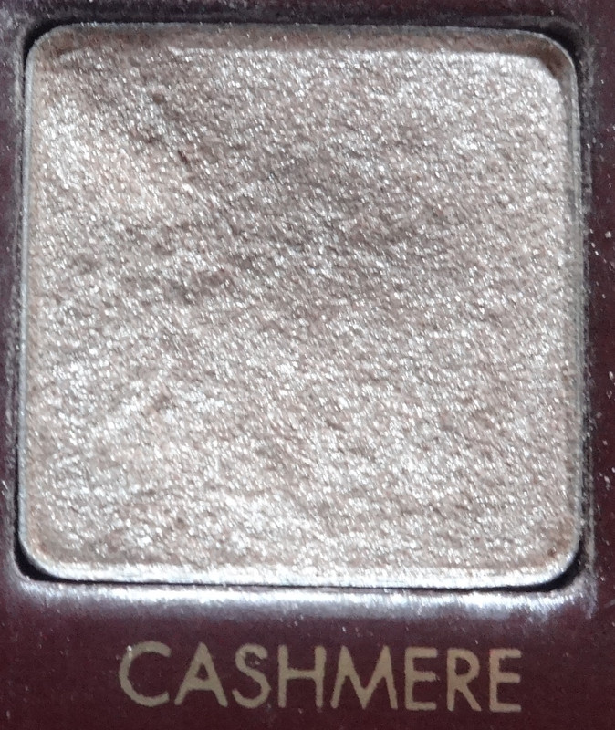
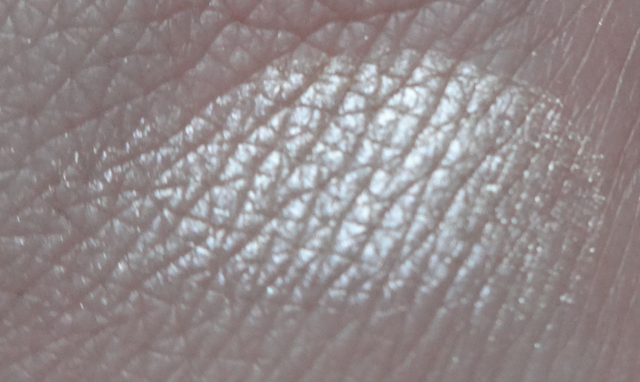
Cashmere - a whiter version of Opal.
![](https://i.postimg.cc/SNHHBmkp/DSC05146.jpg)
![](https://i.postimg.cc/kG7m7ZJy/DSC05178.jpg)
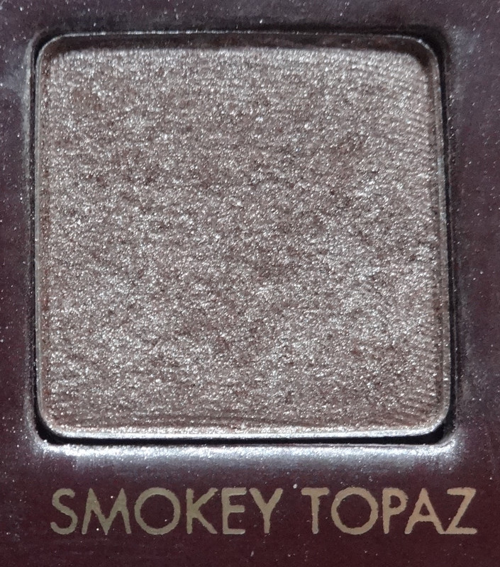
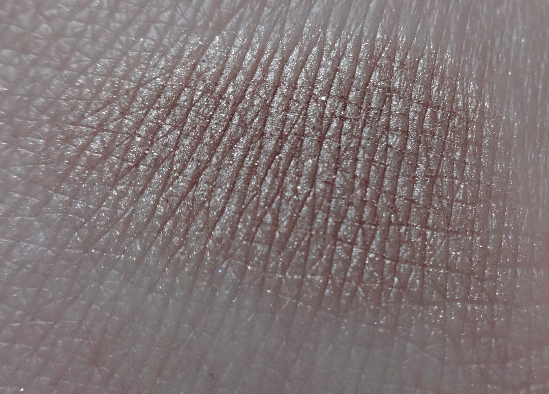
Smokey Topaz - a pearly golden taupe.
![](https://i.postimg.cc/QxFRYFLb/DSC05147.jpg)
![](https://i.postimg.cc/L5vM5ThF/DSC05179.jpg)
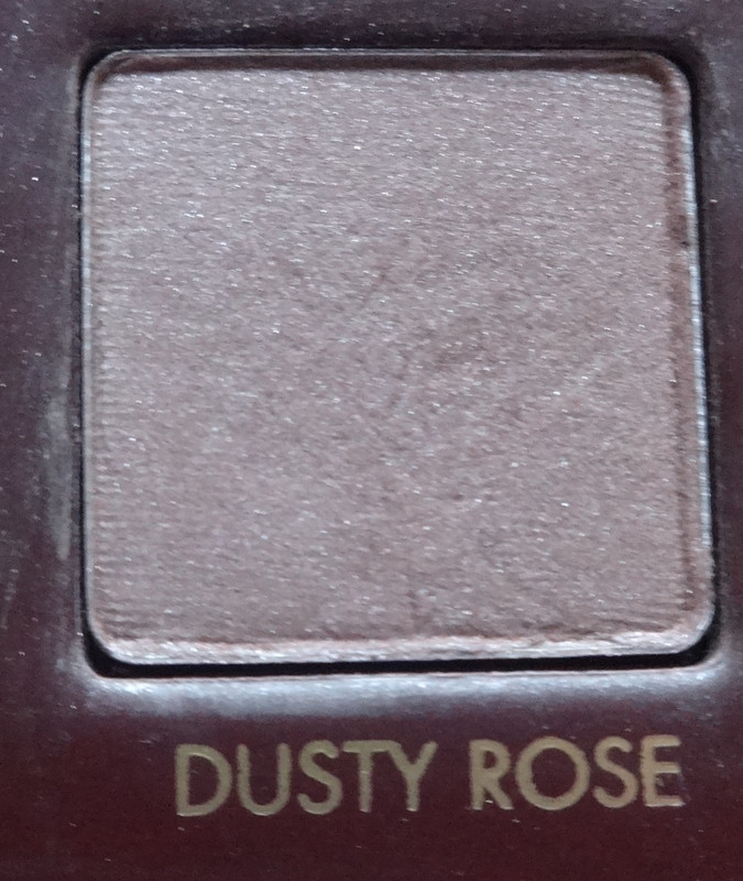
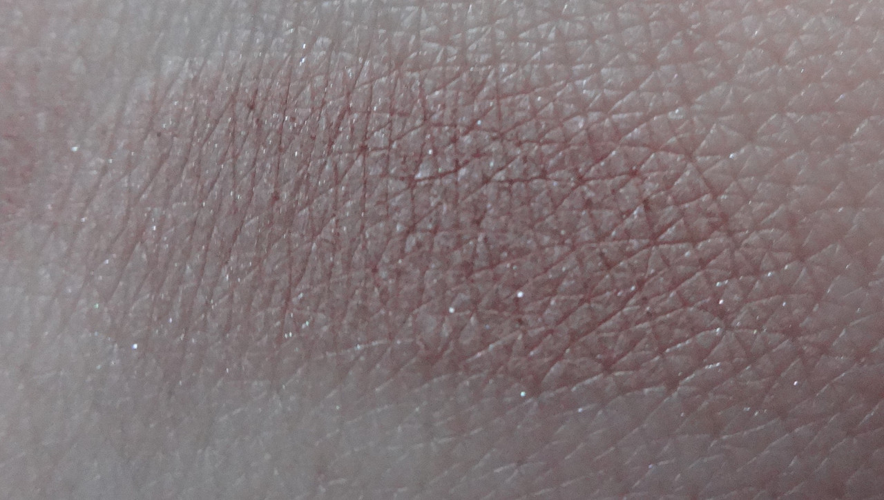
Dusty Rose - as the name suggests, a dusty rose - heavily grayed rose color, a gray with a kiss of rose.
![](https://i.postimg.cc/JhLvhKs6/DSC05148.jpg)
![](https://i.postimg.cc/022s3LHk/DSC05180.jpg)
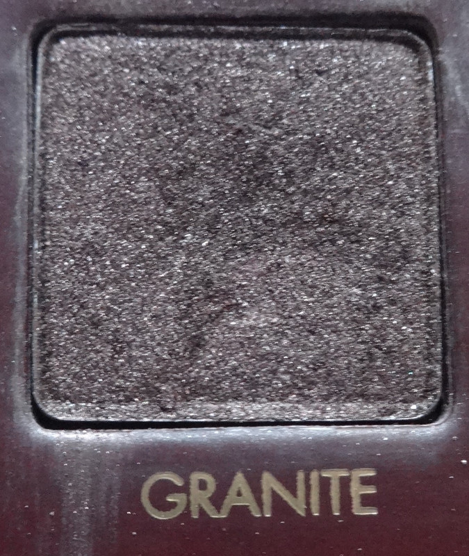
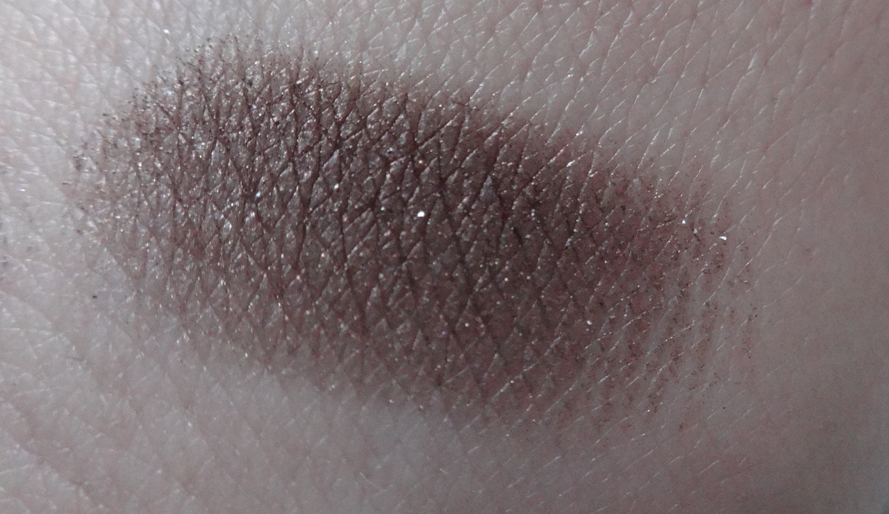
Granite - a rich blackened brown with a slightly reddish pearl.
![](https://i.postimg.cc/vZ9CMCZx/DSC05149.jpg)
![](https://i.postimg.cc/jqhTMsc3/DSC05181.jpg)
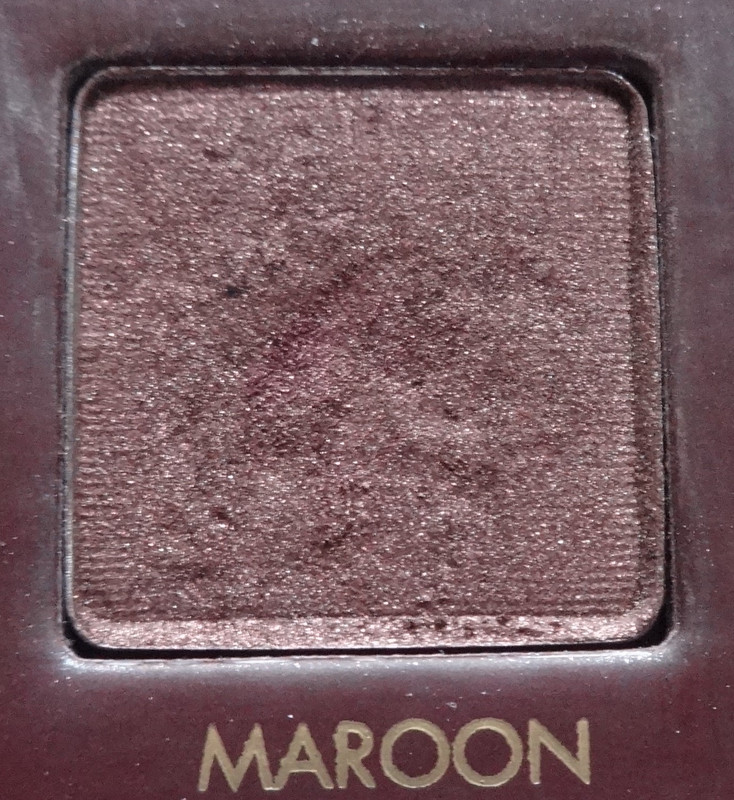
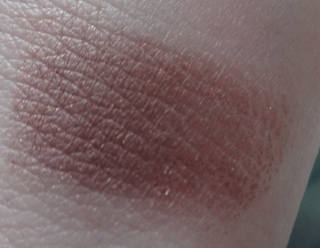
Maroon - a rosy plum with a kiss of taupe.
![](https://i.postimg.cc/9MXkdMty/DSC05150.jpg)
![](https://i.postimg.cc/R0n9dKpw/DSC05182.jpg)
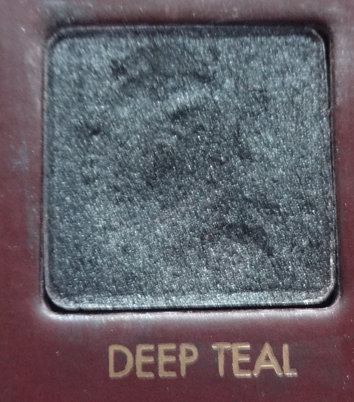
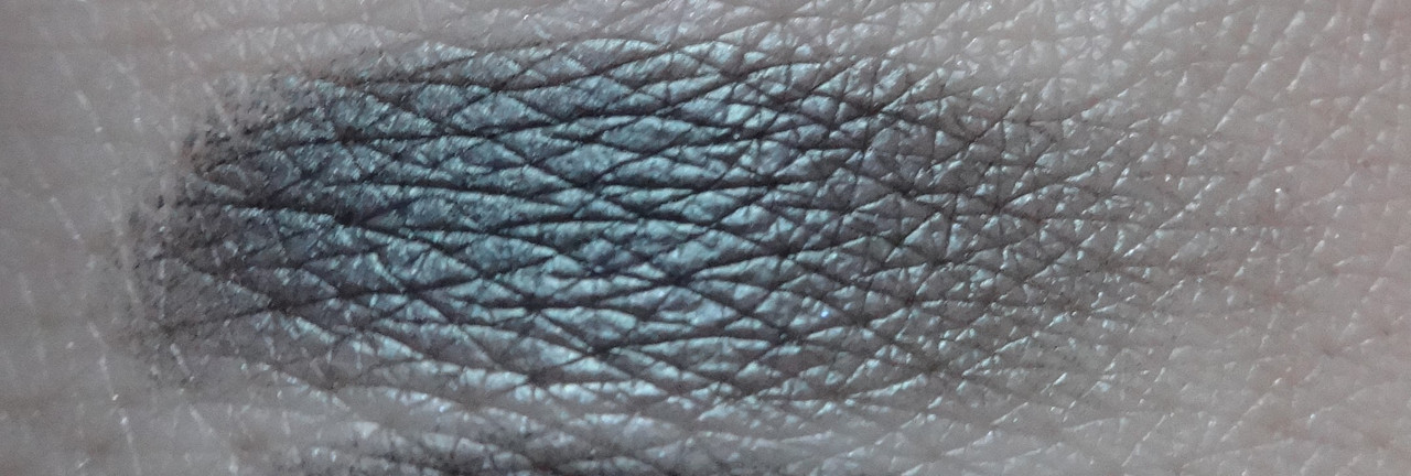
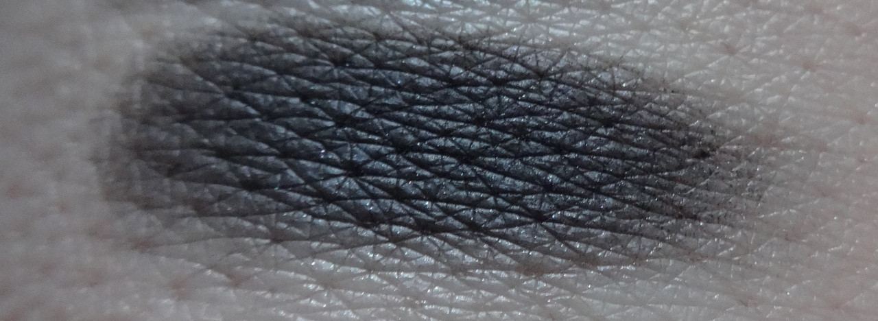
Deep Teal - this is more of a black with a teal pearl and needs a black base for the teal in it to really pop.
![](https://i.postimg.cc/90KNHB3B/DSC05151.jpg)
![](https://i.postimg.cc/C1G0TYg1/DSC05183.jpg)
Caviar - a rich pearly black.
Please let me know if you have any questions or comments.
Disclaimer: I paid for this myself.
No comments:
Post a Comment