Thursday, May 5, 2016

Violet Voss Pro Eyeshadows Holy Grail Palette Review

Today I'll be reviewing the Violet Voss Pro Eyeshadows Holy Grail Palette
Availability: This retails at $45 for 20 eyeshadows and is available at sephora.com along with its physical store locations along with shopvioletvoss.com.
Would I buy this? Yes!
Notes: Alright let's do pros and cons - the pros of this palette is that the metallic colors are extremely pigmented, smooth, and buttery. Everyone raves and raves about this palette and I'm not knocking it at all, it's beautiful. I love the color selection and how this has both highlight and transition tones that are appropriate for a variety of skin tones as well as a good selection of textures - be it metallic, shimmery, satin, or matte. I also love how the cranberries and burgundies in here show up red, rather than brown (which is a common thing), on me. Overall, I feel like the matte shades need a little extra loving. Again, they aren't bad per se but if it takes hardly touching a metallic shade to get beautiful pigmentation whereas the mattes in here need to be built up to achieve opacity. I almost feel like that was done on purpose with the intention of using the mattes as blending out/transition/highlight colors and therefore not as intense and in your face as the metallic shades are. However, it's just more work and I'm lazy, you know. I feel that I may be nitpicking because they do blend out easily and are pigmented when paired with a primer. More notes will follow each individual shade.
Crystal is a soft, satin off-white shade. This would make a pretty inner corner or cheek highlight. 
Ploof is a satin pink with a white frost.
Thanks A Latte is a matte fair flesh-tone... this is just slightly lighter than my skin color... I'm pale.
Transition is a soft, matte, warm brown. 
Hashtag is a soft matte orange, this color is fantastic as a transition color, along with Transition, especially on someone with a medium to deep skin tone, but can work on someone fair if applied very lightly. 
Awesome Sauce is a frosted amber/copper shade. Super pretty! A color I always love seeing in palettes. 
Bestie is a matte pinkish light brown. This could be used as a transition for cooler-toned looks or with the berries, or on someone with a cooler skin-tone.
Toffee is an intense bright warm metallic amber-bronze tone. OMFG, LOVE!!!! I also actually really love toffee so no one is surprised. 
Chill is a soft, frosty pinkish amber.
How U Doin is a very pink, coppery color. 
Bat My Eyes is a metallic milk chocolate brown. 
Cool Beans is a metallic golden pewter, so gorgeous. In love with this one.
R U Kitten Me is a matte milk chocolate shade.
So Jelly is a copper-kissed champagne base with an intense pink duo chrome. Beautiful!
On Fleek is a berry-kissed copper. So beautiful.
Brownie Points is a deep matte chocolate brown. 
Teddy Bear is a plummy brown. I used this as a brow shade when my hair was more red and it worked really perfectly for that. Digging it. 
Glamping is a satin brick-toned shade. It's a bit disappointing in texture because it looks like it'll be buttery and easy to use and it's kind of stiff. :/
Cranberry Splash is a gorgeous metallic cranberry
Wine N Dine is a rich cool-toned red, berry shade. Kind of reminds me of a reddish version of a cherry blossom color.

Please let me know if you have any questions or comments.

Disclaimer: I purchased this using my own funds.

Monday, April 18, 2016

Highlighter Review: Anastasia Beverly Hills Gleam Glow Kit

BEHOLD the Anastasia Beverly Hills Glow Kit in Gleam
Availability: This appears to have been discontinued.
Would I buy this again? Probably.
Notes: I'll describe each color as I get to it but a few things - firstly I wish this came with a mirror, the palette size and the way it stays open would work well with a mirror, so... there's that. All these shades are heavily frosted/glowy/shimmery, it's not a glitter but they are somewhat metallic, if you're not a fan of that you will not like it. This is by far the most glowy of highlights I've stumbled upon.
Hard Candy is described as a mood changing golden peach with a pink pearl reflective pigment. I'm not sure what they mean by "mood changing" - am I changing my mood or is the highlighter changing its? This is indeed a peach tone with a pink pearl throughout, which I love. Honestly, unless I get some color this summer this would work as more of a blush or a blush enhancer - to give another blush more glow - than as a highlight on me.
Mimosa is described as a radiant golden peach with a metallic finish. This is pretty true to its description and is kind of dark for me, I could definitely get away with using this as eyeshadow and to highlight a lip color if placed on the center of the lips or the cupid's bow.
Starburst is described as a rush of cool pink with an iridescent finish. This is a pink with an intense white, icy finish. I wish this had the pink pearl in it, as it would work beautifully for my skin tone and I love highlighters with a duo-chrome pearl throughout, oh well, it's still quite lovely. 
Crushed Pearl is described as a glimmering pink and silver with a crystallized chrome finish. I would describe this simply as a pink champagne, it's kind of my go-to classic highlight color for my skin tone and I dig it, never hurts to have more of a tried and true.

Please let me know if you have any comments or questions.

Disclaimer: I purchased this myself.

Sunday, April 17, 2016

Blush Review: Clinique Heather Pop Cheek Pop Blush

Today's blush review is going to be on Clinique Cheek Pop Blush in Heather Pop.
Availability: This particular shade is available at sephora.com, nordstrom.com, macys.com, bloomingdales.com, neimanmarcus.com, and their respective physical store locations along with clinique.com. You can also check out ebay.com or amazon.com. It retails at $26.50 for .12 oz (3.5g).
Would I buy this again? I think so.
Notes: I'd describe the color of this as a neutral dusty pink. It looks so natural on my skin tone and adds a soft flush tone that goes with ANY look, I love it. I had to get it for the name too, Raja/Heathers movie reference, because my friends and I are also the Heathers.
Moving on, the texture of this is quite lovely, it's very smooth and silky. It doesn't feel powdery or chalky... it doesn't feel like anything really and just adds a soft, subtle hint of color to the skin.  I'm really impressed with the quality and texture of it. Nothing against Clinique but I often find their products to be more powdery and dry than I'd like and while they don't irritate my skin, they often don't sit right or look good on it. This is a complete 180, silky smooth and beautiful, it wears for a majority of my 10 hr days with very minimal fading. I also adore the flower motif on this, it's very springtime and just brings me joy when I look at it.

Please let me know if you have any comments or questions.

Disclaimer: I paid for this myself.

Tuesday, April 12, 2016

Nail Polish Review: Femme Fatale Glass Coffin Artisan Nail Lacquer

Femme Fatale Artisan Nail Polish in Glass Coffin
This is two coats of polish topped with Seche Vite dry fast top coat
Availability: This is available for $15 at beautometry.com.
Would I buy this again?:Yes
Notes: Color-wise, this is described as a light blue to purple thermal with green-red shimmer. At first when I read that it was a polish that changes color with temperature I wanted to call bs but it truly works and I guess testing it out when it was cold outside/warm inside worked really well. I think it's such a fun nail polish. The color retains a greenish-teal pearl throughout but is more of a sky blue in warmer temperatures and a violet purple in colder temperature. The wear-time was pretty nice, it lasted about 5 days without chipping. given that most of my nails are flaking, I'll take it. 
Update as of 2021: While this polish retained its functionality as a polish and beauty my bottle no longer changes colors so I am unfortunately unable to show you the color shift.

Please let me know if you have any comments or questions.

Disclaimer: I bought this myself.

Saturday, April 9, 2016

tarte tartelette tease Amazonian clay eyeshadow palette Review

Today I'll be reviewing the tarte tartelette tease Amazonian clay eyeshadow palette
Availability: This is available at ulta.com and macys.com along with their respective physical store locations as well as tartecosmetics.com. The retail price is $19 for 6 shadows that are .03 oz each. Honestly, not a bad price point at all. 
Would I buy this?: I want to say yes.  
Notes: This palette that was provided for testing purposes through my job, I wasn't planning on picking it up although I swatched it and drooled over it simply because I figured I'd have similar colors. But I'm so glad that they chose to give this to us because I love it, the quality of these shadows is super pigmented without a base, smooth, easy to go on and if I go on a vacation or short trip where I don't anticipate wearing much makeup, or I don't have to do a lot of makeup for... this is a good tiny thing to drop into my bag. I'm digging it. Apparently the palette is subdivided into two looks, with both rows containing a highlight, lid, and crease shades but... y'all know I don't pay attention to that. Someone in the reviews said this had a cocoa smell and upon smelling the palette... it does! Anyway, behold the swatches. 
Whisper is described as a light pink. This is indeed a matte, fleshy light pink, this would make a good matte highlight for the face as well on a light complexion.
Crush is described as a taupe shimmer. This is a slightly pinky taupe with a golden shift which makes it really unique and interesting - I love taupes so variation is fun. 
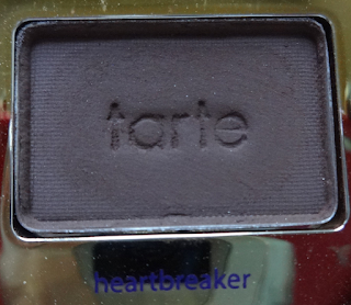
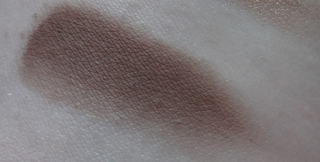
Heartbreaker is described as a brown. This is a matte dark chocolate brown.
Wink is described as a light mauve. I pretty much agree with the description, a whitened light mauve tone that's matte.
First Kiss is described as a mauve shimmer. I'd say this is one of those weird mauve, taupe tones that's heavily kissed (or made out :P) with brown. 
Bff is described as a plum. I would say this color is a really vivid plum brown. Really pretty.

Please let me know if you have any questions or comments.

Disclaimer: This was provided for testing purposes. I am under no obligation, nor am I being compensated to, mention it on this blog.

Friday, April 8, 2016

Sugarpill Feral and Droplet Chromalust Review

My Sugarpill Story: Amy Doan, the founder of Sugarpill, has been an inspiration many years before Sugarpill even launched. I found out about her Ebay shop through Leesha's videos and  was blown away by the gorgeous, colorful makeup looks she did to accompany her product pages. She is an enormous inspiration to me because she's doing what she loves and is colorful and not afraid to express or be herself. So when Sugarpill first launched I knew I had to get my hands on the goods.  I really hope you enjoy the review and seriously, if you have the money to spend, go to sugarpill.com right now and get your hands on this gold! 
Availability: These have been discontinued.
Note: What sets the Chromalusts apart from similar loose shadows or pigments are that a large majority of them contain these amazing micro-glitter particles - they do a good job of staying on the skin as well but generally show up when the product is used dry (it takes a more metallic quality if used wet). I have to apologize that for many of the pigments, my camera just doesn't do the glitter justice because it's just so much more multidimensional in natural light, but I hope my descriptions are helpful :3 
Feral is described as a shimmering orange loaded with golden sparkles. I'd describe this as being true to its description. This is a really pretty mandarin, orange kitty color, full of golden shimmer bits.
Droplet is described as a vivid aqua with blue and green reflects. I'd describe this as being a mid-tone light, shimmering blue-toned turquoise with teal and silver sparkle bits. I love how it has a slight hint of a violet tone when this is used over a black base, pretty!

Please let me know if you have any comments or questions.

Disclaimer: I paid for these myself. :3