Availability: This has been discontinued.
Would I buy this again?: I'm not 100% but I do really love this palette.
Notes: I'll describe each shade individually, but here's some notes on the product itself. Now, I will say that what makes Dior eyeshadows... most luxury eyeshadows... special is the pearlized effect they have that it seems cheaper shadows don't. When the light hits them just right they light up like a prism, you can see little bits of green and pink and silver along with the base color and it's... glorious. Just glorious. It's like... you have a crush on someone and like them from afar (cheaper shadow) and then like... you find out your crush likes you back... and you kiss and it's magical (luxury shadow). Let's not kid ourselves that there's something wrong in the way I just described what the eyeshadow is like... and yet.. that's what it's like! The color payoff... it takes just the gentlest touch for it to yield lots of pigment. It FEELS luxurious. Plus the packaging doesn't hurt it at all... not even a little. The texture is mega silky. I love, love the packaging also. I love navy to begin with, it has a regal... mysterious feel to it. I love the beautiful iconic navy packaging with the CD in it.
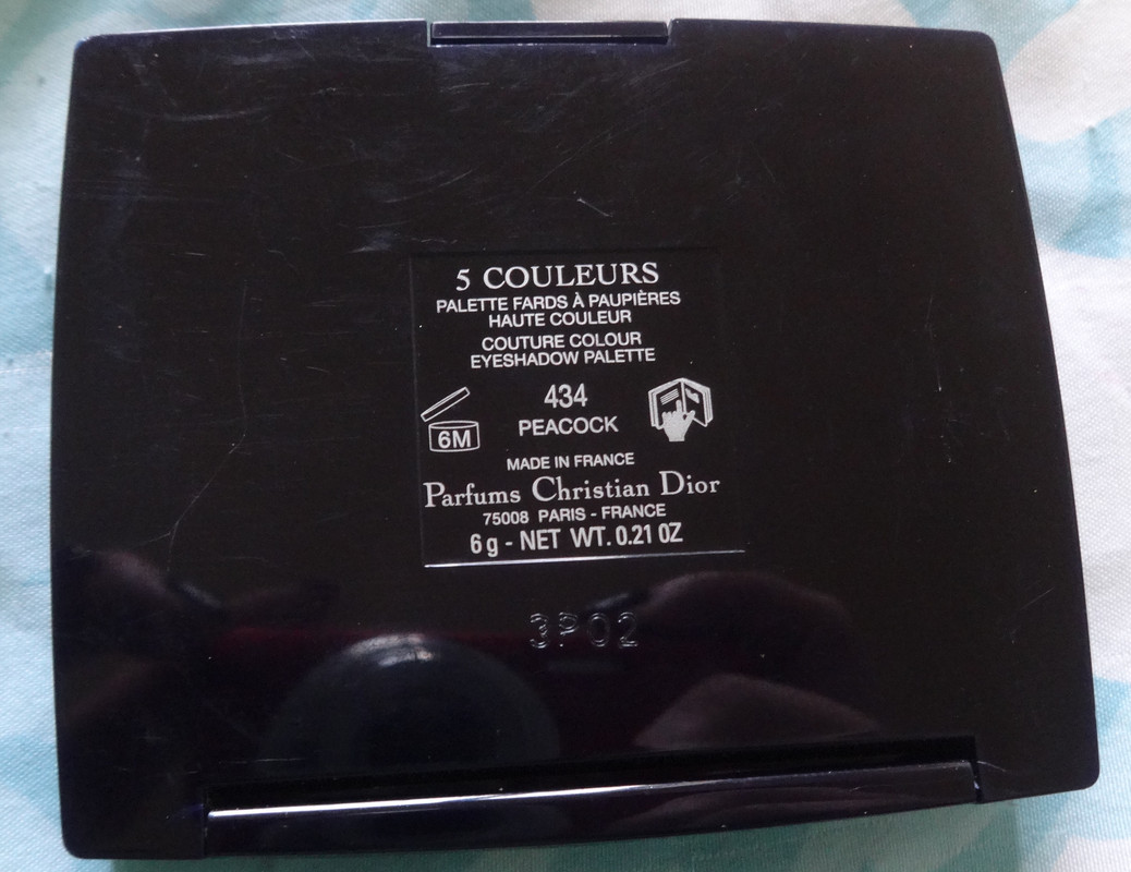
This particular palette had been introduced to me by my lovely coworker... let's call her Diora (I'm SofYSLa btw) and just... it's so ME. I've been really obsessed with the color mint and quilted things lately so this was up my alley with the quilt print on the shadows. I really loved the second palette in the Dior Peacock collection but Sephora didn't carry it and... I really didn't want to spend another $60. I did see it in person though and it's gorgeous, it leans far more blue than this one does. I love mermaid colors and while this, to some degree, represents a peacock, it's somewhat mermaid-esque also. I also really like how the colors in the palette are all soft, they're a good way to play with color and a luxury brand without feeling like they're too bright or overwhelming. This is a palette I bust out when I want color that isn't so in-your-face.
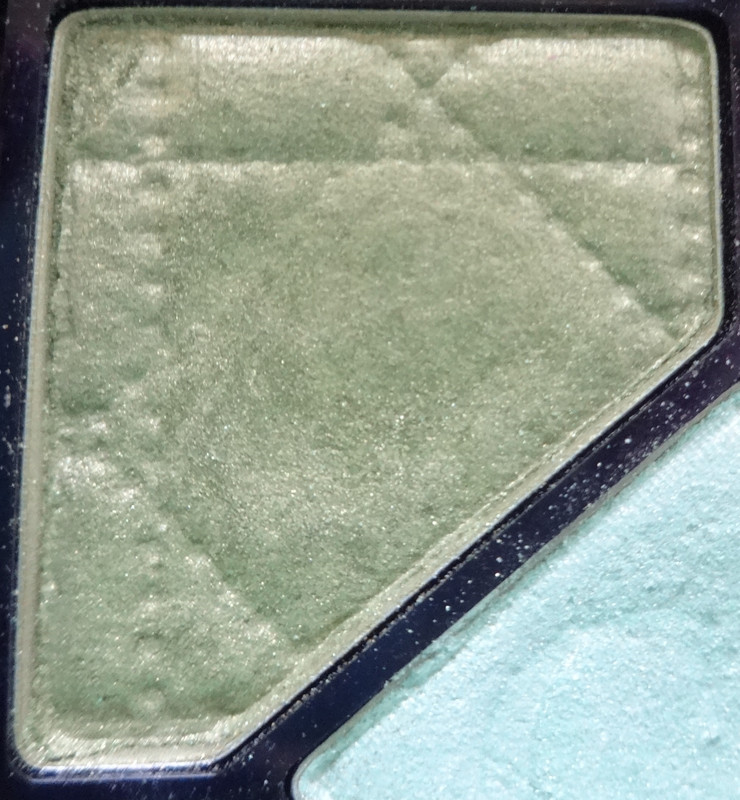
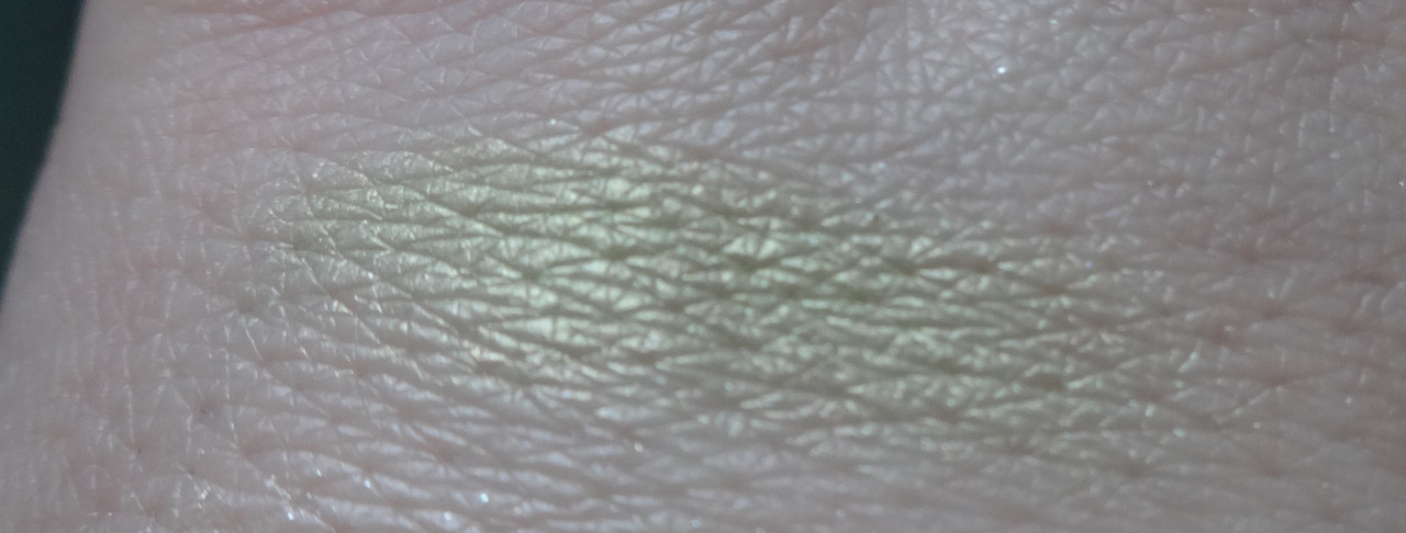
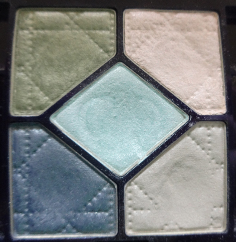
This is the color on the top right corner of the palette. It's a soft limey chartreuse.
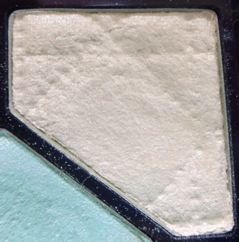
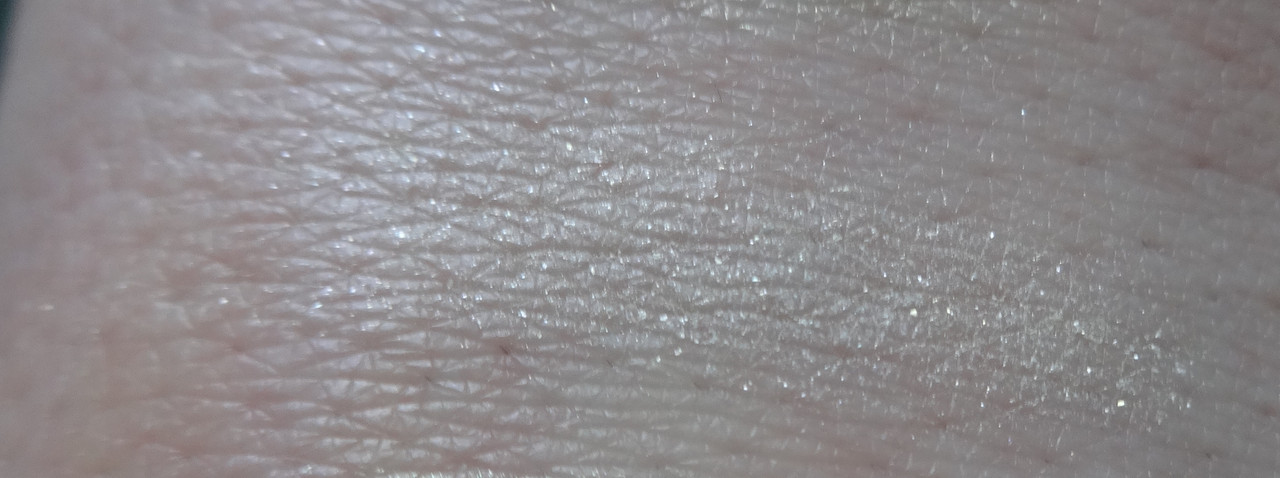
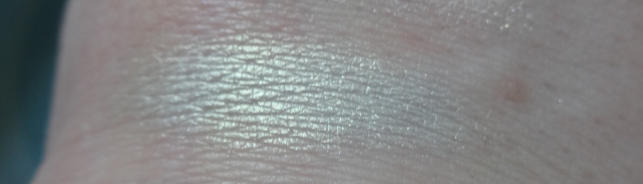
Upper-left corner. It's a very soft, white peachy shade with a hefty dose of silver micro-glitter. The glitter is the only thing that really shows up on my skin and I'm thinking it's because this color is basically my skin-tone with shimmer in it.
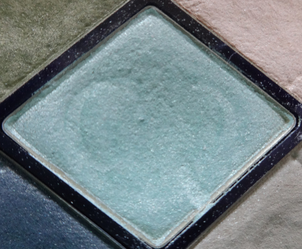
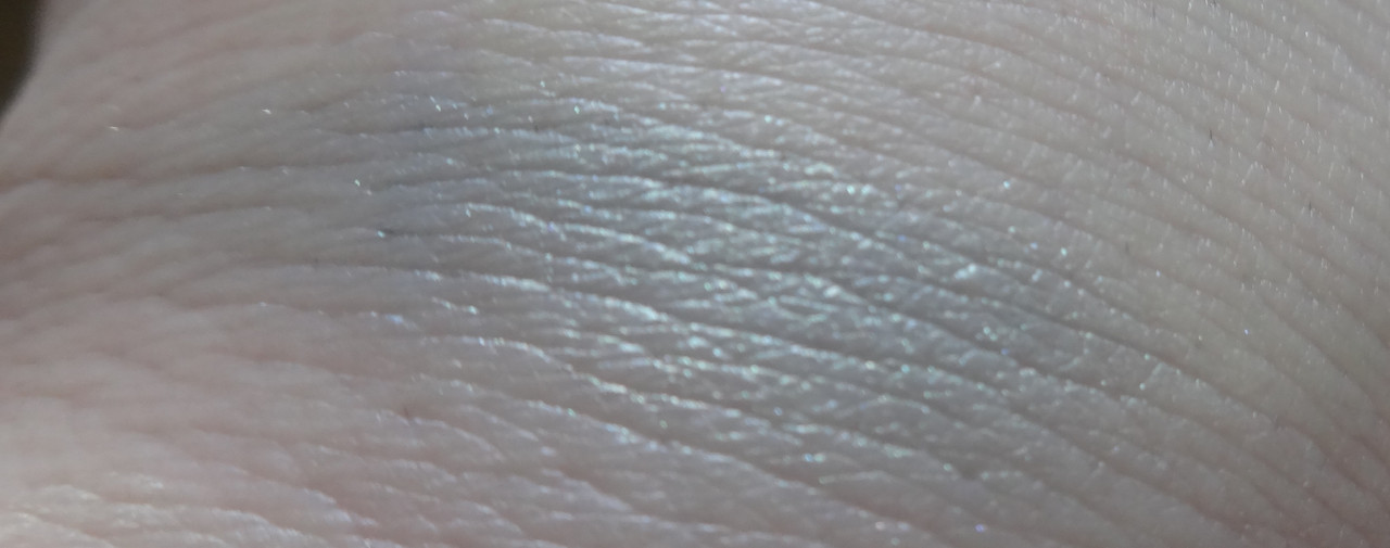
Center. Um... this is the shade that made me want the palette. Firstly, just looking at it, it's the PERFECT mint as far as I'm concerned - I like my teals/mints leaning somewhat blue-ish, this does but without being too blue, and it has this gorgeous golden shift to it that I just... it just makes it magical and mermaid-like, it's like a beam of sunlight below the water's surface. Beautiful.
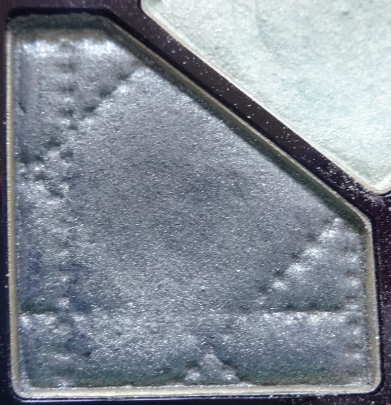

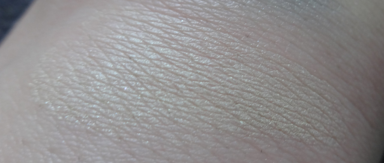
Lower left corner - very soft, almost white, khaki with a subtle green shift. Beautiful yet soft color. Makes an interesting highlight shade.
Please let me know if you have any questions or comments.
Disclaimer: Paid for this baby myself.
No comments:
Post a Comment