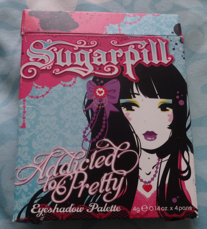
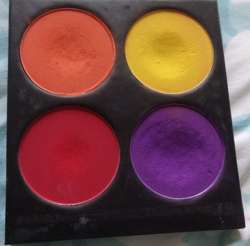
Hiya folks! :) I have two 10 pan palettes from Inglot to review for you folks, but am not too sure how to go about doing it because while each is color-coordinated, I didn't depot eye-shadows to color-coordinate all the colors (I hope that makes sense) - I've considered it, but decided I want to have two palettes than have the eye-shadows themselves be in order, in case I decided to travel with one. Again, I hope that makes sense. Basically, if I arranged the eye-shadows themselves, I'd end up with neutrals and highlighter colors in one and a bunch of colors in the other, and that would mean I'd have to depot and rearrange if I wanted to travel with just 1 of the palettes, and would be a pain in the butt, considering the fact that once the Inglot shadows are in one of their freedom-palettes, they're a royal pain in the behind to remove. There are special magnets you can buy or make but that seems like a lot of effort to me, so I just arranged the palettes how I like them. I recommend you do that as well if you either order the palettes online or purchase them in-store, either arrange them how you like them in the palette, or ask them to package the items separately. Now, I've only ever bought these at IMATS shows, they sell the palettes and shadows separately, and you can arrange things as you like them, which is especially nice if you want to label the palette with the colors, or write the colors down somewhere if you want to refer to them later.
I will start by reviewing my more "neutral" palette, I bought it last week at
IMATS
and it cost me roughly $50 plus tax. I actually think that this is a pretty well-rounded palette, I've got a nice balance of neutrals and colors in this one, with both matte and shimmer colors to allow for a fun play in texture.
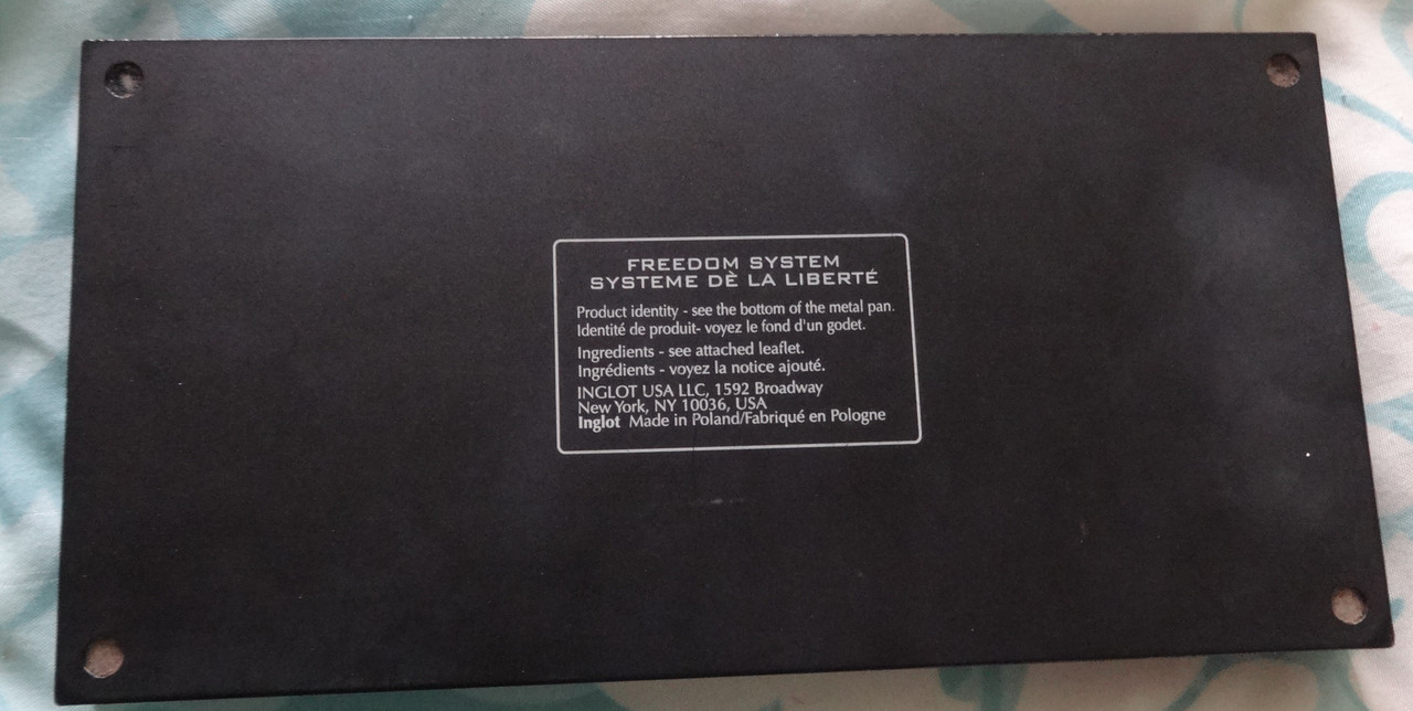
Availability: Inglot eyeshadows are available online at inglotusa.com and in physical Inglot store locations. As of May 2020, the pricing per shadow is as follows - regular shades are $8 each, rainbow pan shades (the tricolor ones you see in my palette) are $10 each. The shades have varying volumes of shadow included, which is based on the color - for further detail I highly suggest inglot.com as everything is spelled out for you there. The empty 10-pan palette can be purchased for $16. You are not limited to just eyeshadow, as they sell multiple other makeup products that are designed to fit the palette (i.e.: face highlighters, brow powder, lipstick)
Would I buy these again: You bet I would! Inglot offers amazing quality for the price.
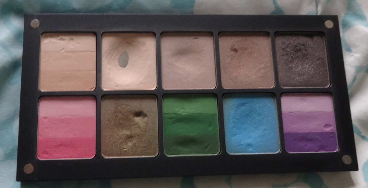
Notes: I'll speak about the quality of the products before I show you more detailed photos of the colors, all of Inglot's shadows are incredibly pigmented and smooth. Their mattes are soft, buttery, and blend like a dream. Their pearls are smooth and buttery too. Plus, Inglot has one of the most unique finishes ever, called D.S. or double-sparkle, these are matte shadows with pretty glitter particles throughout. I am in love. My only pet peeve with the eyeshadows is that they tend to be really dusty (when you pick them up), but there are some tricks to pick them up in order to cut down on how much dust they kick up. Alrighty then, here comes the fun:
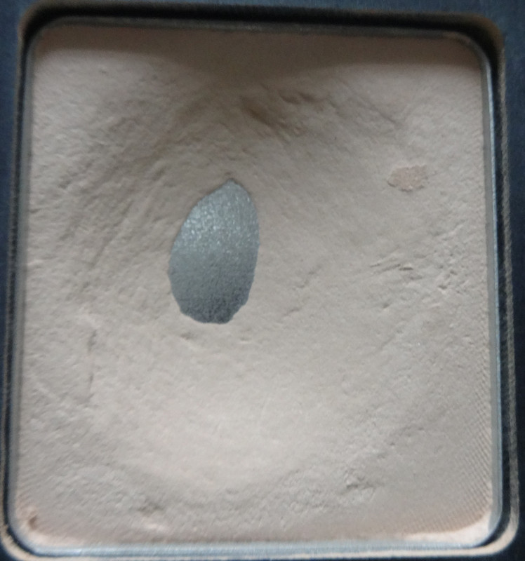
106R consists of three nude, fair skin-tone shades. All are matte. The top shade is about two to three shades lighter than my skin-tone, making it a great highlighting shade for me. The middle shade is pretty much dead-on my skin-tone shade, which is why you can't really see it in the swatch. The bottom shade is about a shade or two darker than my skin-tone. I picked this one up because I figured it would be really great for blending things out if a look gets to be too much or for a really simple nude eye look. That's kind of what I love about the rainbow shades, they're like a monochromatic eye look packed into one shadow - all you need is one that's colorful, and one that's close to your skin-tone, and you're set if you want to keep things simple.
353M is a buttery, smooth nude that's about 3-4 shades lighter than my skin-tone, it's very similar to the top shade from
106R, I figured it'd be good to have a shade like this because it is the perfect matte highlighter for my skin-tone and, because it's matte, I can never go wrong with it. It's also a great shade if I'm in a hurry and want to brighten up my eyes without doing too much.
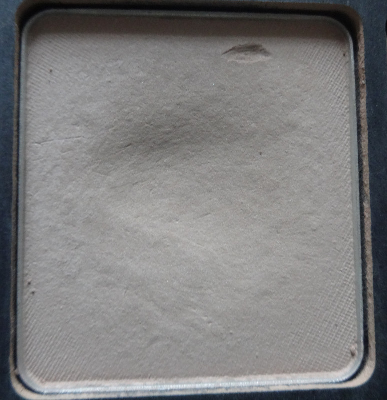
490M is a gorgeous taupe-y nude. I've wanted a color like this for a while now, especially to dupe the now-discontinued MAC All Races eyeshadow. It's perfect for a subtle smokey eye that isn't necessarily dark. This shade has been discontinued.
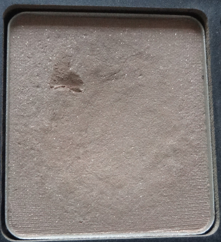
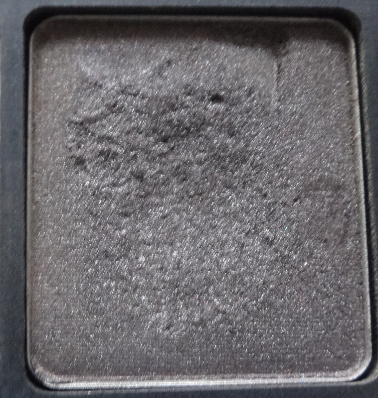
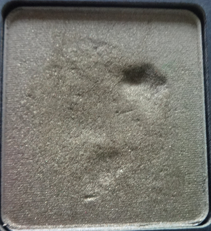
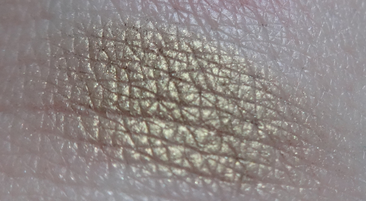
461 D.S. is a
beautiful matte tan base with just a kiss of taupe and gorgeous subtle gold shimmer throughout. This is one of those shades I picked out because it's so unique and beautiful. It kind of reminds me of a darker version of
MAC's Naked Pigment.
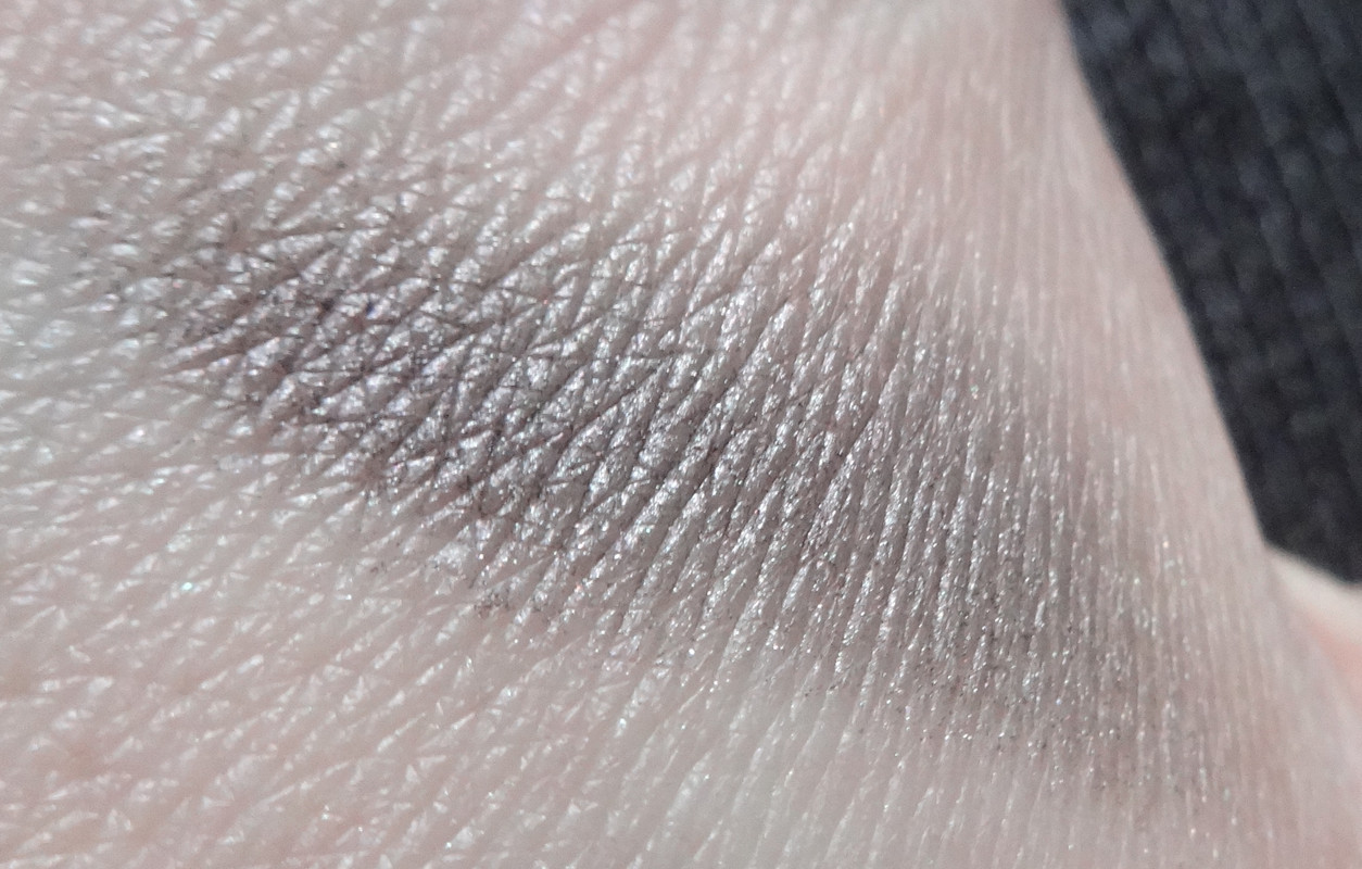
434P looks like nothing special at first glance, but is a stunning smoky color. It's almost taupe, mauve, or violet-gray depending on how the light hits it. This again, is something I picked up because it's super unique and beautiful. I've never seen a color quite like this anywhere. I think it would work beautifully with 353M or 490M for a smoky eye. :)
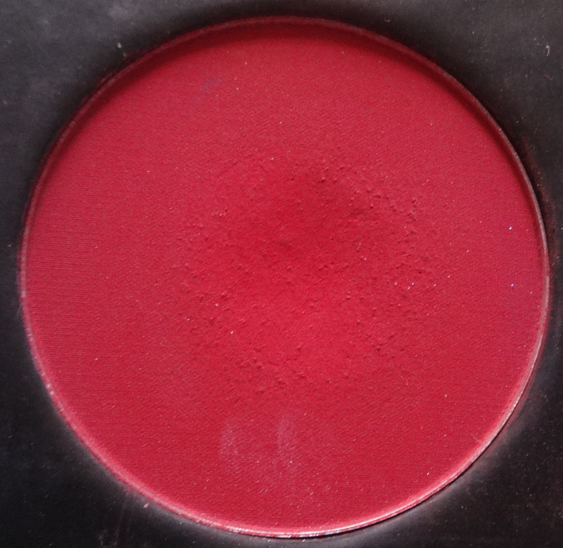
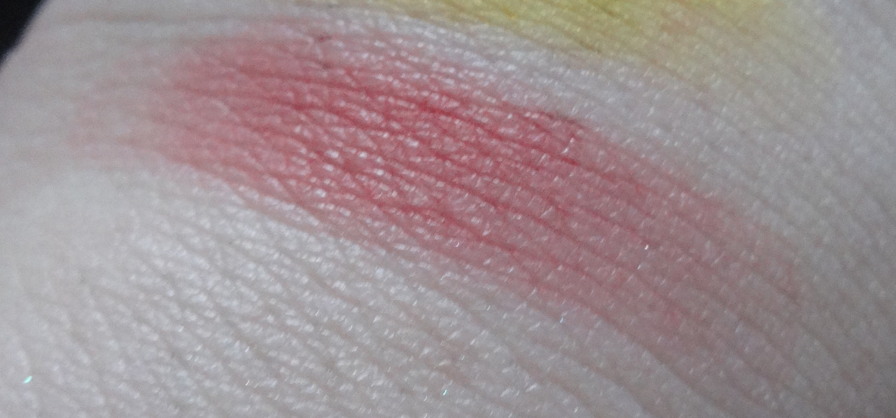
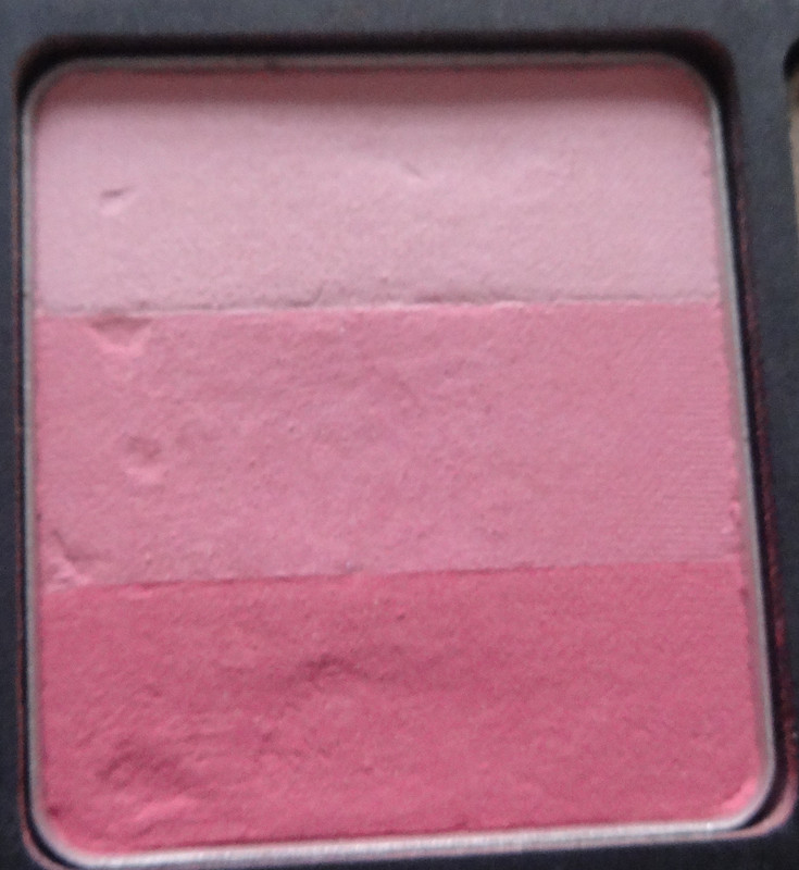
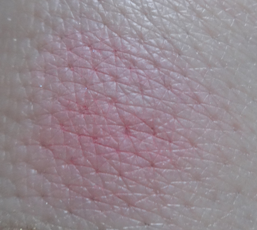
119R is a selection of three matte pinks that all lean a little on the blue side of the spectrum - the top shade is a pretty light baby pink, the center shade is sort of like a "Barbie pink" to me - a mid-tone blue pink, and the bottom shade is a pretty fuchsia. This trio would be particularly pretty for a cherry/flower-blossom type of look. My only peeve with this is that I wish it went from pink to red, but alas, I love it anyway. This shade has been discontinued.
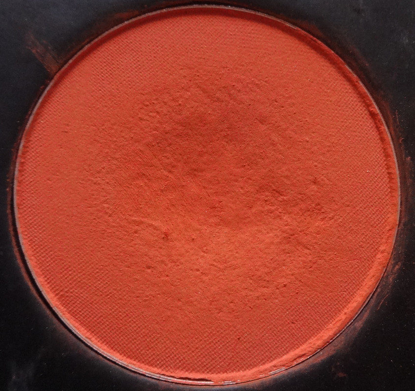
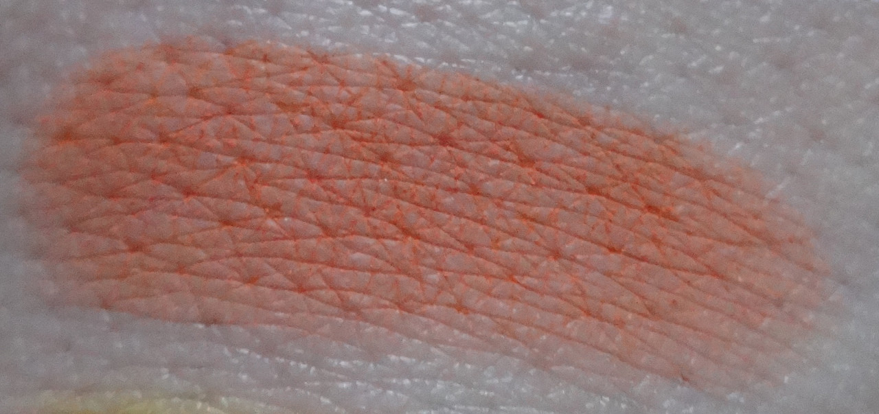
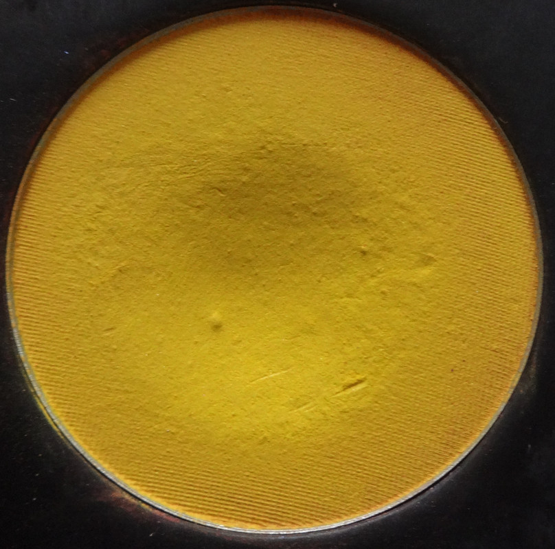
433P is a beautiful olive, I don't have very many olives in my collection but think it's a really pretty color, so I decided to pick this up. This is nice because it can kind of lean brown-ish, which makes it kind of pretty, yet not obviously colorful.
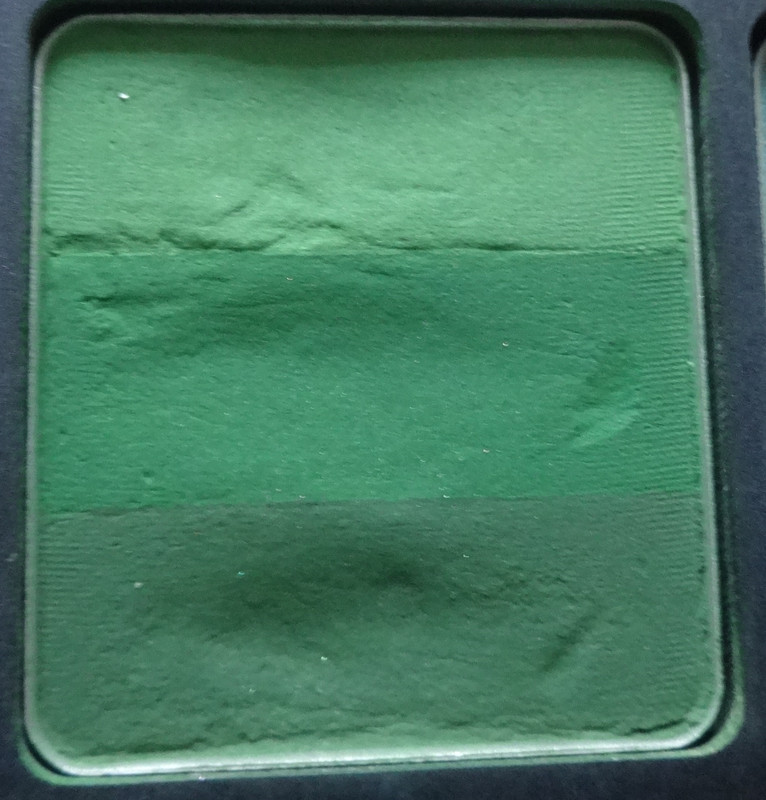
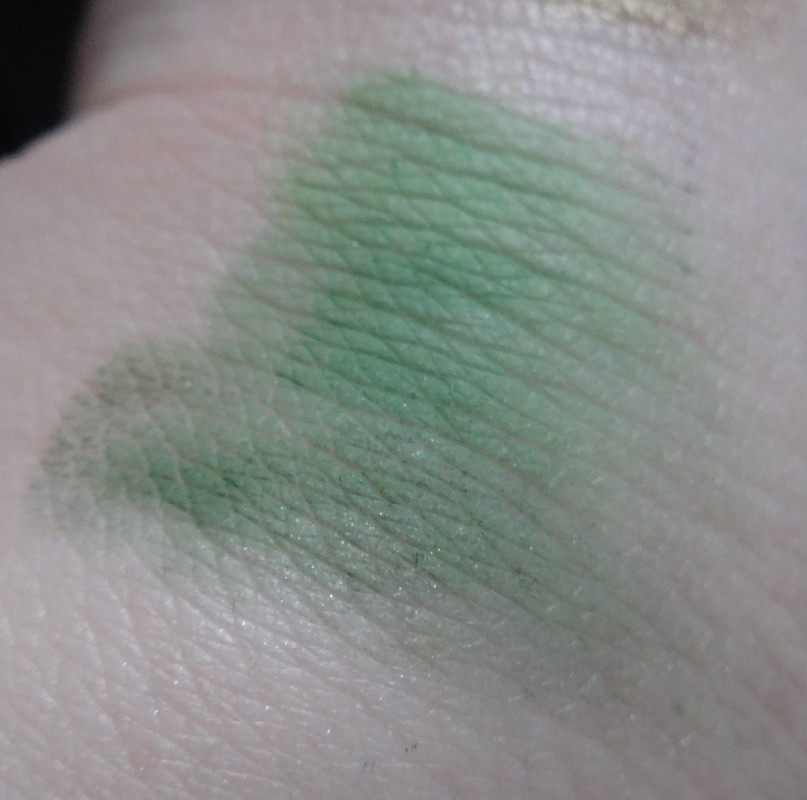
109R is a lovely collection of cooler-toned, grassy greens. The top shade is what I'll refer to as a dark mint leaf green, the center color is more of a grass green, and the bottom kind of reminds me of a dark green beer bottle, it's a color that I've been lemming for, and finally decided to just go for it. Plus greens are fool-proof to make my eyes look almost ambery, and people always ask me if I'm wearing contacts when I do that. It's kind of cool.
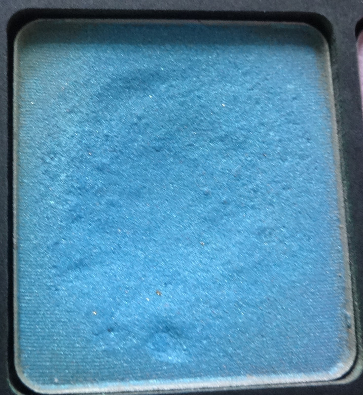
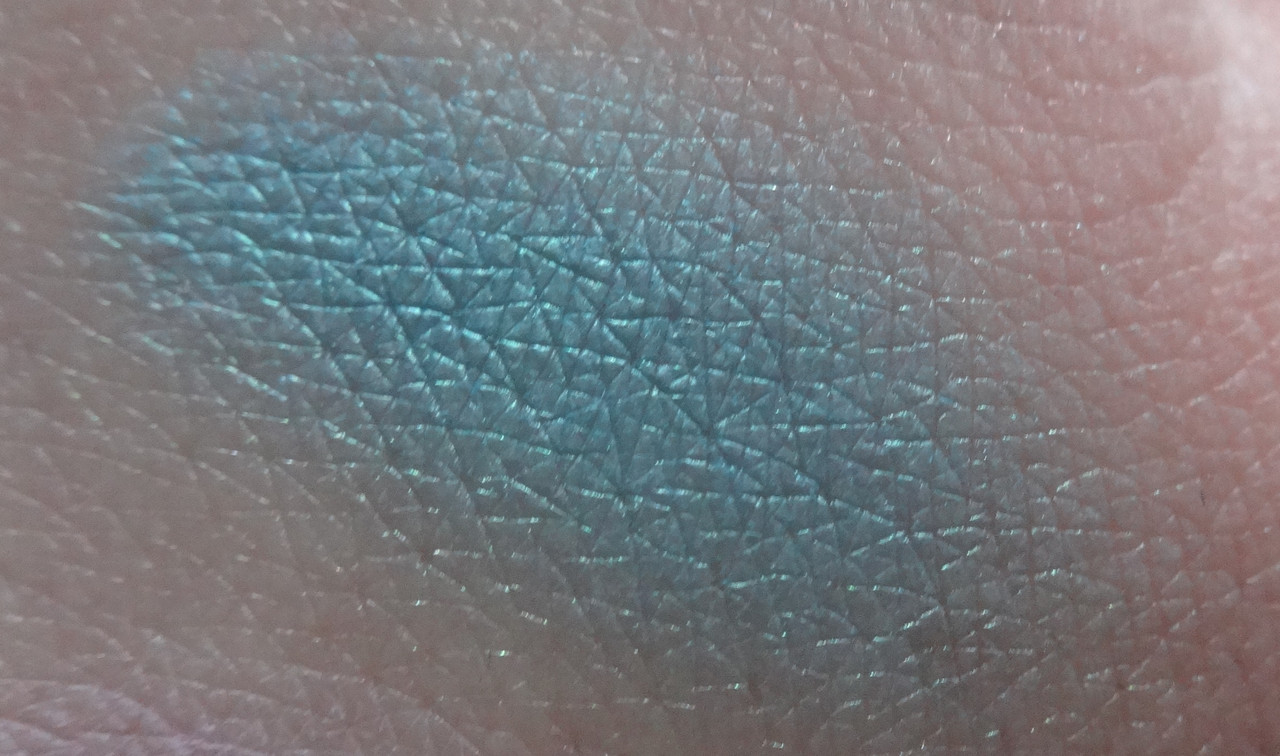
415P is a gorgeous teal that... well I just had to have a teal! Teal is my favorite! This is one of my favorite shades of teal too - if not my very favorite, a stunning blue-based teal that's almost warm. It's kind of perfect! I just can't help myself, nearly all of my palettes, except neutral ones, have teal shadows in them, and funnily enough, they're a unique shade to my collection each and every time. I think I was a mermaid in another life because I'm a mermaid so of course I just can't resist this color! I want to live in it!
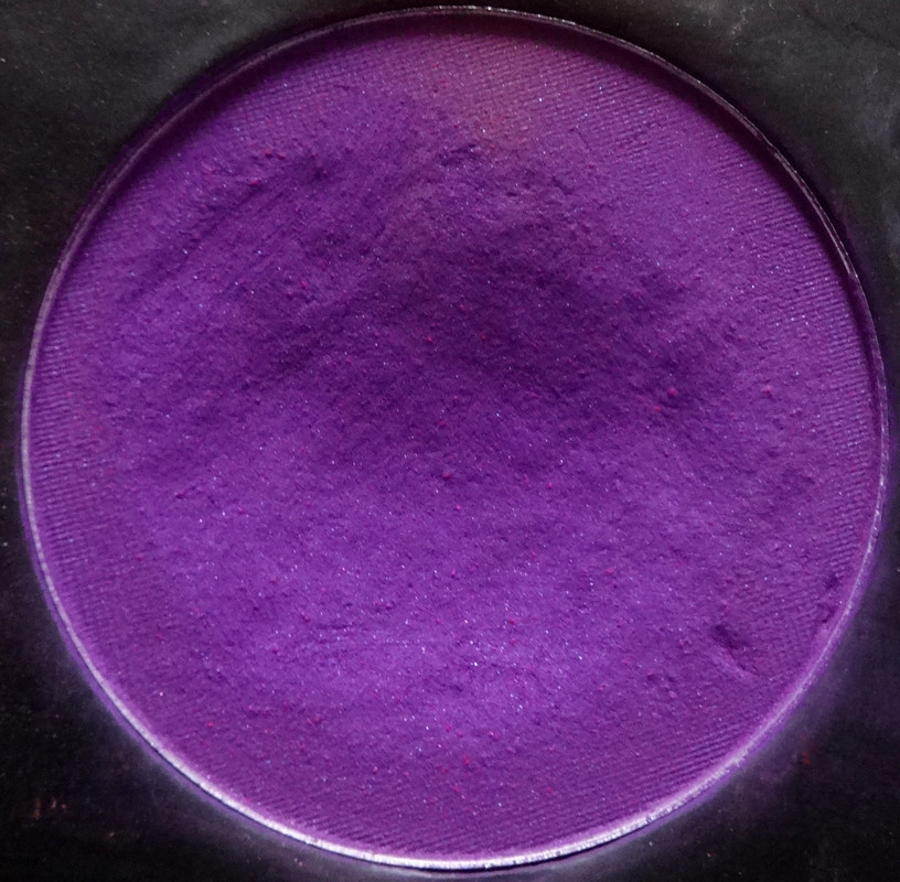
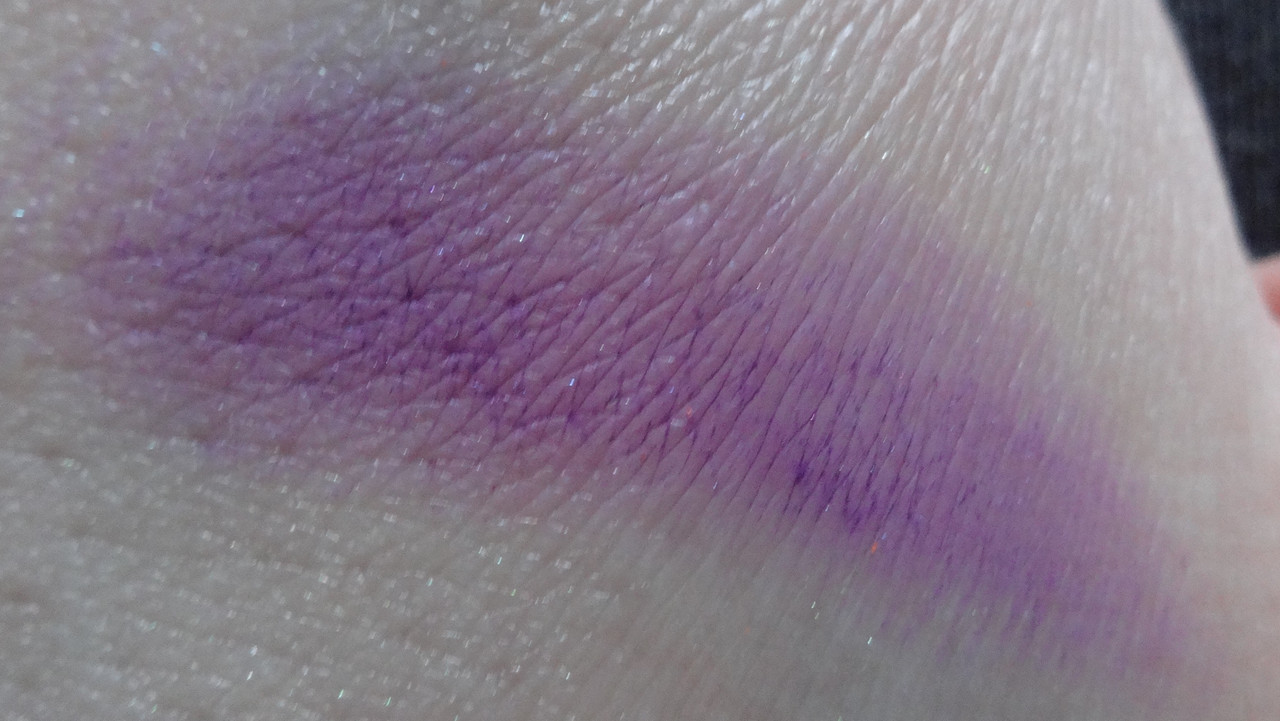
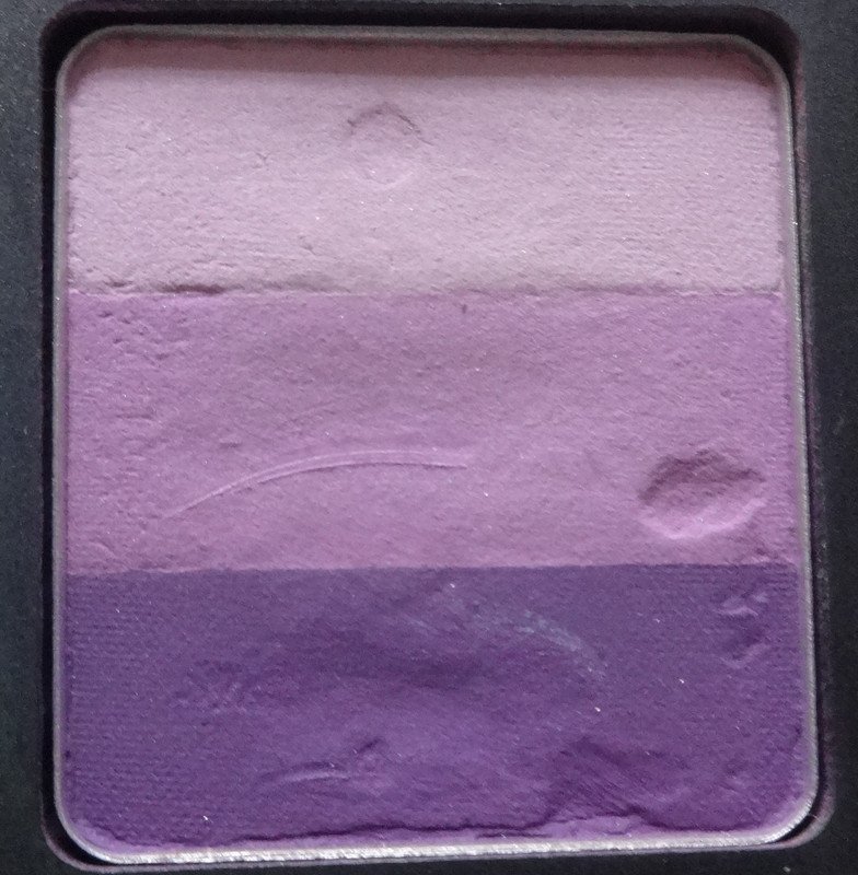
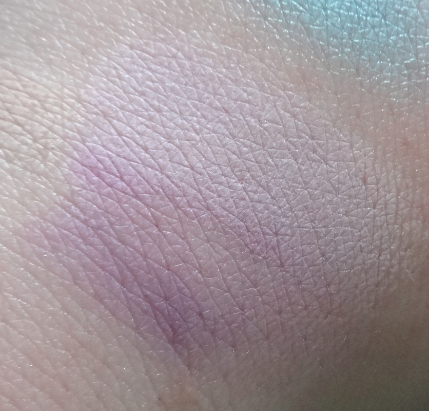
114R is a lovely selection of purples, they're neutral, meaning they don't lean to either the red or blue side of the spectrum. The top shade is a pretty light lilac, the center shade is a mid-tone lilac, and the bottom shade is a pretty matte amethyst. This would be another trio that's lovely for creating a flower-inspired look with a pretty green or olive shade to go with it, I don't have very many matte purples to play around with so I decided to get this to round out my 10 shadows.
Please let me know if you have any questions or comments. :) Thanks!
Disclaimer: Bought this all on my own with my own money, mhhhm.