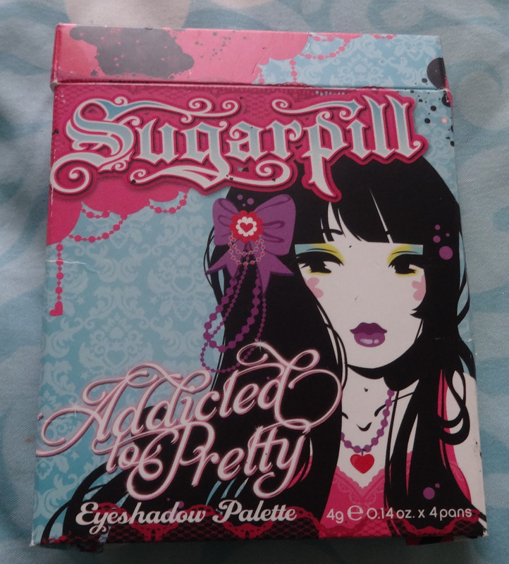
The outer packaging with artwork by Miss Kika - I think it would be so cute to say... put it in a cute frame and hang it up somewhere. One day I'll have a room cute enough to do that in! :P
Notes: I will start with the technical stuff and overall notes
before getting into each individual color. First of all, I've heard
complaints about the heaviness of the palette. Now, the reason it's
heavy, is because it has a magnetic plate under it, which holds the
shadows. Amy didn't have to add this and could very well have gone with a
design where the shadows were glued in, but I love how thoughtful this
is, you can switch out shadows between the palettes (or de-pot the
individuals) so you can arrange or travel with them as you like.
Personally, I don't really mind the heft, to me, it makes the palette
feel more sturdy.
I've been lusting over this palette for quite some time and am so happy to have it because I love it, and to be honest, if I'm wanting to do a look with one (or more :P) of the shades included, I tend to reach for this instead of my other palettes, I mean the color intensity and quality are amazeballs! Plus I plain just love the packaging and this gives me an excuse to take a gander at it :P
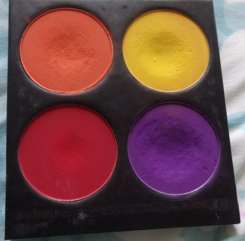
Ok, ok, enough chatter, lemme show you the colors!
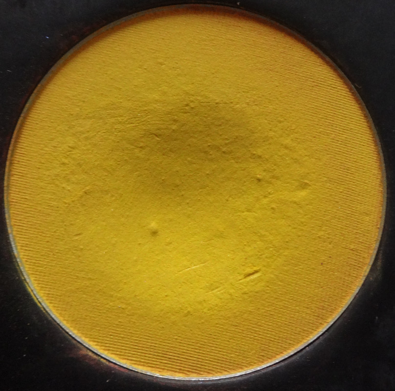

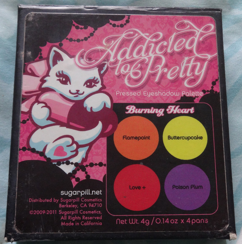
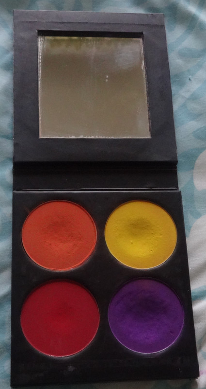
Buttercupcake is my favorite yellow ever! It's so intense, cheerful and happy! Although it's labeled a matte, and looks matte in daylight, it's a bit of a satin and has subtle pinky and silver shimmer to it. I kind of dig that it looks satiny in artificial light, I like when colors or textures have these subtle little things that make them cool and unique. :P
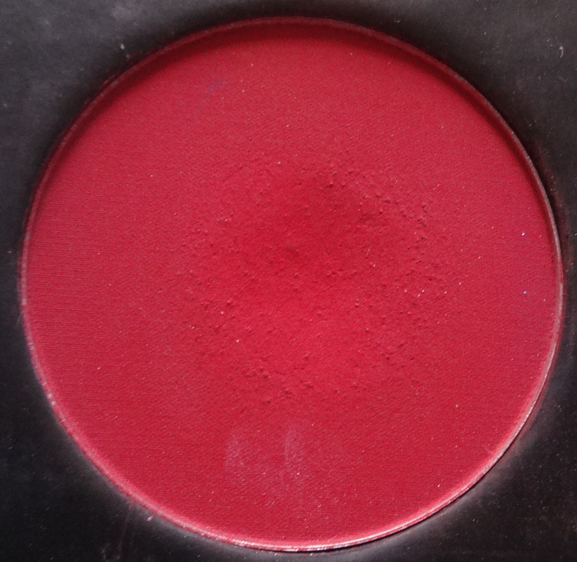
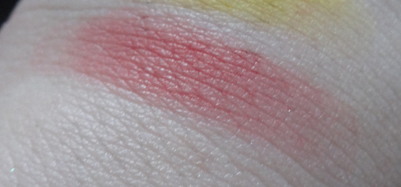
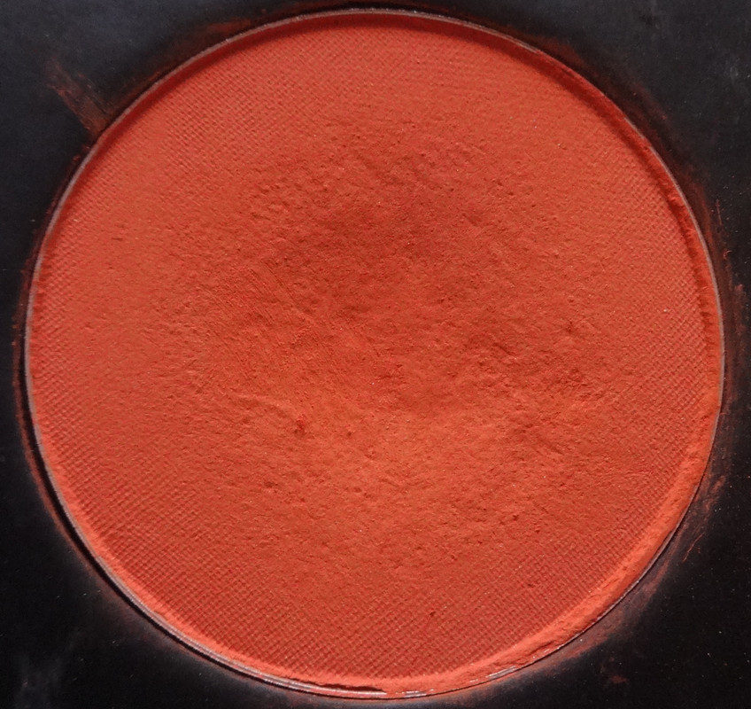
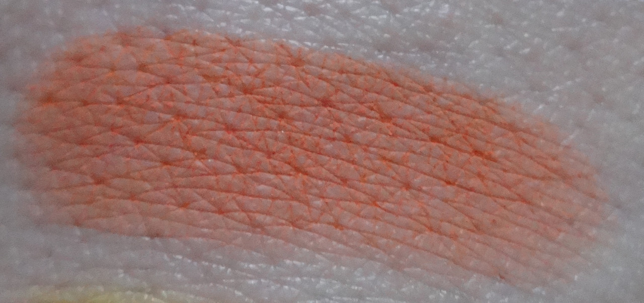
Love + is a beautiful matte red, this isn't a color I see myself using often because well... red eyeshadow still scares me (although I'm starting to embrace red lips and I've worn bright red eyeshadow out in public on a non-Halloween day and no one said anything or looked at me weird XD), but I'm sure I'll come up with a creative way to incorporate it into a look. :P If all else fails, I think this would make a beautiful blush, especially for someone with a darker skin-tone.
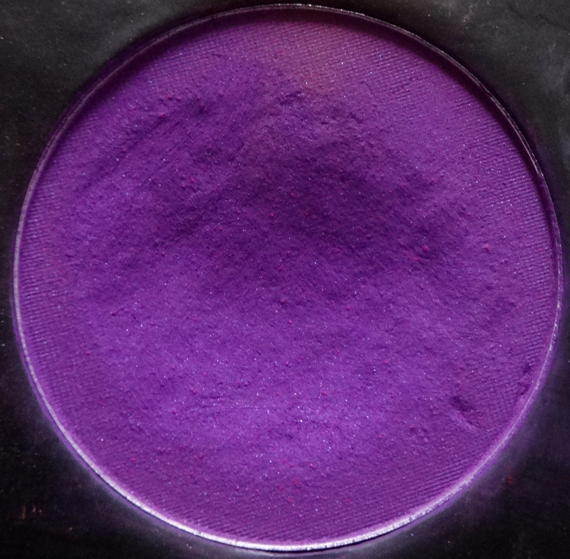
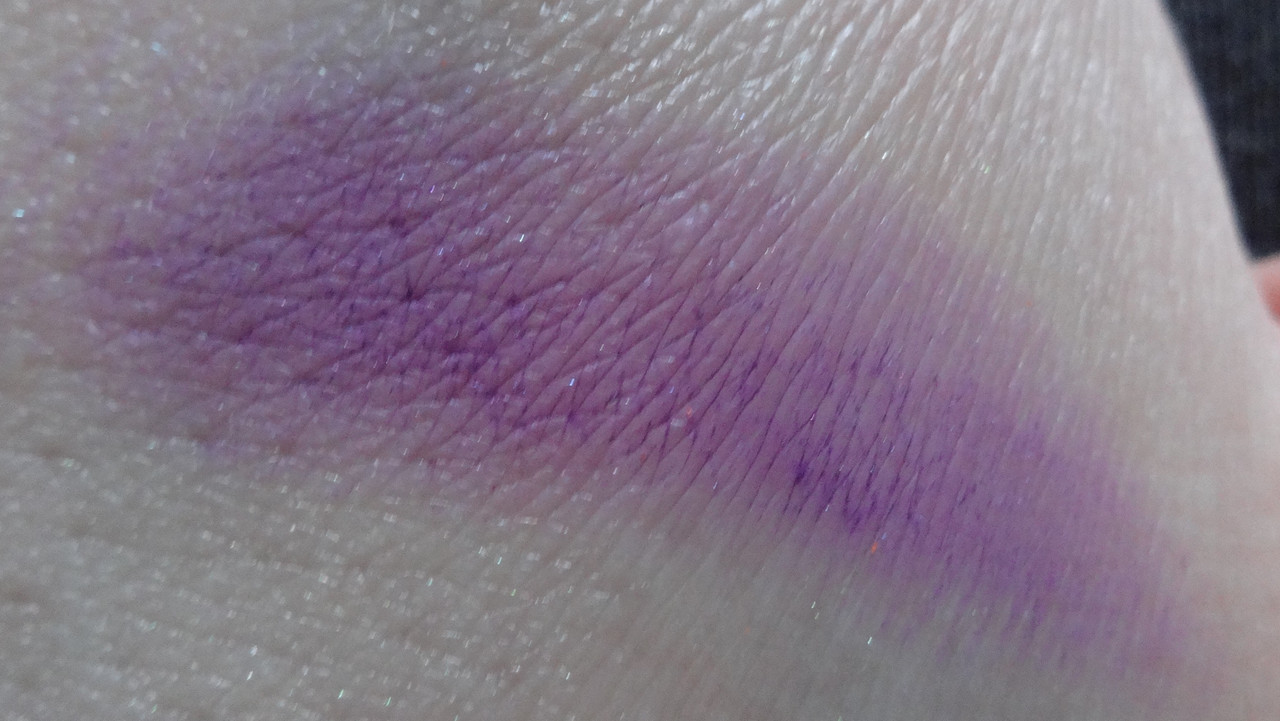
Poison Plum is another favorite - I am just obsessed with this shade of purple, it's so spring-y and pretty and kind of tranquil-yet-mysterious. I also like that it walks the line between being red and blue-toned, it kind of looks red-toned in the palette, but when paired with cooler colors it definitely looks almost more violet than plum, but that redness in it makes it kind of contrast and pop, whereas a more "true" violet might compete or lie flat. This is definitely a satin - it has beautiful violet and pink shimmers in it. While I adore the entire palette, I think that if you can't afford it, or are having a hard time picking out colors - this and Buttercupcake are must-owns. Plus they look amazing paired together, just sayin' :D
Please let me know if you have any questions or comments :)
For a review of the Sweetheart Palette please click here.
Disclaimer: I bought this using my own money.
No comments:
Post a Comment