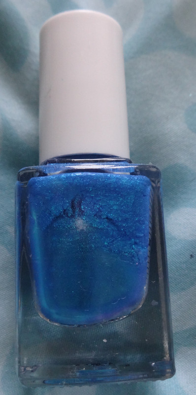
Saturday, May 12, 2012

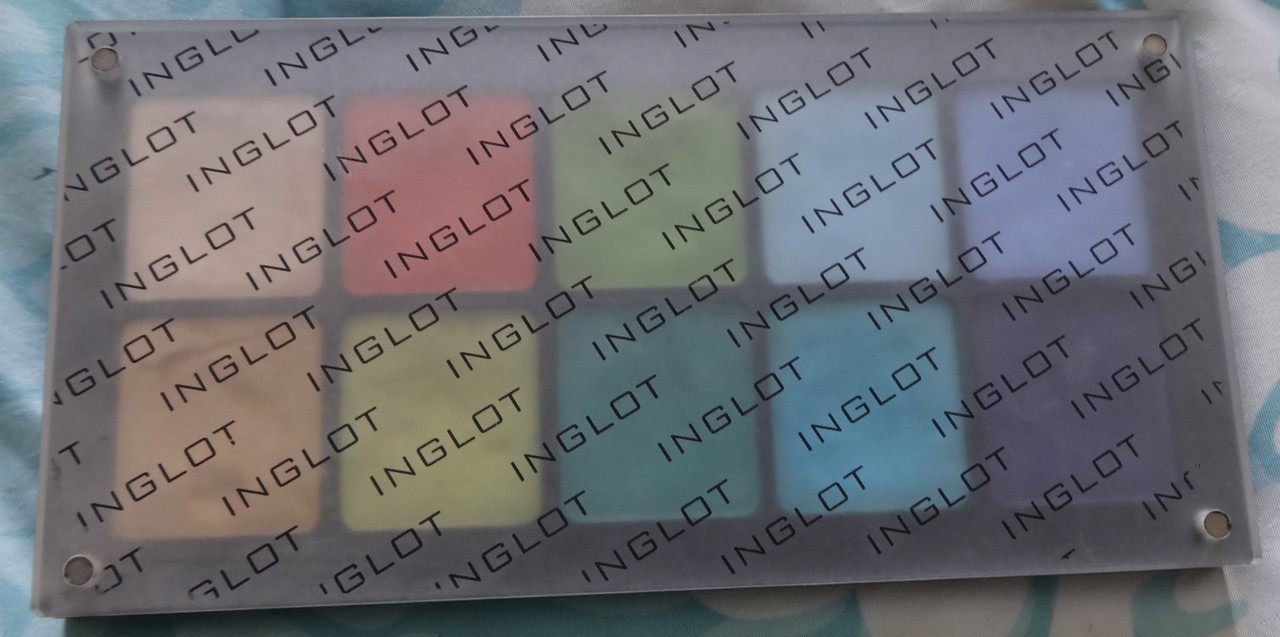
Inglot Eyeshadow Review: AMC Shine 30, AMC 51, DS 477, DS478, Pearl 429, Pearl 403, AMC Shine 41, DS 504, AMC Shine 05, AMC 67

Hi peoples. So... tomorrow is the Makeup Show NYC :D and I'm... nervous... :/ Not that anyone will be like "hey you're that girl with that tiny little blog" xD but um... idk... I get nervous when I go to big events where there's gonna be a lot of people ALONE. But hey, I've "braved" two years of IMATS, this can't kill me XD Besides, I'm excited for the forums/lectures :D 
Anywho... with the mention of IMATS, I introduce to you the first Inglot palette that I bought at IMATS 2011.  I believe the palette was in the realm of $50, but I don't remember how much I paid for it :/
Availability:Inglot eyeshadows are available online at inglotusa.com and in physical Inglot store locations. As of May 2020, the pricing per shadow is as follows - regular shades are $8 each. The shades have varying volumes of shadow included, which is based on the color - for further detail I highly suggest inglot.com as everything is spelled out for you there. The empty 10-pan palette can be purchased for $16. You are not limited to just eyeshadow, as they sell multiple other makeup products that are designed to fit the palette (i.e.: face highlighters, brow powder, lipstick)
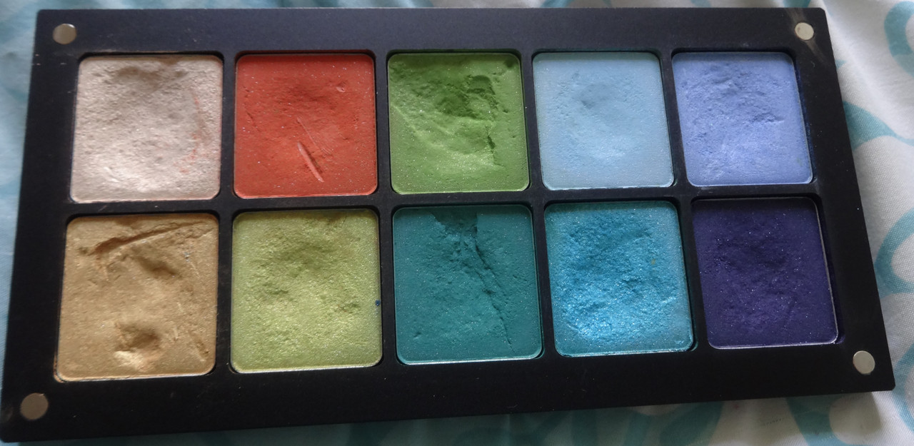
Would I buy these again?: You bet I would! Inglot offers amazing quality for the price.
Notes: I'll speak about the quality of the products before I show you more detailed photos of the colors, all of Inglot's shadows are incredibly pigmented and smooth. Their mattes are soft, buttery and blend like a dream. Their pearls are smooth and buttery too. Plus, Inglot has one of the most unique finishes ever, called D.S. or double-sparkle, these are matte shadows with pretty glitter particles throughout. I am in love. My only pet peeve with the eyeshadows is that they tend to be really dusty (when you pick them up), but there are some tricks to pick them up in order to cut down on how much dust they kick up. I did depot and move some shadows around, hence the un-beautiful dents and cracks some of the have. :/ Alrighty then, here comes the fun: 
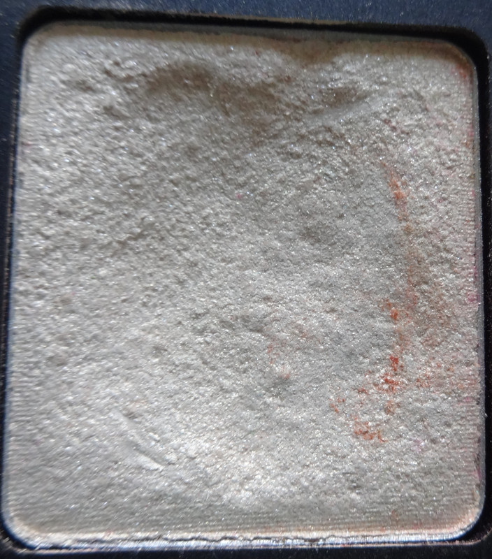
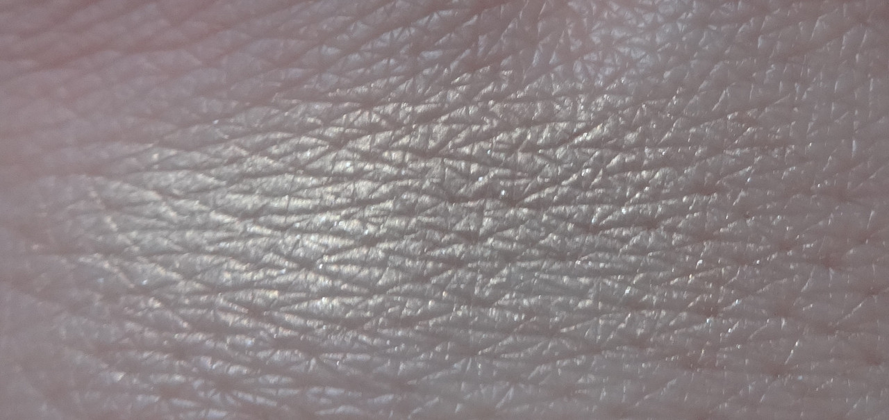
AMC Shine 30 is a beautiful cream tone, it appears white in the pan but has a very strong flash of white-gold to it. It's also got a very subtle pink glow and silver shimmers. At the time, I didn't have a color like this that had a good texture and this is wonderfully silky and buttery. It's a great highlight or lid-brightening shade.
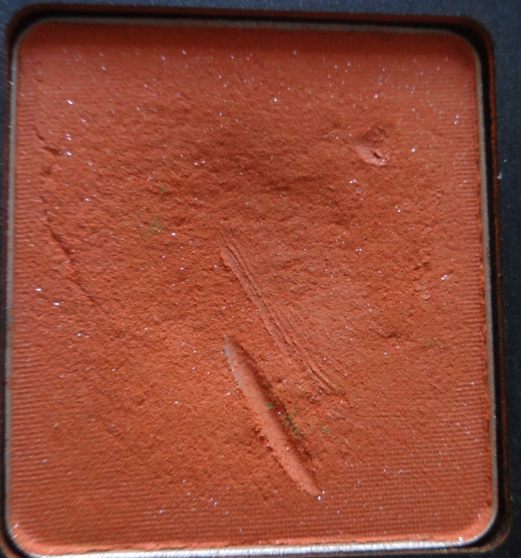
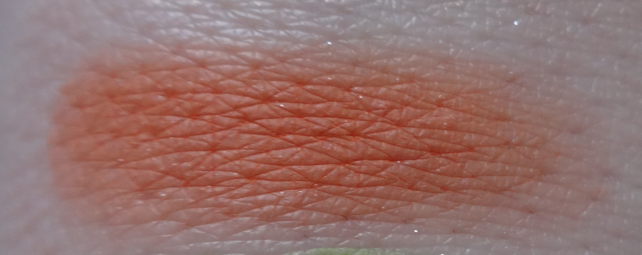
AMC 51 is an intense Sunkist/carroty orange. The base of it is matte and it has silver sparkles throughout. Although the sparkles are kind of prominent in the pan, they don't really show up on the skin.
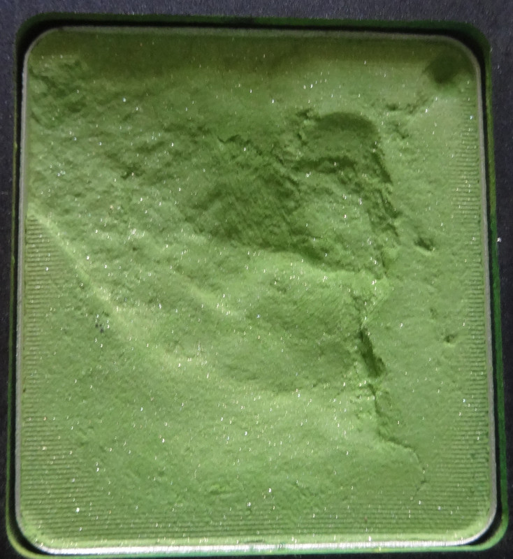
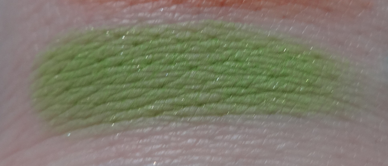
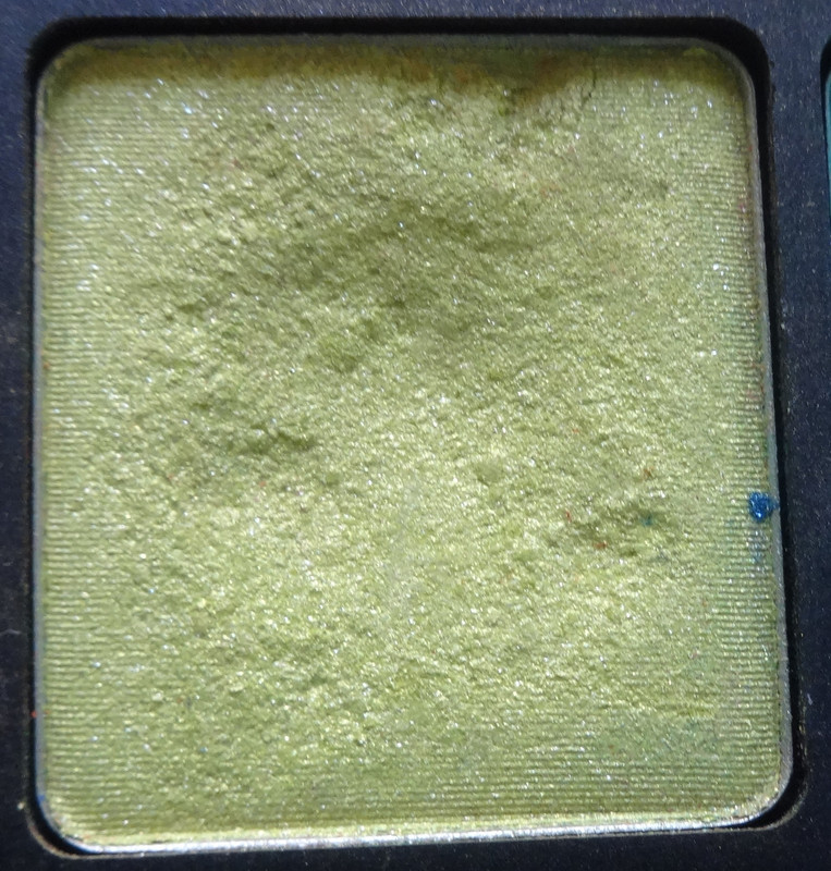
D.S. 477 is a beautiful matte chartreuse base that's loaded with golden sparkles. 
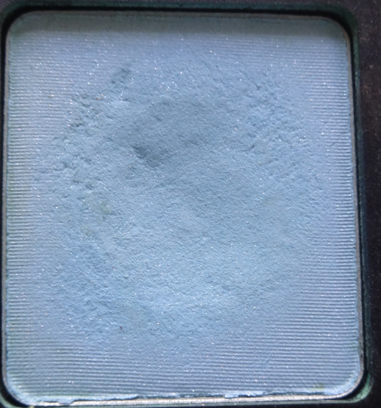
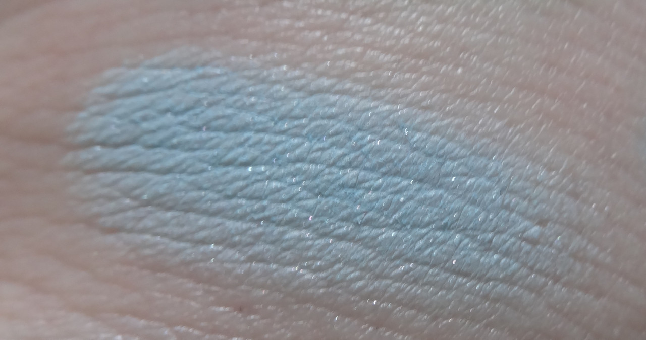
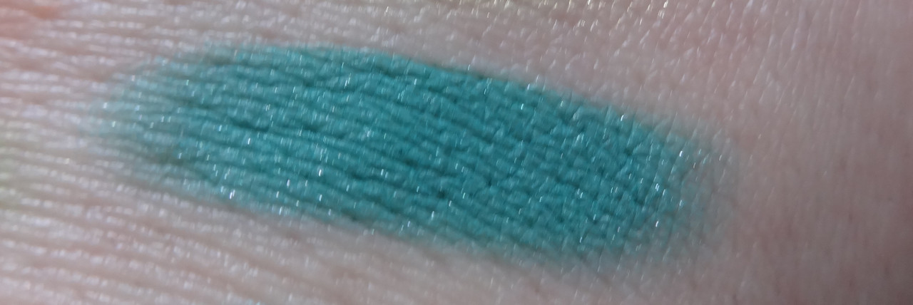
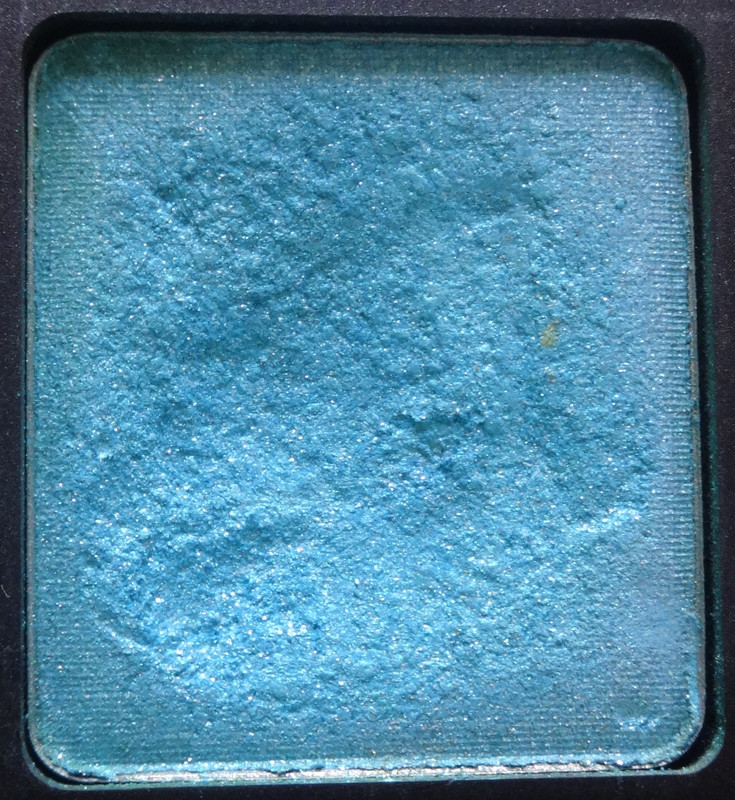
D.S. 478 is a beautiful matte, Cinderella blue with subtle blue, pink, and silver sparkles.
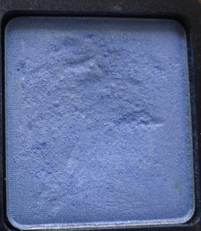
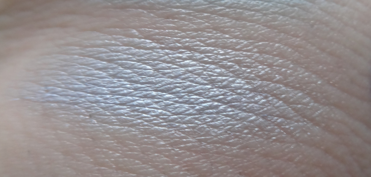
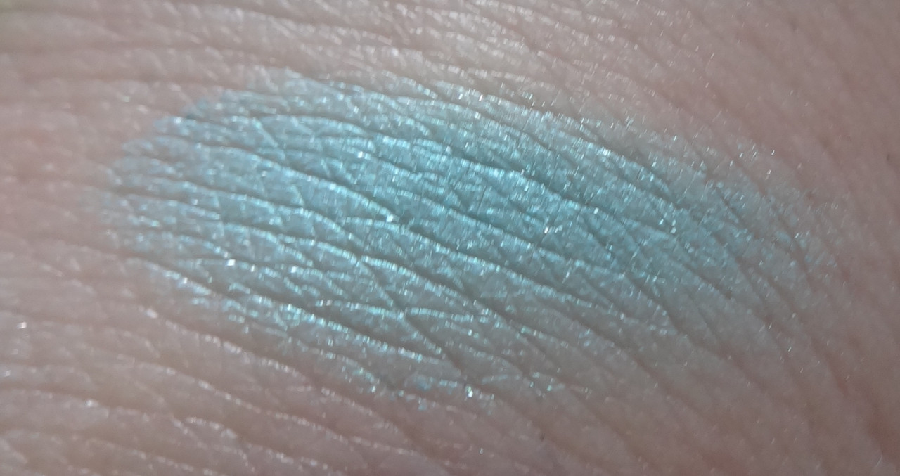
Pearl 429 looks very bland in my swatch. :/ In real life it is a gorgeous cornflower blue with a pearl finish. I really dig it, it's kind of a nice tranquil color that reminds me of the sky just after sunrise, when it's just turned blue... very pretty :3
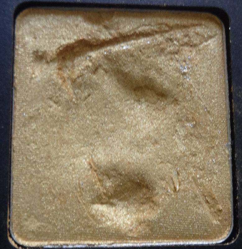
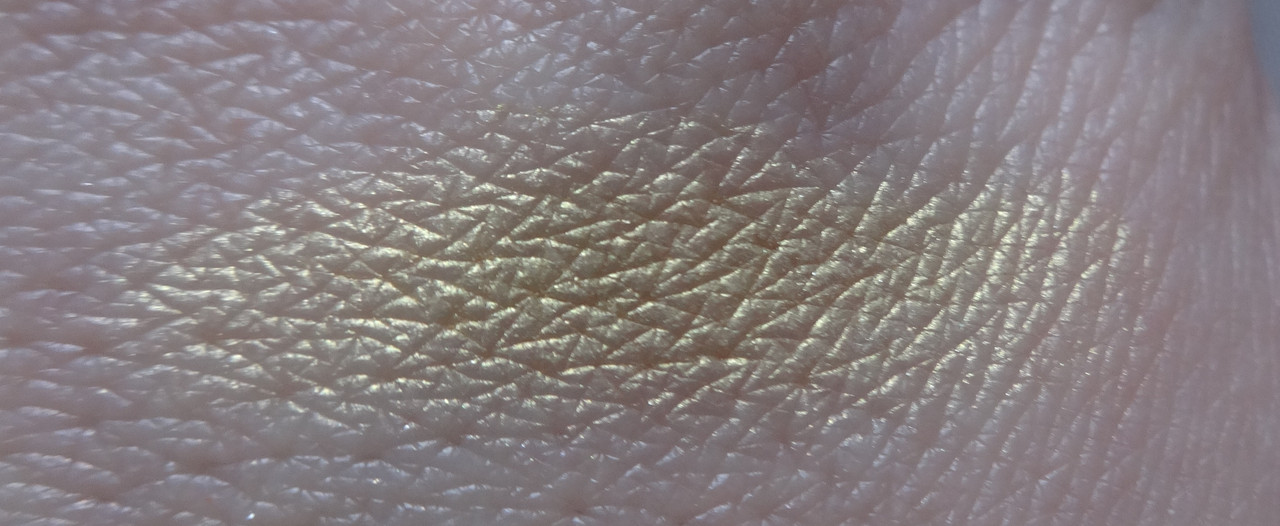
Pearl 403 is an intense pearly yellow-gold.
AMC Shine 41 is a pearly chartreuse that leans heavily yellow - in fact when paired with certain colors it looks more yellow or golden than green.
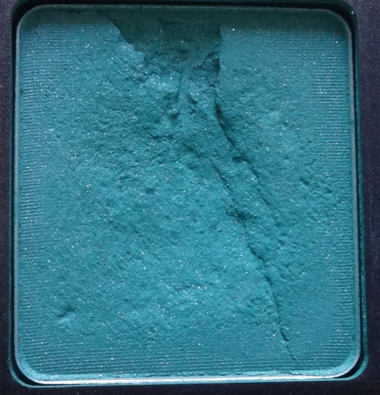
D.S. 504 is a deep, intense green-ish teal. It reminds me of seaweed for some reason even though seaweed isn't really this color. This has a matte base and has pretty silver and pink shimmers in it. :)
AMC Shine 05 is an effing stunning, amazing, gorgeous pearly teal that you can tell that I love xD There was a shade I got in a Too Faced palette that was very similar to this and I had a really hard time finding a good dupe. The thing is... I wanted the exact color, not something similar, because to me this is just so darn beautiful and I love how it kind of alters my eye color, making it seem warm and amber-red. Funny thing is, I brought it home, swatched the colors next to one another, and liked this one more... which hadn't happened up until that point. :P
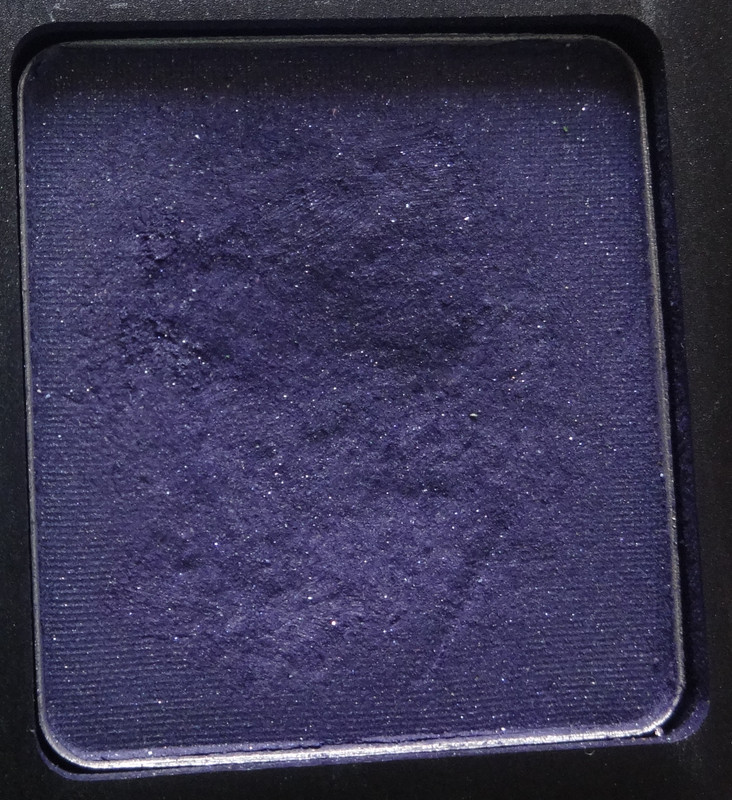
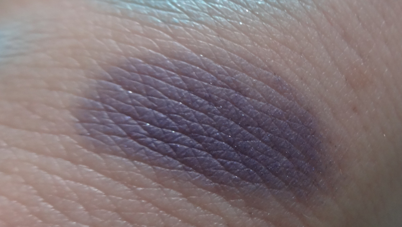
AMC 67 is a color I picked up because I wanted something dark and purple-y. This is an intense, dark matte violet (although my swatch looks watered down... this is mega pigmented :/) with silver, pink, and blue microshimmer. It photographed lighter than it is in real life. In real life it kind of reminds me of the night sky. This shade has been discontinued. 

Please let me know if you have any questions or comments. :) Thanks!

Disclaimer: Bought this all on my own with my own money, mhhhm.
Monday, May 7, 2012

Sugarpill Burning Heart Palette Review

Hey there :P So in an embarrassing turn of events I've been meaning to write up a review of this since November when I got it... and have used it in my looks of the week, but omitted writing a review. I can't say why, I just kept putting it off and forgot until now xD But the anticipation of the new Heart Breaker Palette kind of refreshed my memory :P Plus let's be honest, I cannot!!!! wait to get my hands on  Heart Breaker, it looks gorgeous. 
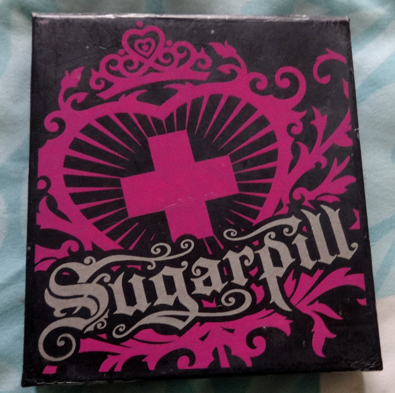
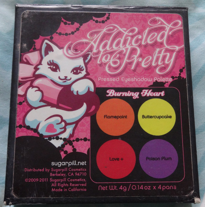
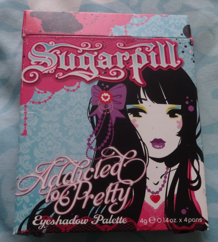
The outer packaging with artwork by Miss Kika - I think it would be so cute to say... put it in a cute frame and hang it up somewhere. One day I'll have a room cute enough to do that in! :P
Availability: Sugarpill no longer carries these palettes and the only colors still remaining for purchase are Flamepoint and Buttercupcake which retail at $13 for 3.5g (0.12 oz).
Notes:  I will start with the technical stuff and overall notes before getting into each individual color. First of all, I've heard complaints about the heaviness of the palette. Now, the reason it's heavy, is because it has a magnetic plate under it, which holds the shadows. Amy didn't have to add this and could very well have gone with a design where the shadows were glued in, but I love how thoughtful this is, you can switch out shadows between the palettes (or de-pot the individuals) so you can arrange or travel with them as you like. Personally, I don't really mind the heft, to me, it makes the palette feel more sturdy.
I've been lusting over this palette for quite some time and am so happy to have it because I love it, and to be honest, if I'm wanting to do a look with one (or more :P) of the shades included, I tend to reach for this instead of my other palettes, I mean the color intensity and quality are amazeballs! Plus I plain just love the packaging and this gives me an excuse to take a gander at it :P
Ok, ok, enough chatter, lemme show you the colors!
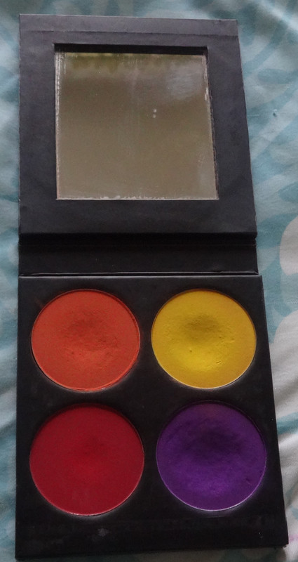
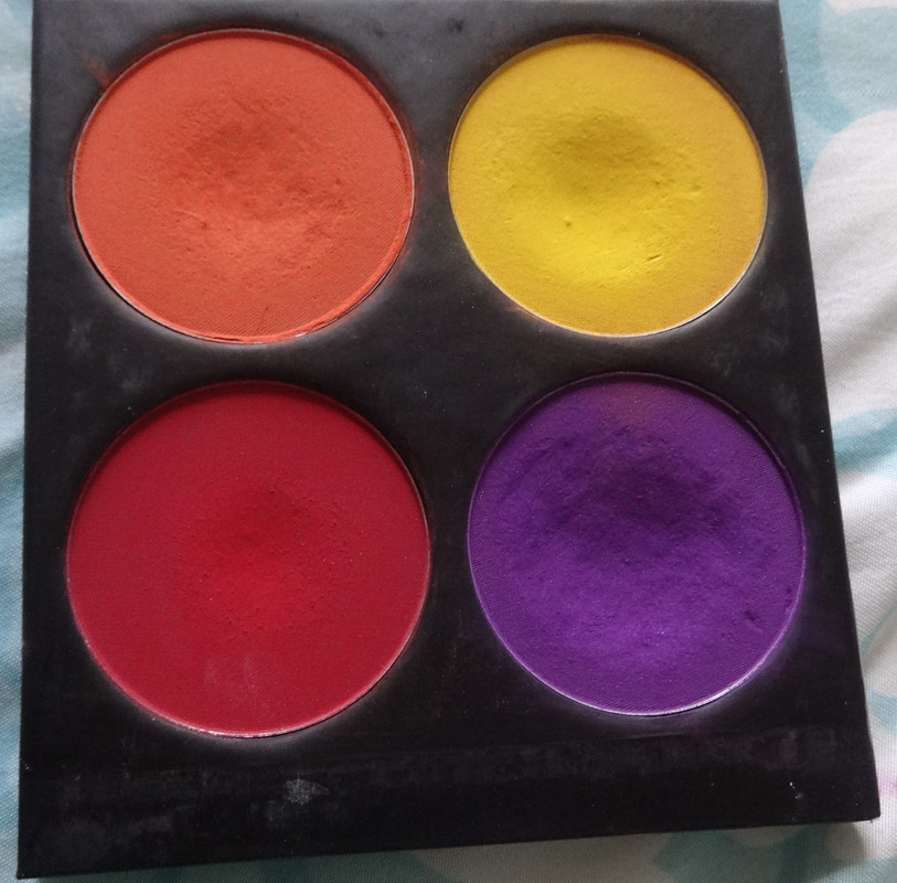
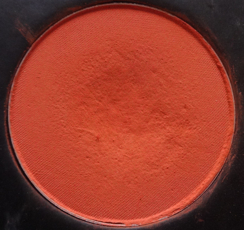
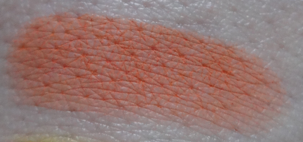
Flamepoint is a smooth intense tangerine-y orange. It appears matte, but has these very tiny silver flecks in it that aren't really noticeable, but are pretty :P
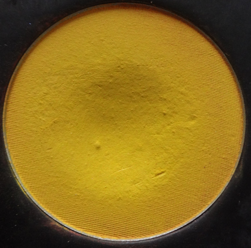
Buttercupcake is my favorite yellow ever! It's so intense, cheerful and happy! Although it's labeled a matte, and looks matte in daylight, it's a bit of a satin and has subtle pinky and silver shimmer to it. I kind of dig that it looks satiny in artificial light, I like when colors or textures have these subtle little things that make them cool and unique. :P

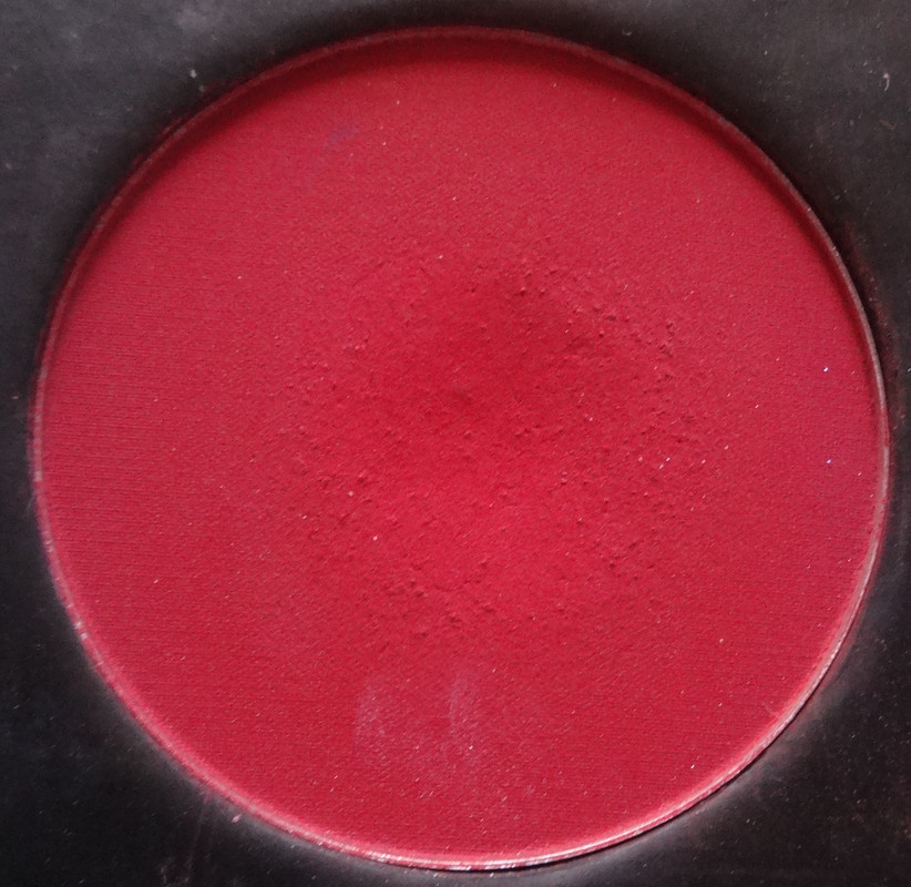
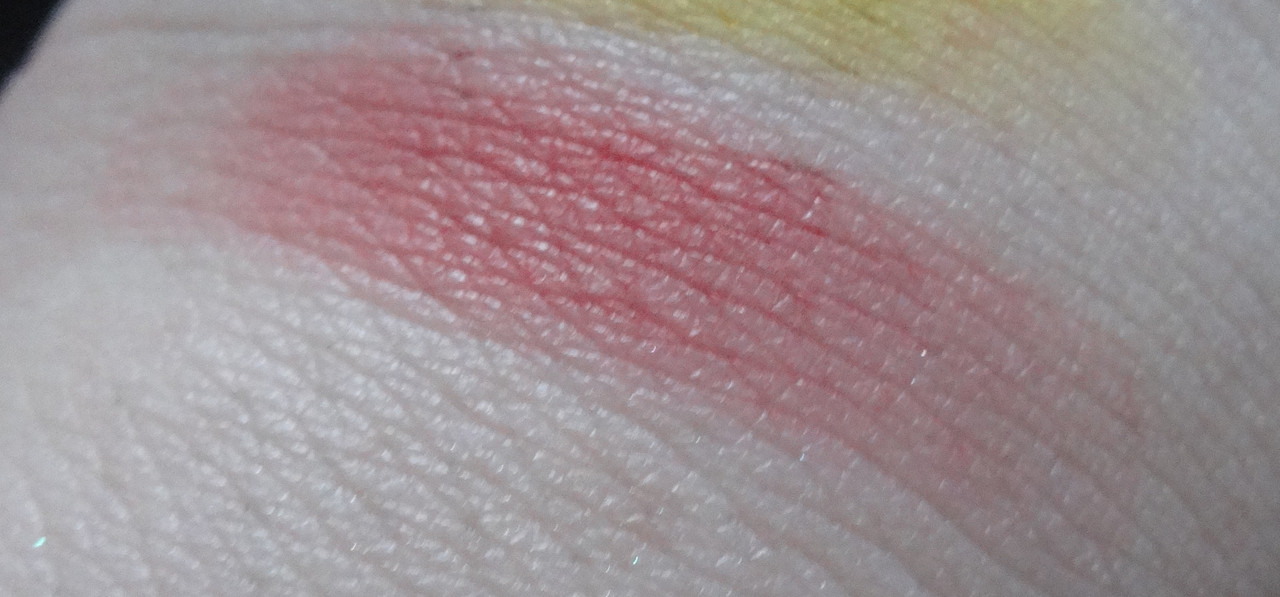
Love + is a beautiful matte red, this isn't a color I see myself using often because well... red eyeshadow still scares me (although I'm starting to embrace red lips and I've worn bright red eyeshadow out in public on a non-Halloween day and no one said anything or looked at me weird XD), but I'm sure I'll come up with a creative way to incorporate it into a look. :P If all else fails, I think this would make a beautiful blush, especially for someone with a darker skin-tone.
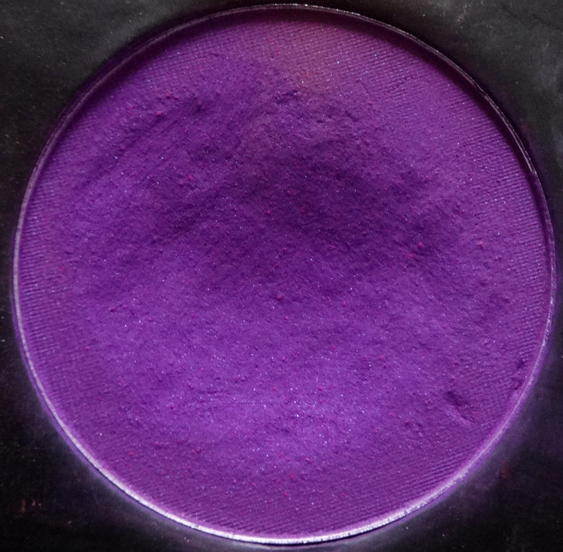
Poison Plum is another favorite - I am just obsessed with this shade of purple, it's so spring-y and pretty and kind of tranquil-yet-mysterious. I also like that it walks the line between being red and blue-toned, it kind of looks red-toned in the palette, but when paired with cooler colors it definitely looks almost more violet than plum, but that redness in it makes it kind of contrast and pop, whereas a more "true" violet might compete or lie flat. This is definitely a satin - it has beautiful violet and pink shimmers in it. While I adore the entire palette, I think that if you can't afford it, or are having a hard time picking out colors - this and Buttercupcake are must-owns. Plus they look amazing paired together, just sayin' :D

Please let me know if you have any questions or comments :)

For a review of the Sweetheart Palette please click here.

Disclaimer: I bought this using my own money.

Friday, May 4, 2012

OCC Jubilee Loose Color Concentrate Review

Hi folks :3 Today's review will be about another exciting little thing I got to play with and buy :)

Availability: Unfortunately, this has been discontinued.
Would I buy this again?: Absolutely!
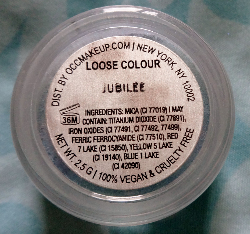
Notes: From hearing good things and my experience with the Lip Tars and their airbrush makeup (which I LOVE!!!!), I KNOW OCC is good stuff and while nearly all of their loose color concentrates are beautiful, Jubilee is what called my name. I really wanted to pick up at least one to play with and am so glad I got this :) Before I show you my swatches I'd like to mention that ALL the loose colour concentrates are 100% vegan, carmine and cruelty-free. They are safe for use all over the face and body, and can be combined with airbrush medium if you'd like to apply them with an airbrush. :)
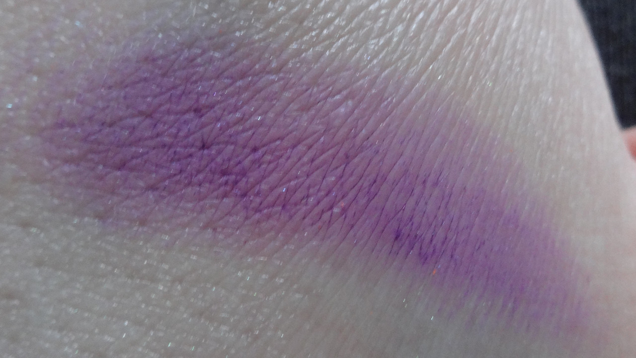
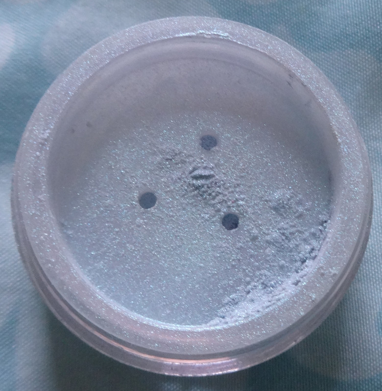
   The site describes Jubilee as a baby blue shimmer and to me, that's an understatement of what this shade really is. Jubilee is a beautiful baby turquoise with what I'll refer to as teal star-bursts - they're really shimmer/micro-glitter which give this shade a duo-chrome quality that shows up over a dark base and changes with light. This is a gorgeous shade for anyone that loves anything in the blue or teal range and I highly recommend it. This has a very smooth texture and blends easily. Alrighty then, drool over the gorgeousness.


 It's like magical ocean-snow :3
The order from left to right is: black base, dry, white base, damp.  I used lune+aster Dawn to Dusk Gel Eyeliner in Black  for the black base and Sephora Collection Let It Snow Colorful Shadow & Liner for the white, the far right is swatched wet.

Please let me know if you have any comments or questions :)

Disclaimer: Bought this myself :)  

Monday, April 23, 2012

JulieG Nail Color Review: Mermaid's Tale and Kickin' It

Hi folks :)
Availability: These polishes have been discontinued.
Would I buy this again?: You bet!
Notes:    I'll show each color individually and speak about each a little. In terms of application - each color was very easy to apply. The ones with glitter flecks in them aren't chunky at all, and feel smooth on the nail - this will most likely mean they're easier to remove than typical glitter polishes. In addition, nearly each color was opaque in two coats, I was skeptical because with the first coat, most looked streaky and sheer, which had me worried, but the second coat seemed to fix that issue. Maybe I just did a really thin first coat, who knows. :P Without further ado, here come the actual colors:


My nails with 2 coats of polish, all nails have Orly Won't Chip, Chip Resistant Topcoat on.
Mermaid's Tale is the perfect mermaid color (I would know, I'm a mermaid) a beautiful teal base with tons of gorgeous teal shimmer, it's almost jewel-like and reminds me of the ocean. If you like teal even half as much as I do, you need this!


My nails with 2 coats of polish, all nails have Orly Won't Chip, Chip Resistant Topcoat on.
Kickin' It is my favorite shade of turquoise, I believe this is the color that Jesse helped formulate, and I really adore it. If Mermaid's Tale is like the ocean, Kickin' It is like the sky on a clear day (which reminds me of an awesome Oceanlab song - Youtube "On A Good Day") - it's both calming and incredibly cheerful (like the song! :P). To me, this is another one of those top colors to get, especially if you like blues or teals.
 
Please let me know if you have any questions or comments. 

Disclaimer: I bought these myself.