Monday, October 7, 2013

Eyeshadow Review: Urban Decay Zodiac Moondust Eyeshadow

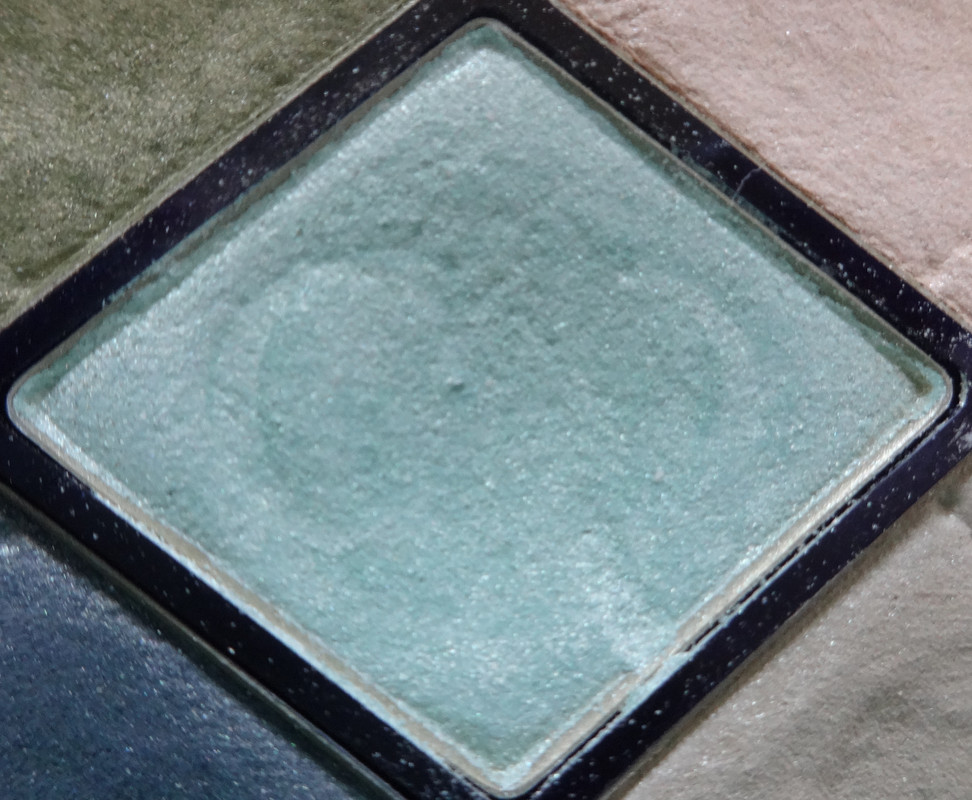
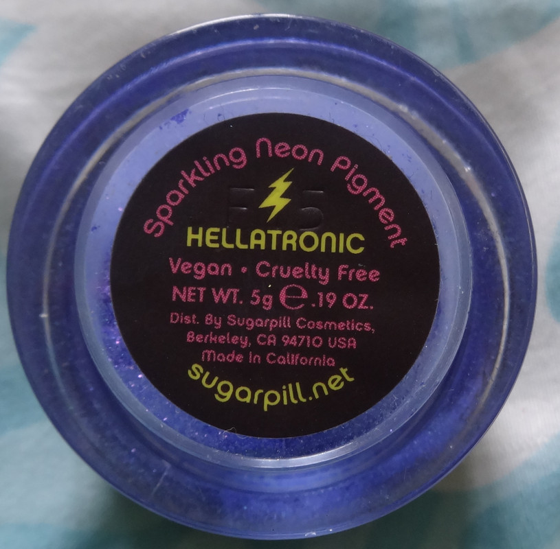
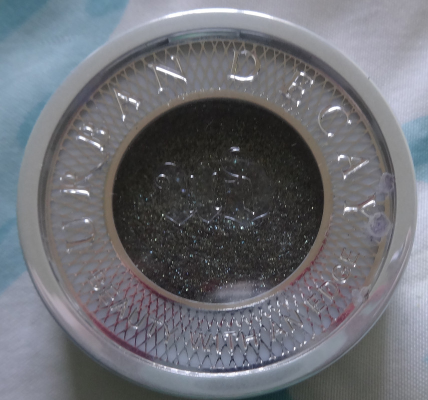
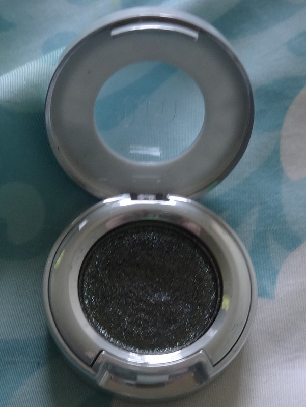
Today I bring you a review for the lovely Urban Decay Moondust Eyeshadow in Zodiac
Availability: This retails at $22 for .05 oz and can be found at sephora.com, macys.com, jcpenney.com and ulta.com as well as their respective store locations. You can also get it on urbandecay.com.
Would I buy this again? Possibly.
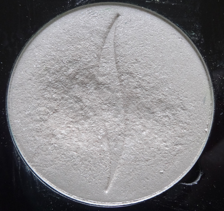
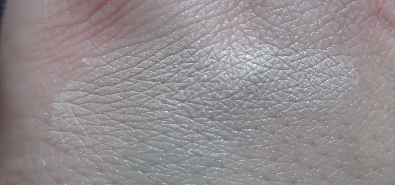
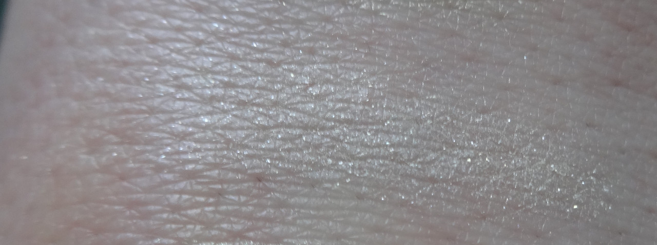
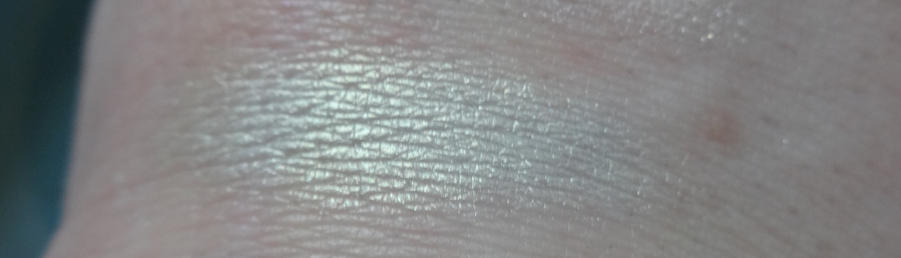
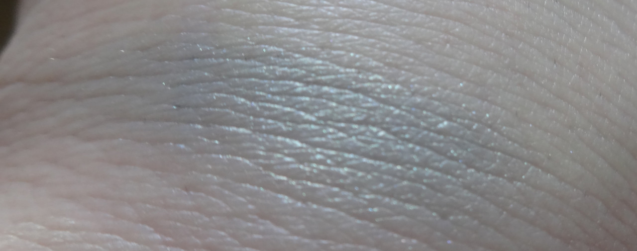
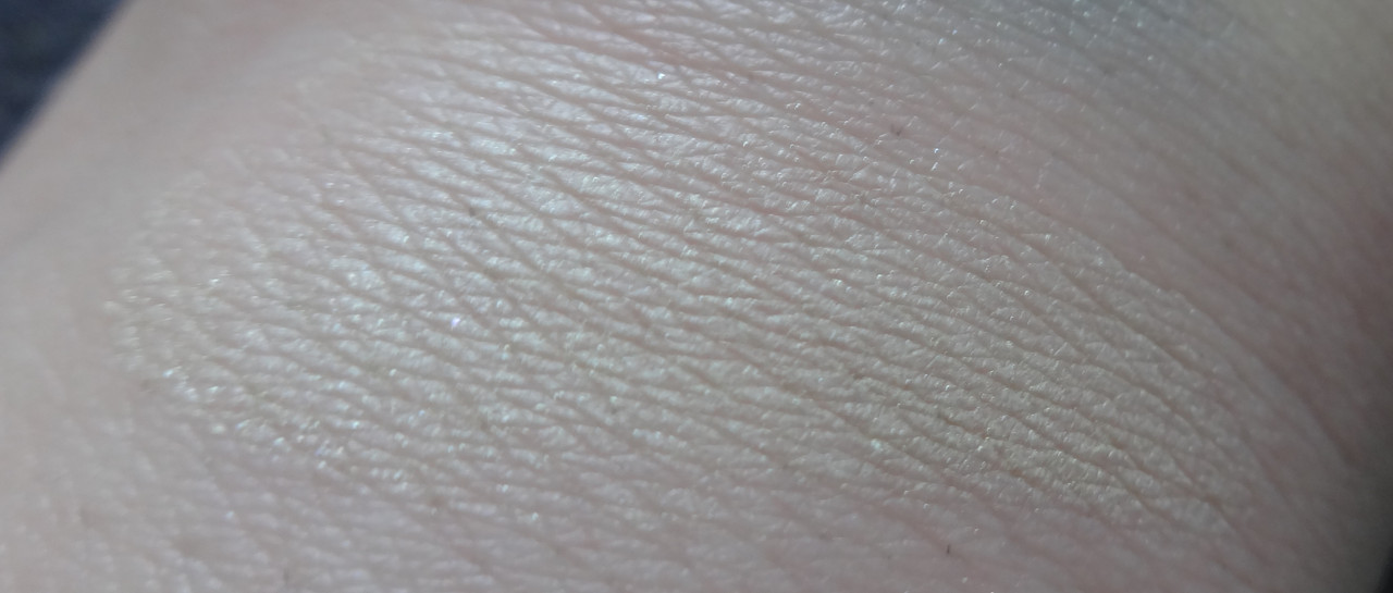
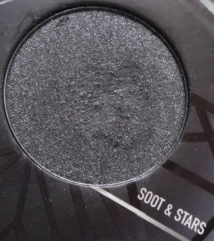
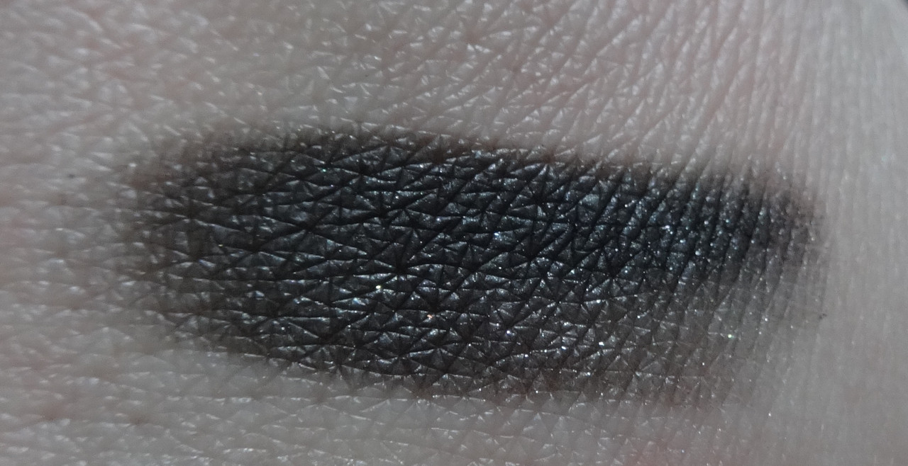
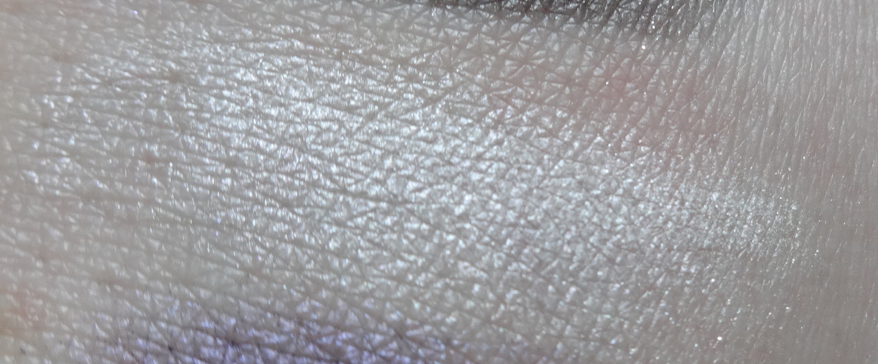
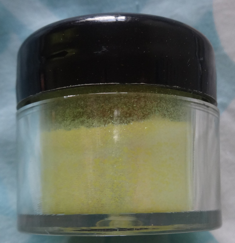
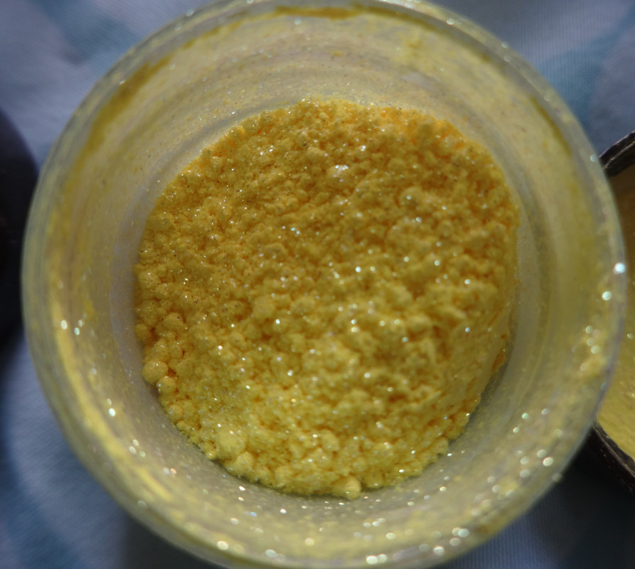
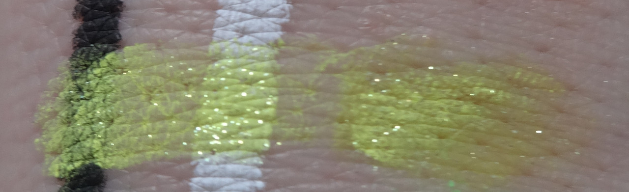
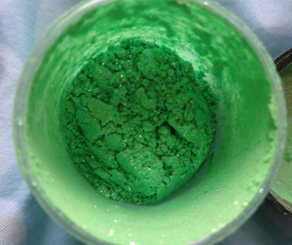
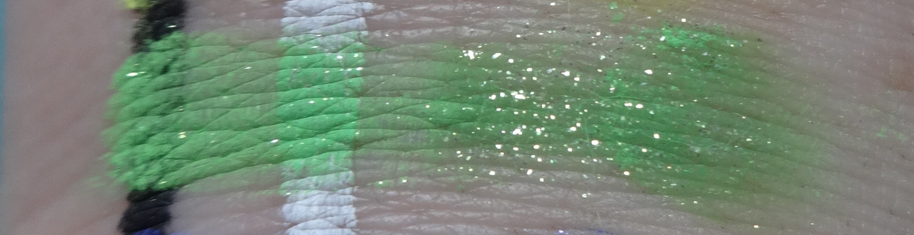
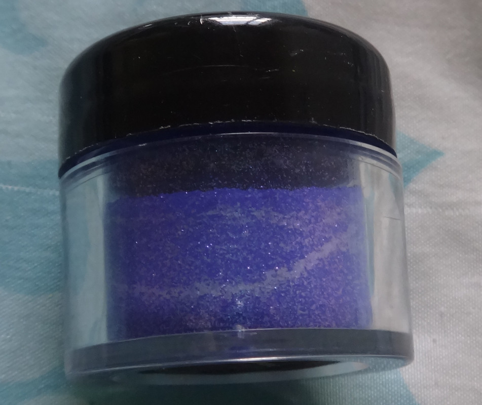
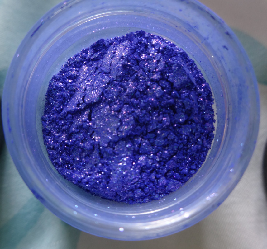
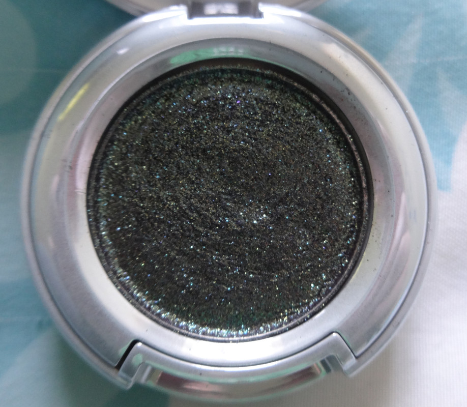
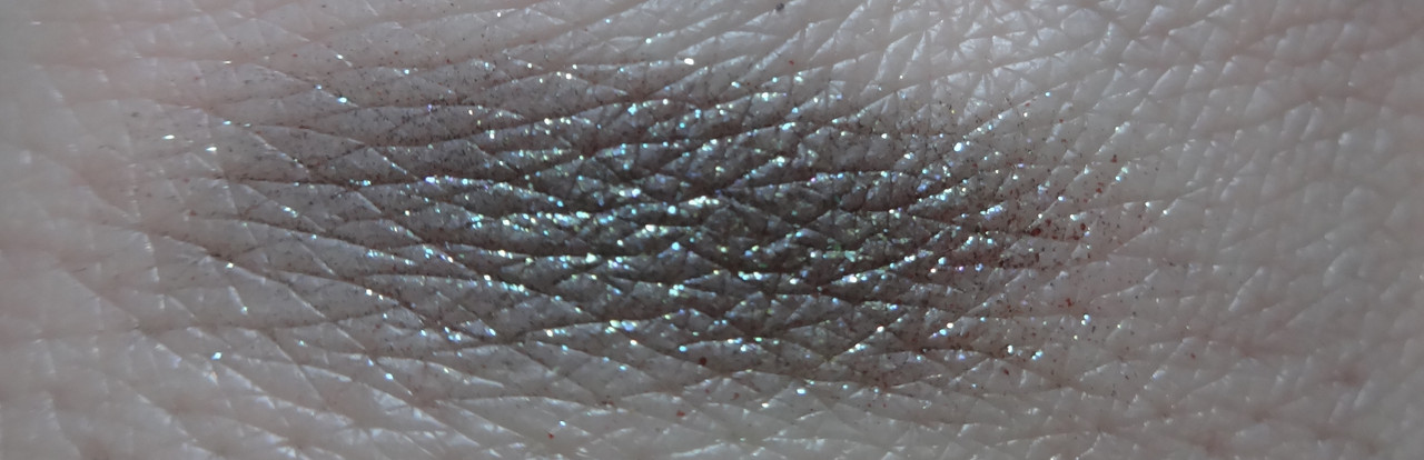
Notes: In terms of color this is described as a smoky black with blue-green shift and blue-green 3D sparkle. I honestly don't see the shift in the actual shadow, which is smoky black. But the sparkle is a gorgeous teal interspersed with chartreuse and gold. It's almost like the night sky meets sunlit ocean depths meets peacock. It's beautiful and speaks to me although I don't use it as often as I'd possibly like. Honestly I like shadows like these and think the effect is pretty but this was the only one that really spoke to me enough for me to buy it. It has a really cool texture where it's a shadow interwoven with micro-glitter. What's different about this versus shadows that have bits of glitter in them is that the glitter here is more consistent throughout as you can see in the photo above - no random chunks here or there, so it almost looks like a foil. For best results with such consistencies I suggest using a stickier eyeshadow base or primer (NYX Jumbo Pencils would be a good option) and patting the eyeshadow onto the lid with a fingertip for maximum glitter/color impact. I find that if you use something like this with a brush it goes on rather sheer and a lot of the glitter gets lost. :/

Please let me know if you have any comments or questions.

Disclaimer: I paid for this myself. :3

Sunday, October 6, 2013

Eyeshadow Review: Sephora Colorful Collection First Glance

Sephora Colorful Collection Eyeshadow in First Glance

Availability: This has been discontinued.
Note: Despite all the long-last claims - 10 hours on the shimmers and mattes, I believe and then 8 on the glitters and 6 on mirrors - or perhaps I've got the mirrors and glitters mixed up here, either way; I suggest the use of a primer. Not only to prolong wear but to enhance the color and application of the shadows. It's a crime not to prime - ESPECIALLY the eyelid area. Just sayin. In addition, the eyeshadows can also be used wet for more intense pigmentation. I haven't really tried them wet so... I mean, I don't mind ruining the testers in the store because well... clients will ruin them anyway, but I don't want to ruin mine by getting them wet. I have seen them used wet though and yes, they do go on more intense that way. Not too sure if they'll form a crust though. The testers haven't. :P I think that if you're not a person who likes pre-made palettes or are often unhappy because you use up only certain colors in a palette then this is for you because it gives you control over what you put in your palette.
This particular color is described as a beige glitter. I think it's a tad more complex than that. I'd describe this as a pastel taupe with silver micro-glitter. I'm always looking for this kind of shade for a softer smoky eye and it's kind of what I wanted? There's this color I've been lusting after that's like this very soft purplish-grayish-taupe-ish color. Or at least that's how it appears on other people and I got to thinking that I've only seen such a color on people of medium to darker skin-tones and it could possibly be a color similar to this that goes ashy on them and makes it look... idk... grayer than it is, but it's pretty so it's not ashy in a bad way? Anywho, I like it ok and it serves its purpose but I'm not sure if I'll be repurchasing.

Overall, I think that if you're in Sephora, these are worth checking out.

Please let me know if you have any comments or questions.

Disclaimer: I paid for this myself. :3

Saturday, October 5, 2013

Eyeshadow Review: Dior Peacock 5-Colour Couture Eyeshadow Palette

Today I'll be reviewing Dior 5-Colour Couture Eyeshadow Palette in Peacock
Availability: This has been discontinued.
Would I buy this again?: I'm not 100% but I do really love this palette.
Notes: I'll describe each shade individually, but here's some notes on the product itself. Now, I will say that what makes Dior eyeshadows... most luxury eyeshadows... special is the pearlized effect they have that it seems cheaper shadows don't. When the light hits them just right they light up like a prism, you can see little bits of green and pink and silver along with the base color and it's... glorious. Just glorious. It's like... you have a crush on someone and like them from afar (cheaper shadow) and then like... you find out your crush likes you back... and you kiss and it's magical (luxury shadow). Let's not kid ourselves that there's something wrong in the way I just described what the eyeshadow is like... and yet.. that's what it's like! The color payoff... it takes just the gentlest touch for it to yield lots of pigment. It FEELS luxurious. Plus the packaging doesn't hurt it at all... not even a little. The texture is mega silky. I love, love the packaging also. I love navy to begin with, it has a regal... mysterious feel to it. I love the beautiful iconic navy packaging with the CD in it.
This particular palette had been introduced to me by my lovely coworker... let's call her Diora (I'm SofYSLa btw) and just... it's so ME. I've been really obsessed with the color mint and quilted things lately so this was up my alley with the quilt print on the shadows. I really loved the second palette in the Dior Peacock collection but Sephora didn't carry it and... I really didn't want to spend another $60. I did see it in person though and it's gorgeous, it leans far more blue than this one does. I love mermaid colors and while this, to some degree, represents a peacock, it's somewhat mermaid-esque also. I also really like how the colors in the palette are all soft, they're a good way to play with color and a luxury brand without feeling like they're too bright or overwhelming. This is a palette I bust out when I want color that isn't so in-your-face.
This is the color on the top right corner of the palette. It's a soft limey chartreuse.
Upper-left corner.  It's a very soft, white peachy shade with a hefty dose of silver micro-glitter. The glitter is the only thing that really shows up on my skin and I'm thinking it's because this color is basically my skin-tone with shimmer in it.
Center. Um... this is the shade that made me want the palette. Firstly, just looking at it, it's the PERFECT mint as far as I'm concerned - I like my teals/mints leaning somewhat blue-ish, this does but without being too blue, and it has this gorgeous golden shift to it that I just... it just makes it magical and mermaid-like, it's like a beam of sunlight below the water's surface. Beautiful.
Lower right - deep, yet not dark, oceanic blue-teal. Mermaid. Beautiful.
Lower left corner - very soft, almost white, khaki with a subtle green shift. Beautiful yet soft color. Makes an interesting highlight shade.

Please let me know if you have any questions or comments.

Disclaimer: Paid for this baby myself.

Sunday, September 15, 2013

Sugarpill Cold Chemistry Collection Palette Review

Um so folks... here is the palette we've been anticipating for a YEAR now. Cold Chemistry :D A beautiful fall-appropriate smoky goodness of a palette featuring signature charcoal and two lovely bursts of color along with a white. Are you excited? I know I am!
Let us first take a look at the exterior packaging:
The mirror is pretty and edgy looking but not particularly functional... I'd rather use another one as I'm applying my makeup. 
Availability: This palette and all the shadow shades have been discontinued. 
Notes: Alright so... this palette was made in collaboration with Amy's friend Amelia Arsenic. It's a bit different in its aesthetic - darker, sultrier, deeper. The rest of the colors we've seen so far in Sugarpill have all been bright and cheery and this is almost like its dark side. On top of that, we've seen a lot of mattes and satins in the pressed shadow formulations whereas all four shades in this palette are pearlized. They're beautiful. However, I wish it contained a matte highlight because the white in it is too intensely pearlized to work well with the other three colors as a brow-bone highlight unless you like a very sparkly brow-bone.

Ok, ok, enough chatter, lemme show you the colors!
Soot & Stars is a rich blackened charcoal (it looks more charcoal-ish when blended out or used with a fluffy brush but darker if packed on) with noticeable silver pearl. It also contains pink and turquoise pearl which isn't so visible.
Diamond Eyes is a very pearly intense white with a hint of a pink - I like it as a highlight for the inner corner but imagine it'd be nice on the lid or below the eye as well.
Elemental Chaos is my favorite color in the palette - which should surprise you because you know how I love my teals. It's a beautiful deep, dark, blue-based violet purple with a blue shift. Have you noticed a trend of me just buying and buying these types of colors this year? Love 'em with brown eyes.
Subterranean is a blackened green-based teal with turquoise pearl. I wish it had more blue in it. Le sigh. 

Please let me know if you have any questions or comments :)

Disclaimer: I bought this using my own money.

Sugarpill Elektro Cute Sparkling Neon Pigment Review

Alright, if you know me, you know Sugarpill gets me uber excited because the wonderful Amy Doan shares my love of all things girly, frilly, and bright. Thusly I bring you a review of Sugarpill's newest products tonight.

In this particular post I will be featuring the Elektro Cute Sparkling Neon Pigments and my suggestions as to how to wear them and best practices. I bought all the colors sans the pink because the pink was sold out when I ordered them. I don't think I'll be picking it up though. But before that, let's take a look at some of the exterior packaging cuteness. 

Availability: These have all been discontinued.

Notes: Firstly let's start off with packaging talk. These are packaged very similarly to the loose pigments Sugarpill carries - the Chromalusts the main difference being that these are filled to the brim with product. That said, both contain 5g of product. A vast majority of bloggers have suggested NYX's Jumbo Eyeshadow Pencil in Milk as the ideal base for this. I decided to try these with Too Faced Shadow Insurance - Glitter Glue and yo... the stuff works. I mean look at the swatches - it keeps the pigment and glitter in place. Try it. Ask for a sample. It being a clear base versus a white like Milk means that it won't alter the colors. There will still be fallout though so I suggest doing your eyes before the rest of your face. Speaking of, these are technically not FDA-approved for the eye area so apply at your own risk. I haven't had an issue. In addition to that, I find these work best in applications of patting, rather than anything that requires blending. They don't blend or move around well. They sit in place well provided you pat them on a sticky base. Using them as crease colors has proved to be a poor endeavor for me as they either don't want to blend out properly or fade significantly throughout the day - neither of which I experience on the lid.

Ok, ok, enough chatter, lemme show you the colors! For all color swatches I used lune+aster Dawn to Dusk Gel Eyeliner in Black  for the black base and Sephora Collection Let It Snow Colorful Shadow & Liner for the white, the far right is swatched over Too Faced Glitter Glue Shadow Primer.
Hi-Viz is a bright lemony canary yellow with multi-sized gold glitter with a silver-ish shift.
Supercharged is a coral-kissed orange with the same glitter that Hi-Viz has. It is the least pigmented of the bunch and the one that requires the most work to look nice. I probably would've skipped it if I knew how much work it'd be.
Sparkage is a beautiful grass green with the same kind of golden glitter that the other two contain. It's so pretty - a marriage of chartreuse and grass green. I kind of want to eat it and hope it tastes like green tea powder. But it won't! Don't eat neon pigment folks.
Hellatronic is my favorite of the bunch. It's the most pigmented on its own and is the only one that responds to any sort of blending (although this makes it fade throughout the day... but alas). It's a royal blue with just a kiss of purple and contains magenta and silver glitter that has a bluish shift (or reflects its blue-ness... I'll never know!) 

Please let me know if you have any questions or comments :)

Disclaimer: I bought this using my own money.