Availability: This has been discontinued.
Would I buy this?: Let's just put it this way - I have similar colors but if I didn't I could justify buying it for myself.
Notes: First of all, a huge thank you to my beautiful wife for getting me this palette. She... I cannot... Firstly, she didn't have to give me anything because she's so wonderful to begin with, she makes me laugh and feel loved every day. :3 Gah I feel all warm and fuzzy talking about it and then like... I have Tip Of The Iceberg by Owl City playing and gah... I wanna get hot chocolate and go on a date in cozy sweaters and cuddle and I'm going off on a tangent.
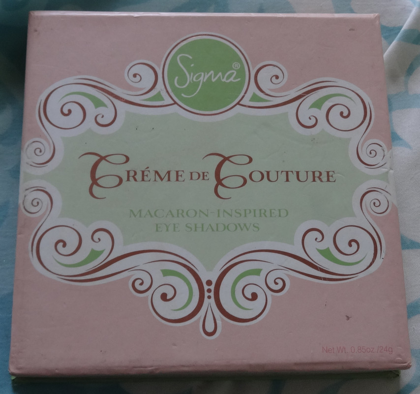
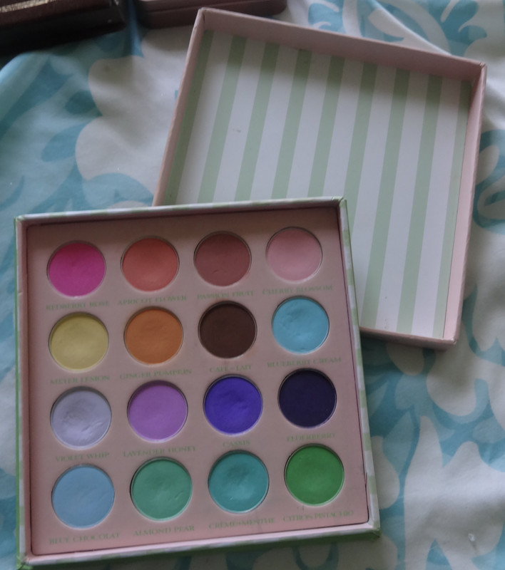
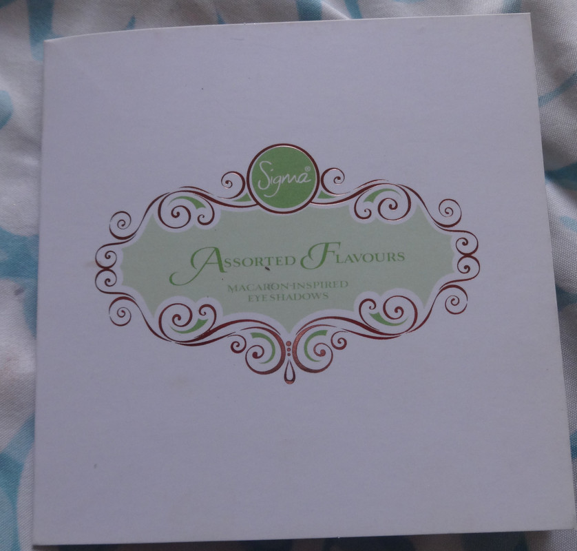
I'll speak a bit about the packaging before I show you the shades - firstly, I love the attention to detail (there will be pictures). It's super cute and looks like a candy... or a very tiny macaron-box.
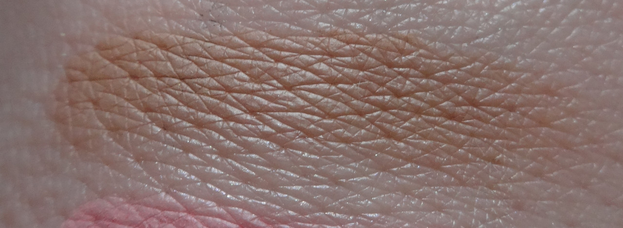
Ok let's speak a little bit about the shadows themselves before I get to individual color reviews. Uniqueness is key here - firstly who has a palette of ALL MATTE shades that are colorful and secondly who has a palette of these cool pastel-yet-bright colors. Just to let you know the colors are not as vivid as they appear in the pans - especially most of the darker colors because they're meant to be pastel - like macarons. To get maximum color concentration I suggest applying these shadows over some sort of white base. They all have a smooth buttery texture that glides on easily and unlike some other mattes, these aren't dry at all so they not only glide on but also blend well together - for the most part.
Ok onto the fun part, swatches! :D
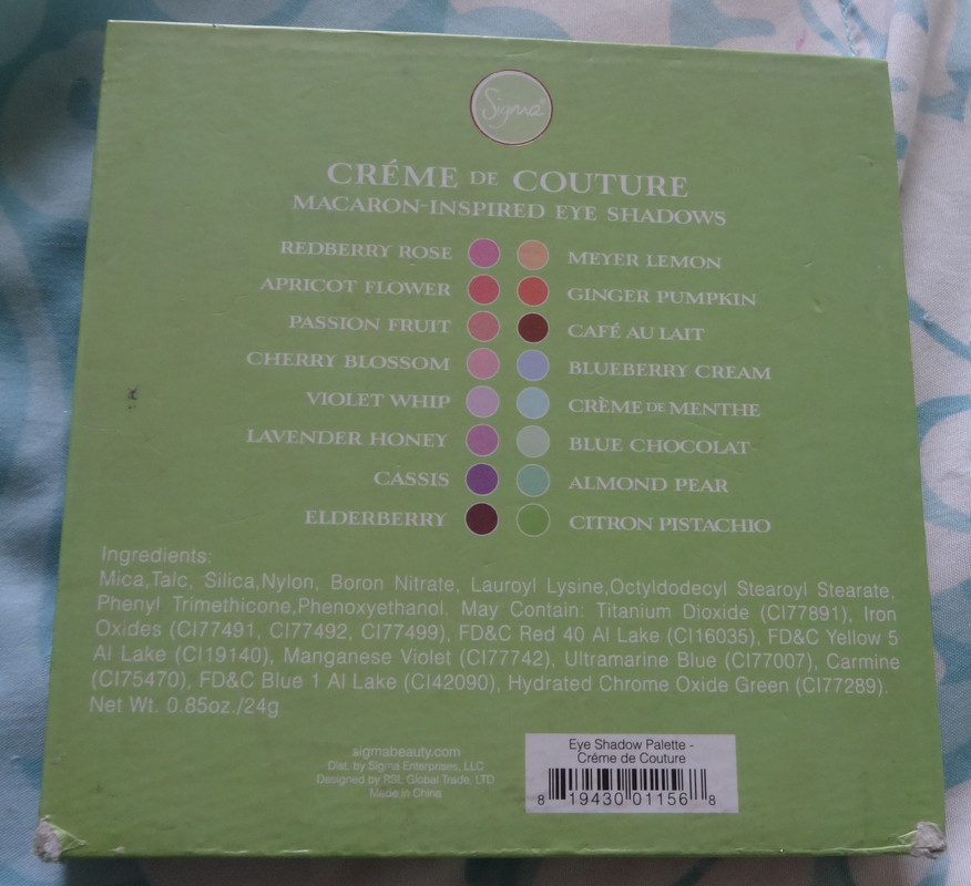
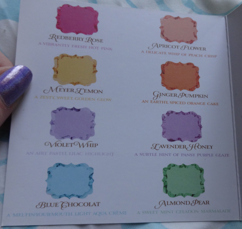
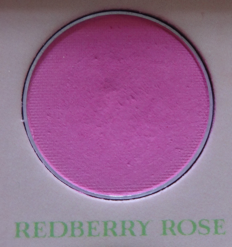
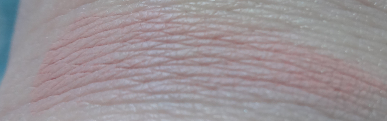
Redberry Rose is a very true fuchsia shade. I like that it looks soft on the eyes when worn and will brighten without making the eyes look bloodshot.
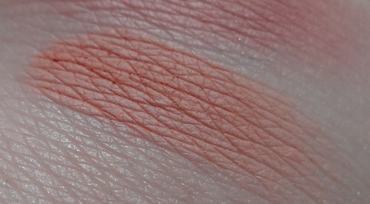
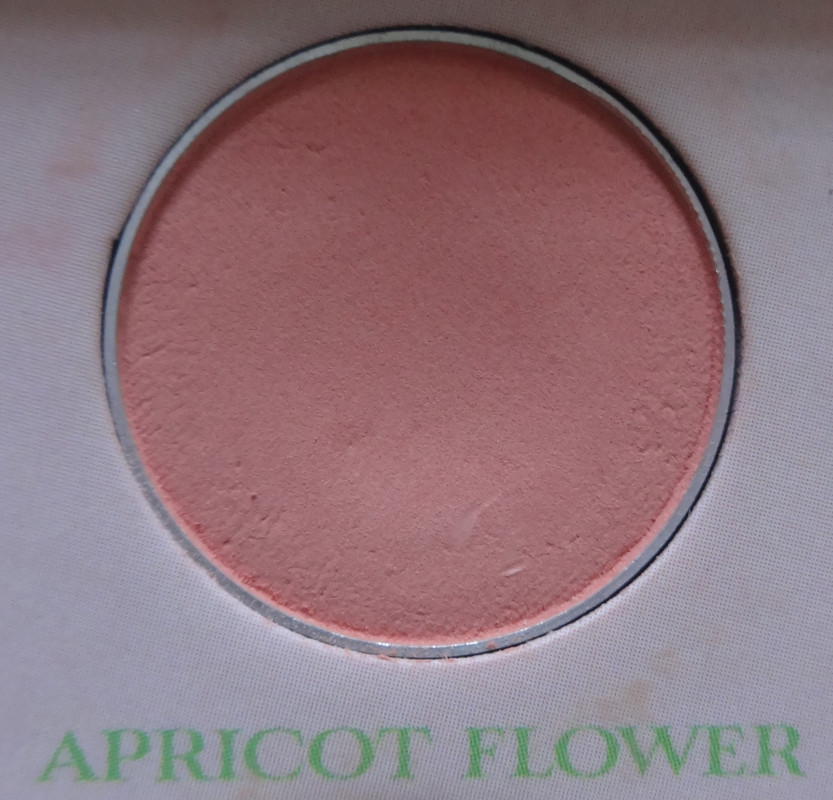
Apricot Flower is exactly what it sounds like, a soft apricot with a kiss of sunshine to make it rosy.
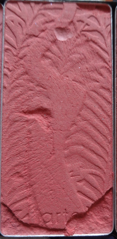
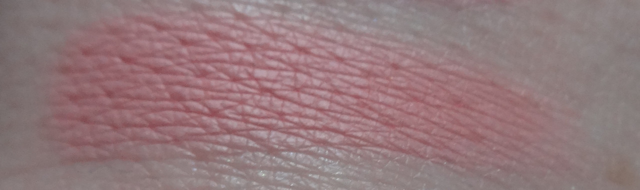
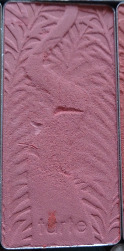
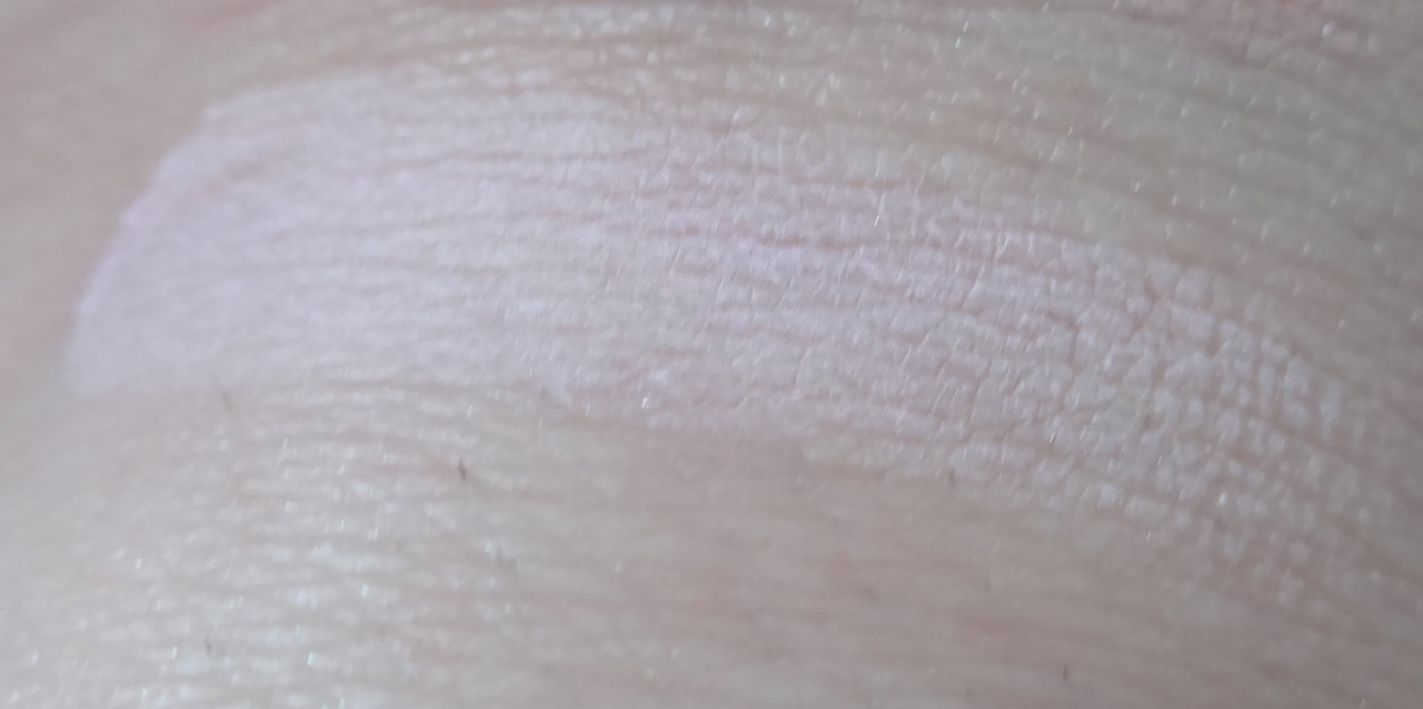
Passion Fruit is not the color of a passion fruit but is passionate about being a fruit. I'd describe it as a dusty rose. In fact looking at this, I think the entire top row can be used as blush/highlight colors depending on the skin-tone.
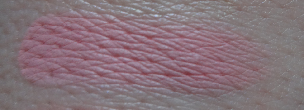
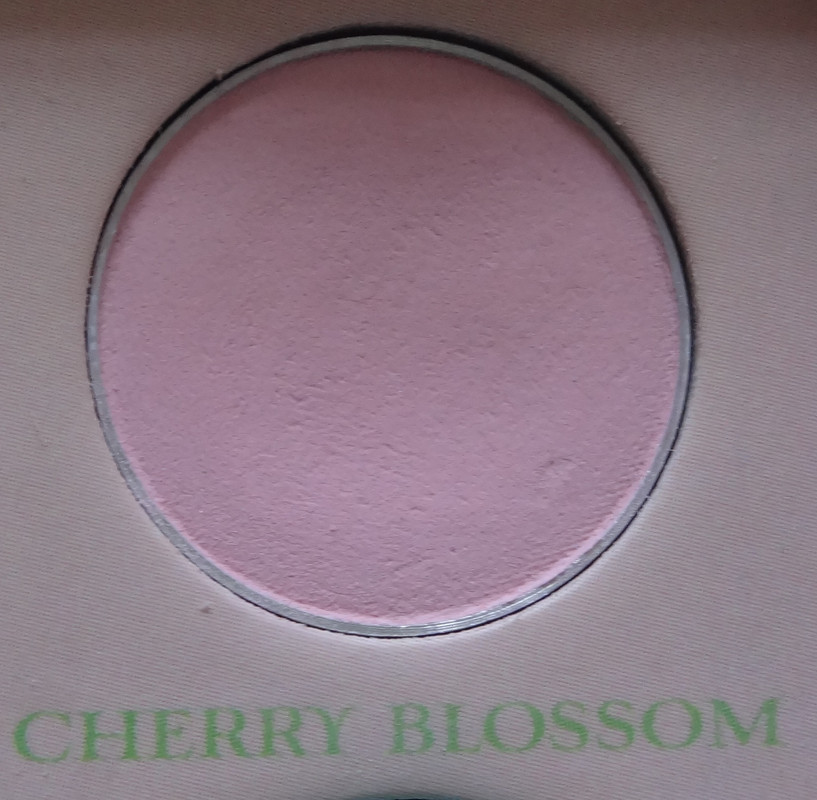
Cherry Blossom is a heavily whitened pink. It's a lot lighter than I initially though HOWEVER that makes it a beautiful highlight shade. It adds a nice brightness without being obviously pink. I was going to complain that this palette had no highlight shades and was I glad to be wrong. To me, highlighting is essential and I dislike the thought of carrying multiple palettes whilst traveling because a palette is somehow "incomplete."
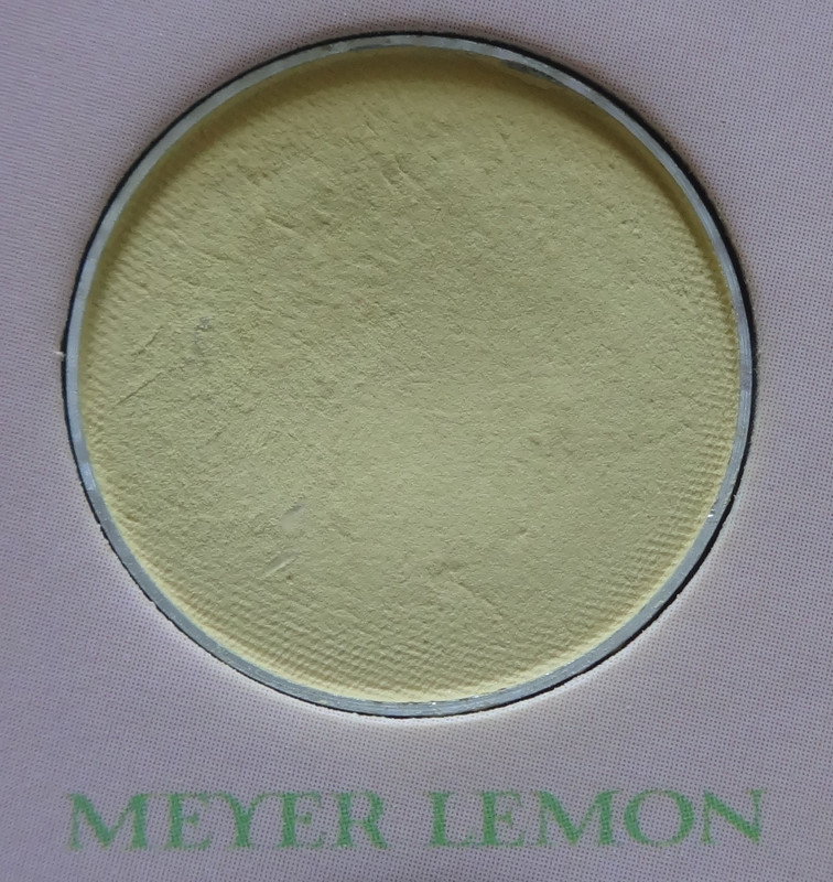
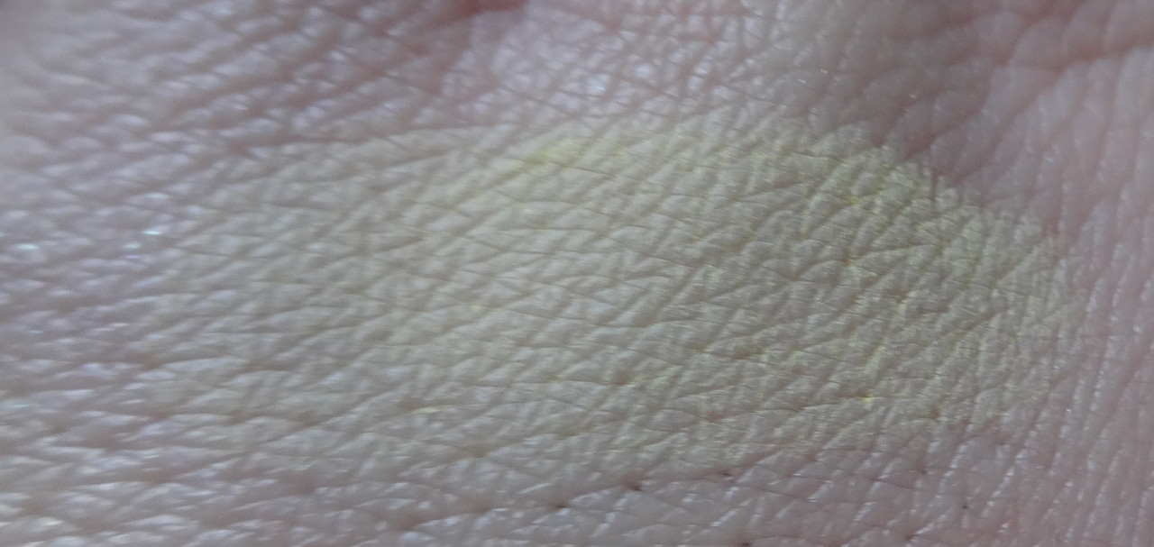
Meyer Lemon is a soft buttery pastel yellow. It looks like very rich, fatty butter.
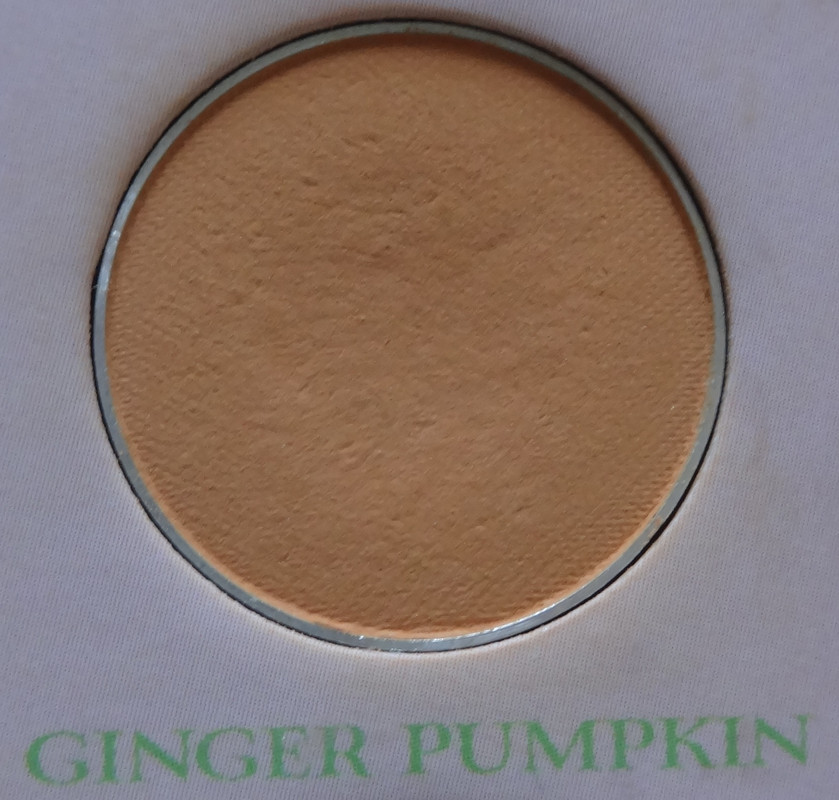
Ginger Pumpkin is actually one of my favorites in the palette it's a really pretty soft orange. It's not pastel - it has no whiteness to it, which is good because it won't go ashy on a darker skin-tone. Plus it's just plain pretty.
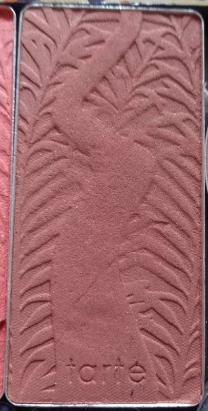
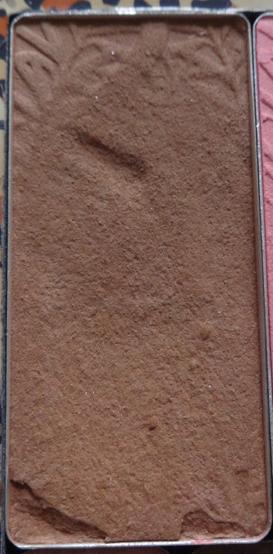
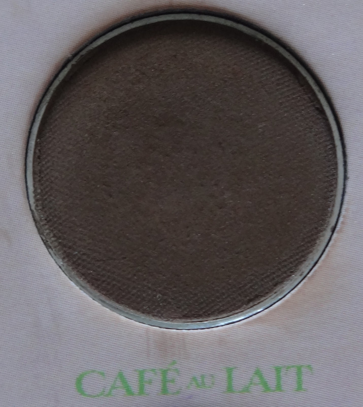
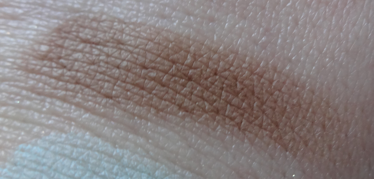
Cafe Au Lait is a soft pretty milk chocolate. A good shade to either ground how bright the other colors are, add some contrast to a blue look, to use for blending/phasing colors out in the crease area, and/or as a liner. So versatile. :)
Blueberry Cream is a beautiful pastel Cinderella blue. I am in love.
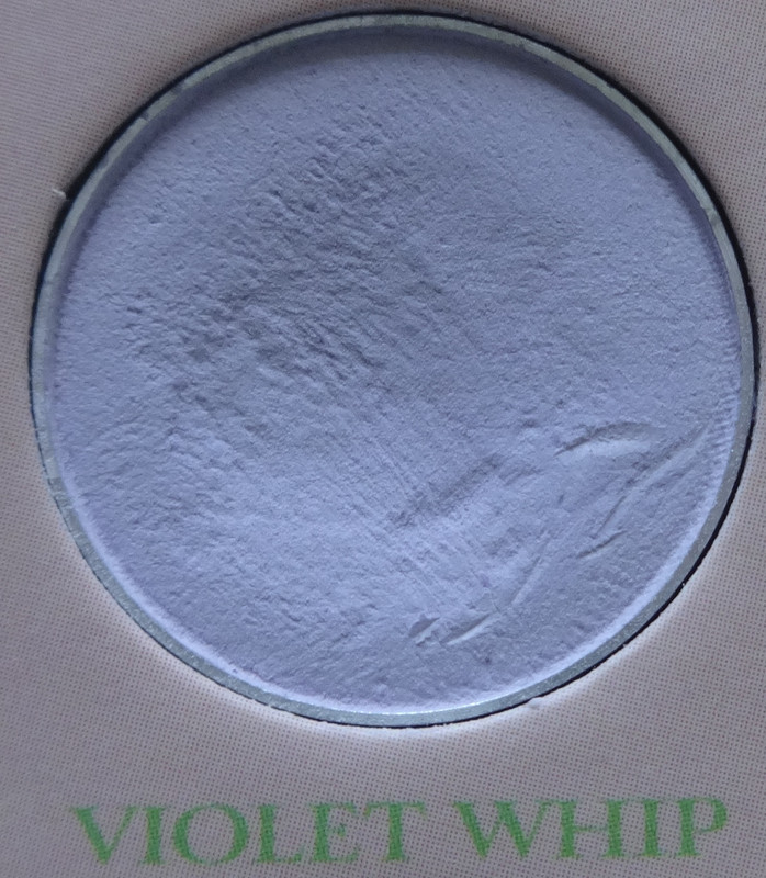
Violet Whip is a heavily whitened grayish purple. Another good highlighter for say... a more cool-toned look or, if we think in terms of color-correction, Cherry Blossom will brighten and this will correct more sallow tones - yellowness, jaundiced appearance, might be nice for a more "medium"/tan complexion although... might go ashy. :/
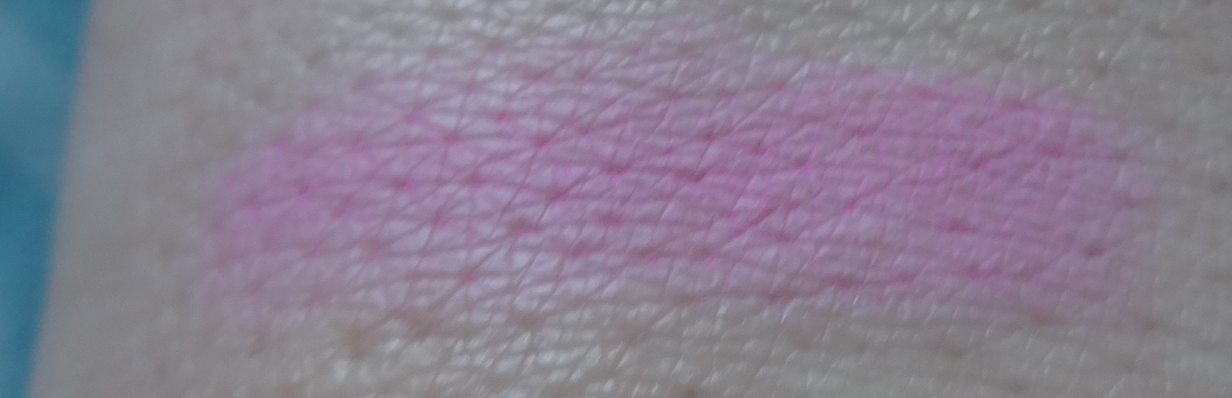
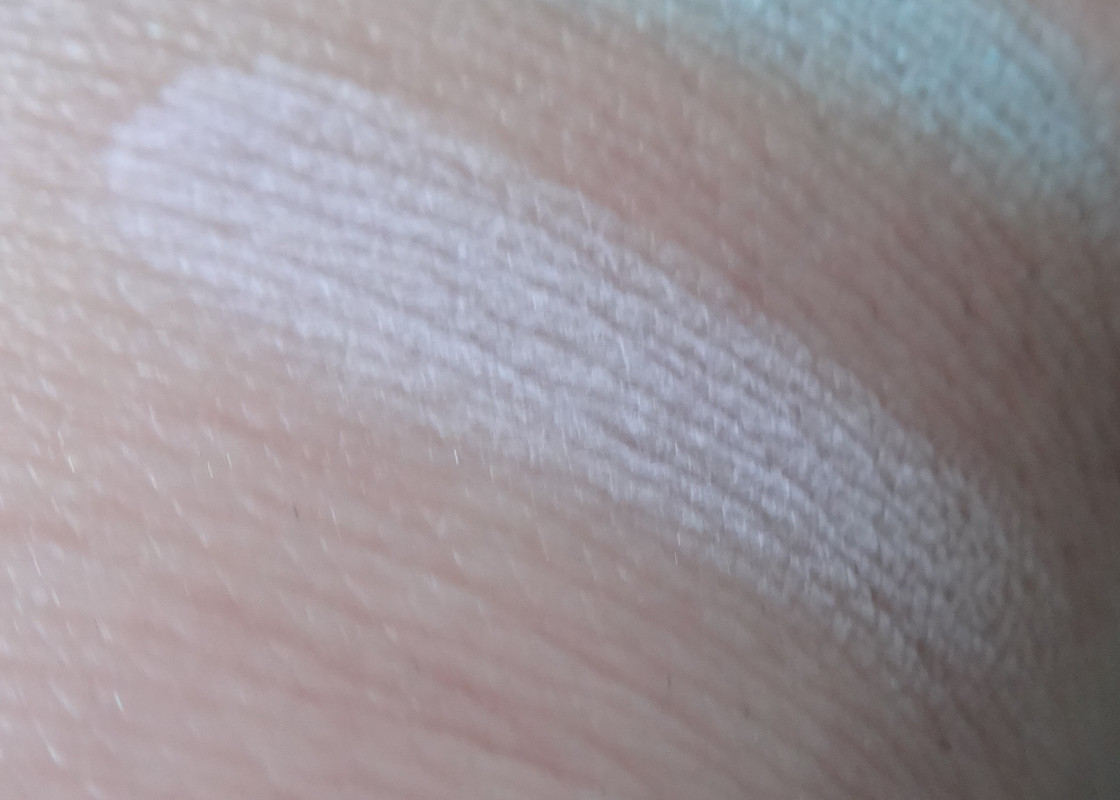
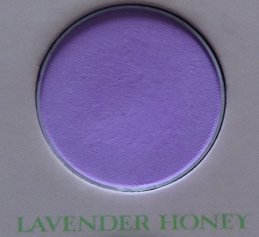
Lavender Honey is a pastel magenta purple kissed with pink.
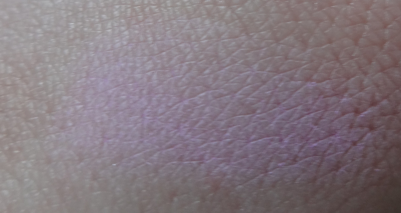
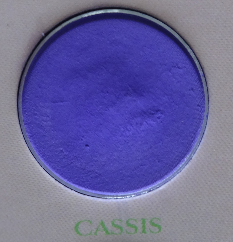
Cassis is appearing far more blue in these shots than in person. :/ It's a beautiful violet-purple that's soft-yet-bright.
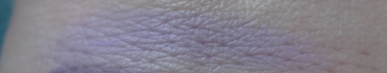
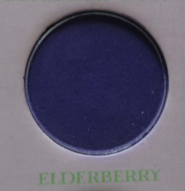
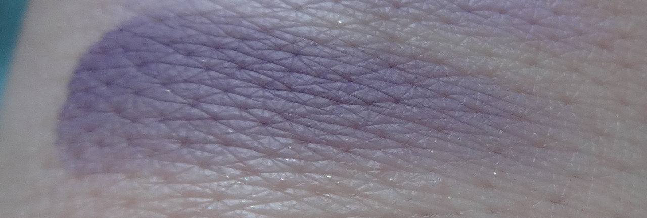
Ederberry is a beautiful deep indigo shade, it's almost a blackened blue but is softer than that. It's so pretty. Didn't I already say that for most of the colors? They're just all so pretty. :') :D
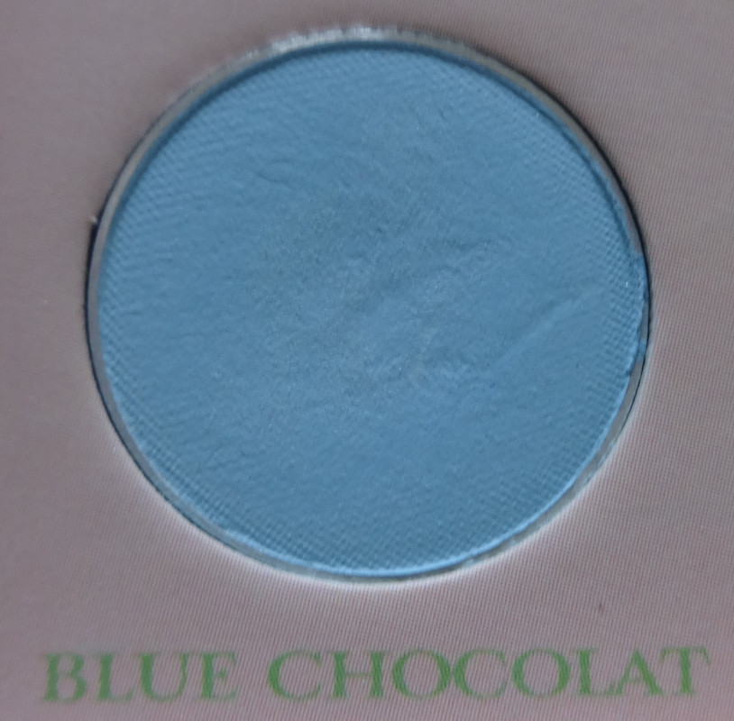
Blue Chocolat is a softer, more pastel version of Blueberry Cream that's just a touch more on the purple/cornflower side of things.
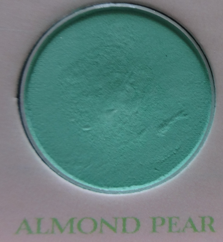
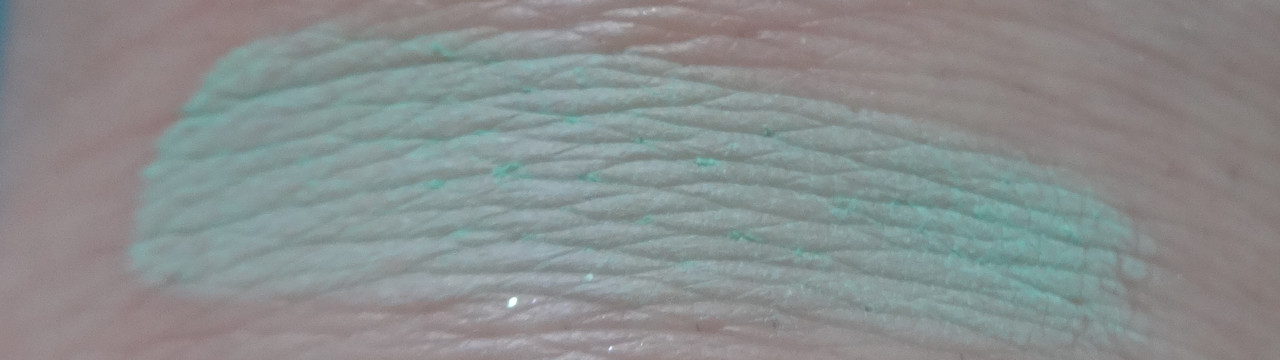
Almond Pear is a soft aqua green-toned teal shade. It reminds me of sea-foam. Mermaid goodness.
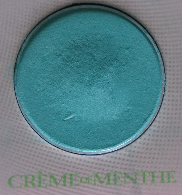
Creme de Menthe cake is delicious. The color is a blue-based teal aqua. More mermaid goodness.
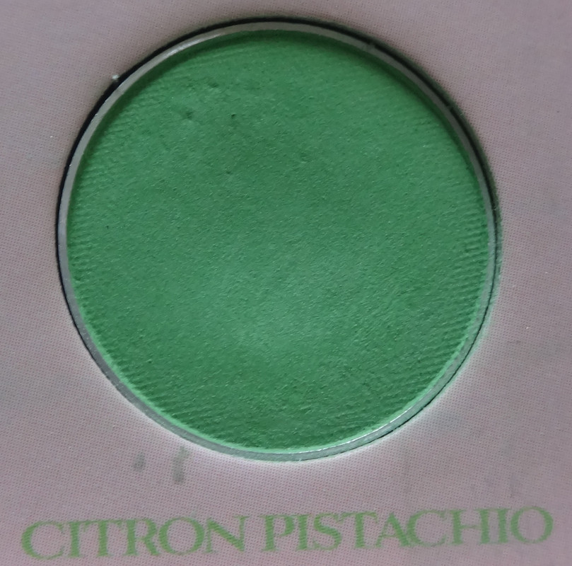
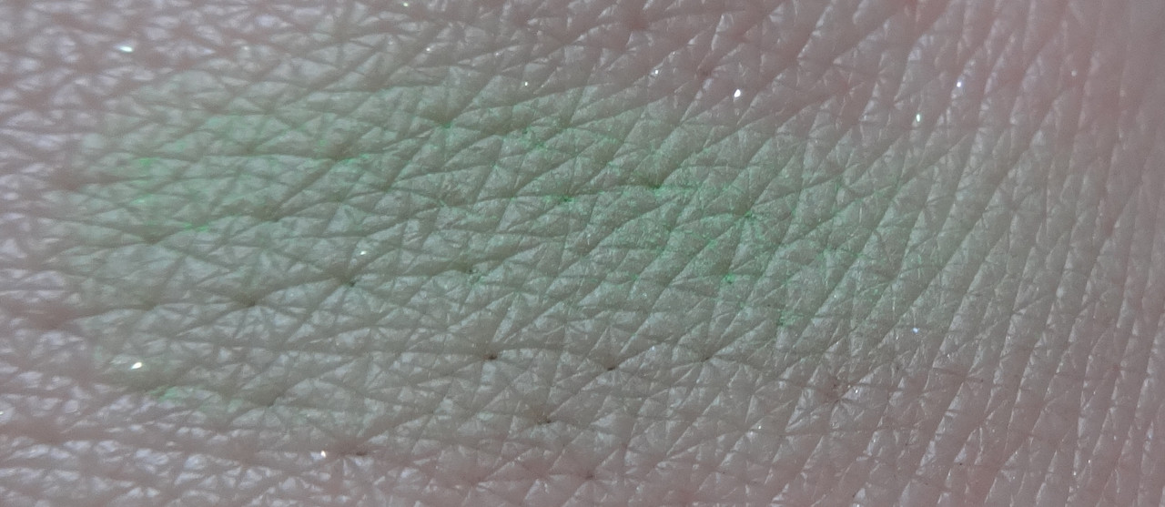
Citron Pistachio is a soft grass green. It's cool-toned and warm-toned all at once depending on how you play with it. It's super pretty for brown-eyed gals because it'll bring out red tones and be cool-looking. I also love this shade of green with blue eyes (because its yellow base tone brings out blue). Super purdy!
Please let me know if you have any comments or questions.
Disclaimer: As mentioned previously, my wonderful wife got this for me.